
October 17, 2026
I Ship My First Shopify 3D Model Like a Product-Page Feature
A practical launch checklist for publishing, testing, and rolling out a first interactive Shopify 3D product model.

I used to think a first 3D model was a media task: get a nice GLB, attach it to the product, admire the spinner, move on. That is how you end up with a technically valid asset that does nothing for the person trying to decide whether the product is right for them.
I now treat it like a tiny product-page feature launch. The feature has a job, an acceptance test, a place in the page, and a rollout plan. That framing made my first Shopify 3D project much less mysterious—and stopped me from treating a successful upload as the finish line.
Supra 3D Capture is useful here because it starts with a guided phone-photo orbit, processes those photos into a web-ready GLB, and can publish the result to Shopify product media or an Online Store 2.0 app block. I still do the feature work around it.
Start with the shopper question
Before I capture anything, I write one sentence: what can a shopper learn by rotating this object that the existing images do not settle?
For a desk lamp, it might be whether the shade projects far enough over a work surface. For a bag, it might be gusset depth and the way the handle attaches. For furniture, it might be leg shape, under-seat clearance, or how chunky the proportions really are. If the answer is “nothing,” I leave that SKU on the normal photo workflow.
That is a different decision from choosing a product that is easy to scan. My earlier low-risk SKU selection note is still where I start for capture risk. This step is about product-page value.
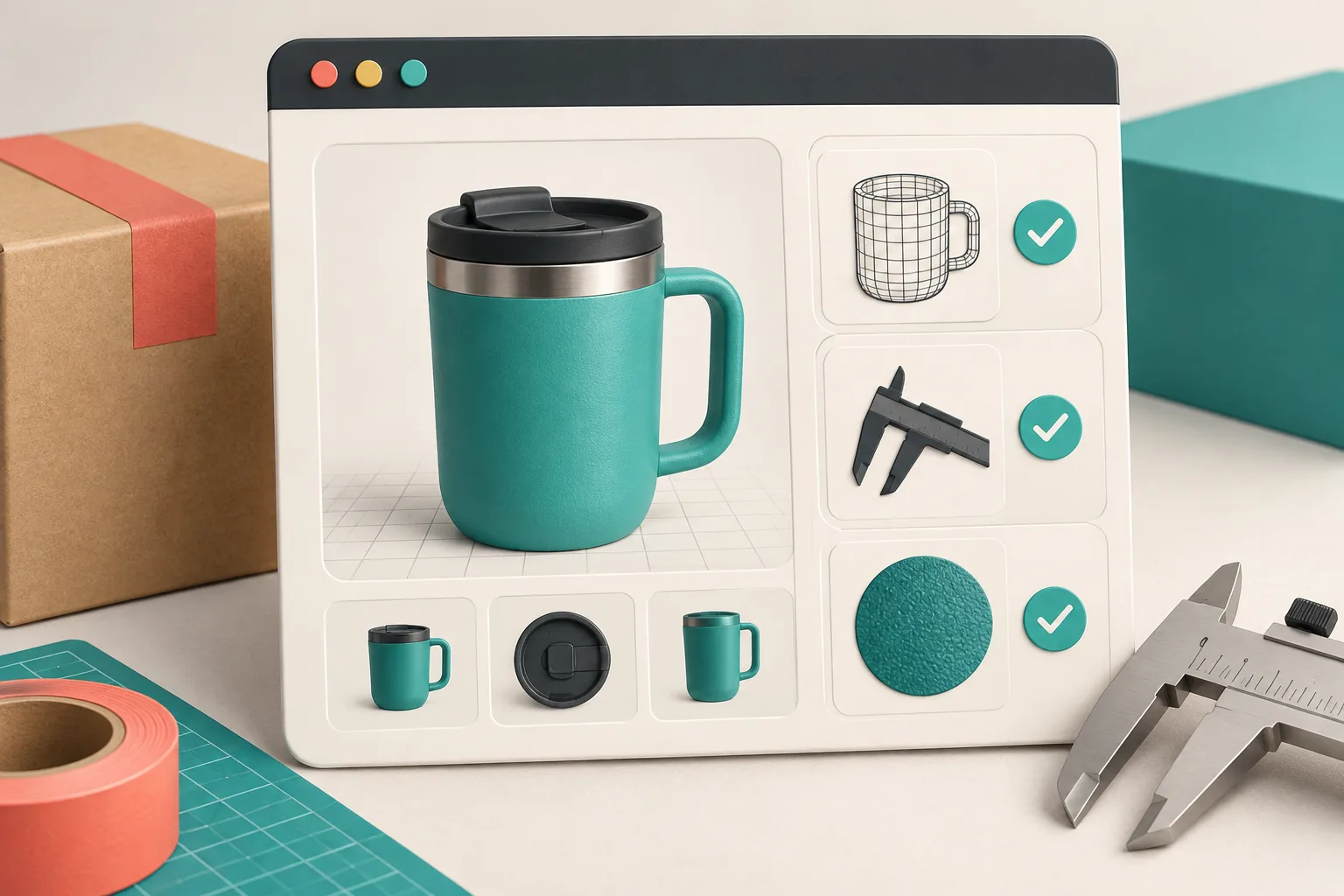
Capture for the question, not just for a mesh
A guided phone capture keeps the process approachable, but it does not replace basic product-photo discipline. I clear the scene, light the product evenly, keep it still, and make one steady orbit with enough overlap between angles. Supra says its workflow starts from 10+ guided photos; I take the prompt seriously instead of racing it.
Then I inspect the result for the three things customers actually use: silhouette, scale cues, and material truth. I am not looking for a perfect engineering model. I am checking that a handle does not dissolve into the body, the base is not floating, and the finish does not look invented.
If phone capture is new territory, the practical prep in this capture walkthrough is a good companion. It is much cheaper to re-shoot before publishing than to explain a weird model on a live product page.
Give the model an acceptance test
My launch checklist is deliberately boring:
- The model opens on a useful angle. The first frame should answer the main shopper question without a dramatic drag.
- The product is recognizably the same SKU. Color, finish, attachments, and proportions have to agree with the buy box and product photos.
- The viewer does not bury the buying path. I check the media gallery, image order, and mobile layout with the buy controls still easy to reach.
- The fallback still works. A product gallery must remain useful for a visitor who never interacts with 3D.
- The page holds up at real breakpoints. I test a narrow phone, a familiar laptop size, and the actual theme settings—not only the editor preview.
This is the same customer-eye habit I use when I audit size charts before they ship. The admin can tell you that an asset exists; only the live page tells you whether it makes the decision easier.
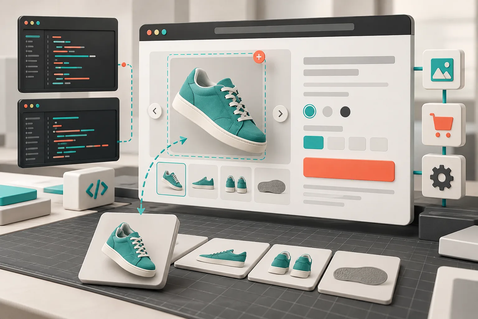
Publish in the smallest useful place
For the first rollout, I prefer Shopify-native product media. It places the GLB in the context shoppers already understand: the product gallery. Supra 3D Capture can publish there, and its dedicated app block is useful when the model belongs in a comparison section, landing page, or other Online Store 2.0 location.
I do not add both just because I can. Duplicate viewers make the page feel experimental rather than intentional. Pick the location that serves the one question you wrote at the start, then test the page from a clean browser session.
The other practical detail is page weight. 3D is not permission to stop caring about media hygiene. I keep the conventional gallery focused, export sensible image variants, and use the same discipline described in my browser-ready product-image workflow. A useful interactive model should complement the gallery, not turn the page into a pile of competing assets.
Roll out one SKU before making a catalog promise
My first model gets a short, explicit observation window. I check the rendered page, ask a teammate to find the feature without instructions, and compare support questions or return reasons for that SKU with the usual baseline. I do not promise a conversion lift from one model. I want evidence that shoppers can inspect the relevant detail and that the page has not become harder to use.
If that works, I repeat the same capture and QA pattern on products where depth, texture, shape, or scale are genuinely hard to communicate with flat photos. Supra’s free plan on the Shopify App Store includes three scans per month, which is enough runway to test a small, intentional batch instead of committing the whole catalog.
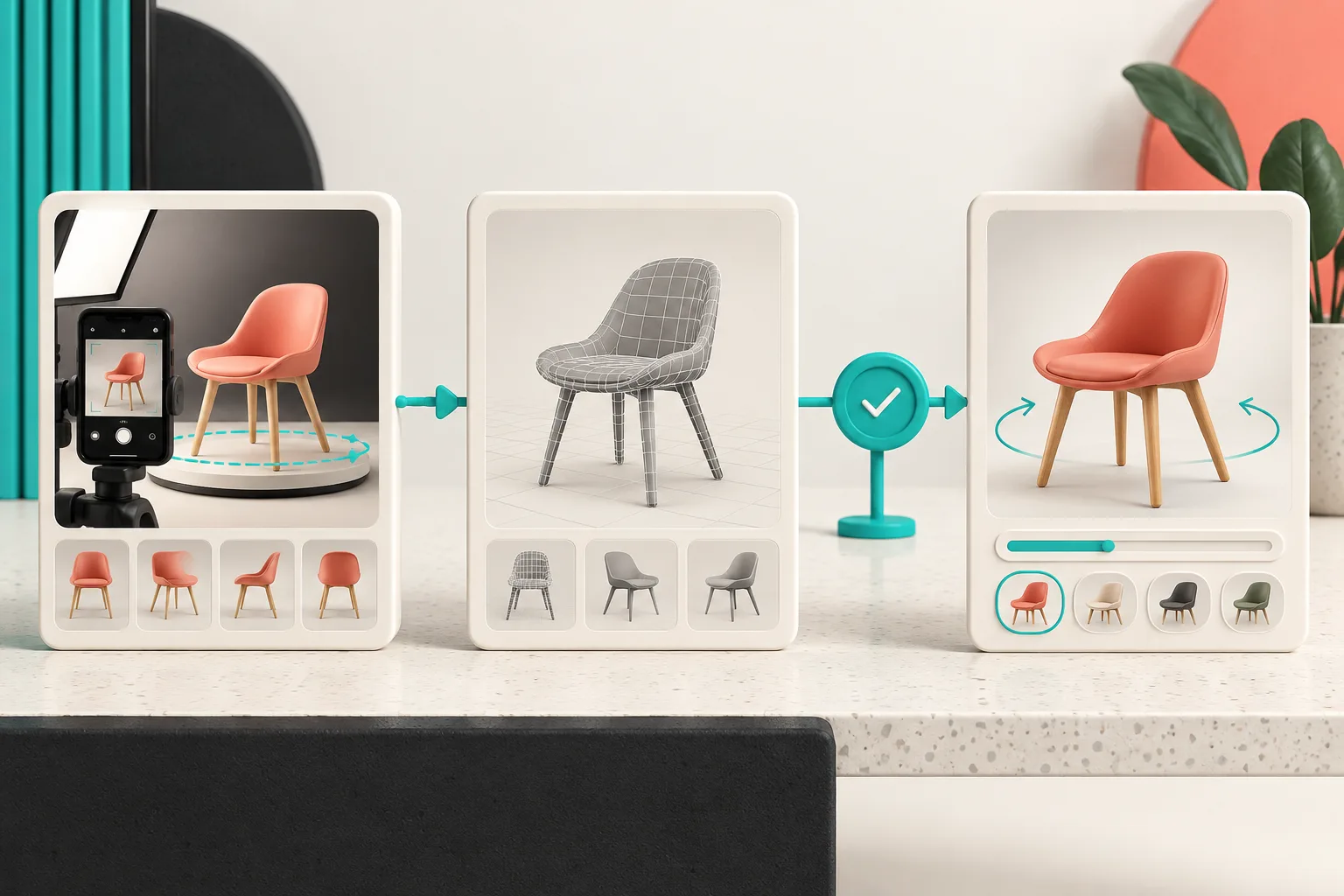
The next action I would take
Pick one product with a clear “I need to see that angle” problem. Write the shopper question, capture it, publish it in one location, and run the acceptance test on your real product page. When the model earns its place there, you have a repeatable Shopify 3D launch process—not just a cool file in the media library.