
October 16, 2026
I Audit Shopify Size Charts Like a Customer Before They Ship
A practical Shopify product-page audit for size charts: measurement clarity, rule matching, mobile display, and shopper-ready QA.
I used to think a size chart was done when the rows and columns looked tidy in the admin. Then I started opening the product page on a phone, pretending I had never seen the garment, and trying to choose a size with no context. That is when the expensive problems showed up: a chart attached to the wrong product type, a chest measurement with no hint about how it was taken, a modal that was fine on desktop but awkward in a checkout queue.
A size chart is not documentation for the merch team. It is a decision tool for someone who cannot touch the product. Here is the customer-side audit I run before a collection ships.

Start with the question a shopper is actually asking
The shopper is rarely asking, “What are the garment dimensions?” They are asking, “Will this fit me well enough that I should keep it?” That distinction changes the review.
For every product family, I open a representative product page and answer four things without consulting the team’s source sheet:
- Is this a body measurement or a garment measurement?
- Where exactly does each measurement begin and end?
- Does the product’s intended fit change the interpretation—relaxed, fitted, oversized, cropped?
- Can I see the chart and the product details together without losing my place?
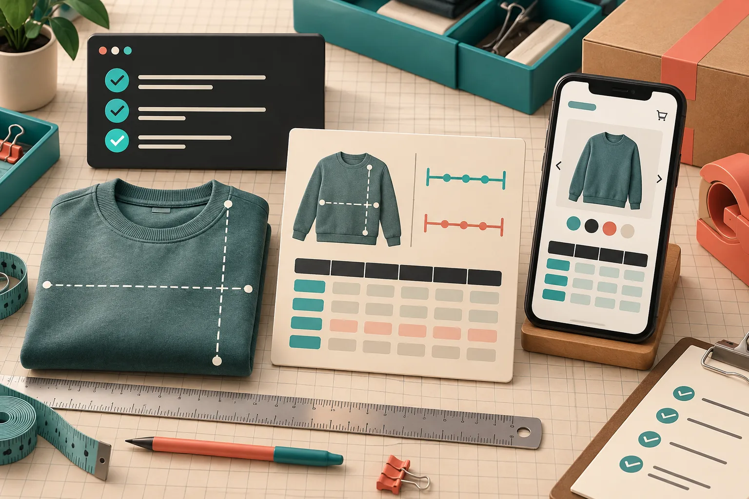
If the chart measures the garment flat, say so directly near the table. If a chest value is half-chest rather than circumference, say that too. A labelled measurement guide makes this much easier than a table of bare numbers; it gives the shopper the same reference point the merchandiser used.
This is also where I split true fit families. We already covered why keeping charts honest across fit families matters in this earlier build note. A heavyweight hoodie and a slim tee may share a size label, but that does not make their measurements interchangeable.
Audit the assignment before auditing the arithmetic
A perfect chart on the wrong product page is still a failed experience. I start by making a small fixture list: one product that should match each rule, one that should not, and one boundary case such as a newly tagged item. Then I open all of them in a private browser window.
For a catalog with repeated patterns, I do not want a manual attachment ritual. Supra Size Chart lets a store assign a centrally managed chart by product, collection, product type, vendor, or tag, with the most specific rule winning. That means I can make the audit reflect the catalog structure instead of hoping a copy-paste job was repeated correctly.
The useful question is not “Did I create a rule?” It is “Would a product added tomorrow inherit the correct chart?” If that answer is unclear, the rule is too broad, too narrow, or the product taxonomy needs work. A practical starting point is mapping product types to size-chart rules before a large batch goes live.

Run the measurement guide test
I give the product page to someone who did not build the chart—or I take a five-minute break and act like that person. I ask them to find the measurement instructions, follow one line on the diagram, and locate their likely size. If they pause at “width,” the copy is incomplete.
For a t-shirt, a simple guide might identify body length and pit-to-pit width. For trousers, I need waist, rise, inseam, and leg opening if those values influence the decision. The aim is not to fill every possible column. It is to publish the few measurements that resolve the actual fit risk.
I also inspect the units. A store serving more than one market should not make every shopper do a conversion in another tab. Supra Size Chart can expose a metric/imperial toggle for counterpart scales, but I still confirm that the original unit is labelled and that the conversion does not hide the measurement note.
Check the product page where it will be used
A chart needs a home in the actual product-page flow. I test the selected display mode—inline, accordion, or modal—on a narrow phone view first, then on desktop. The mode should serve the product page, not a universal preference. An inline chart works when it is short and central to the purchase. An accordion keeps a detail-heavy page compact. A modal can work for a longer guide, provided the trigger is obvious and the close action is painless.
This is closely related to how I organize product details with tabs and mobile accordions: important buying information cannot be technically present but practically buried. I test keyboard focus, touch targets, horizontal overflow, and whether the size-chart block still respects the theme’s light and dark styling.
Make the final pass reproducible
My last step is deliberately boring: I retain the source chart and a short QA record. For a new collection, that record names the source CSV or JSON export, the rule used, two tested product URLs, the display mode, and the reviewer. It makes the next revision a controlled change rather than a rediscovery project.
That portability matters. I made my Shopify size charts survive an app change by treating the chart as store data, not app-owned decoration. Supra Size Chart stores charts as Shopify metaobjects and supports CSV and JSON import/export, so the source can remain with the shop.
Before your next drop, choose five representative product pages, open them on a phone, and try to pick a size without relying on internal knowledge. Fix the first moment that feels ambiguous. Then install Supra Size Chart from the Shopify App Store to keep the corrected chart and its rules in one reusable, merchant-owned system.