
August 14, 2026
How I Build a Publish-Safe Shopify Photo Decision System
A practical approval workflow for turning one Shopify product image into consistent, publish-safe catalog visuals.
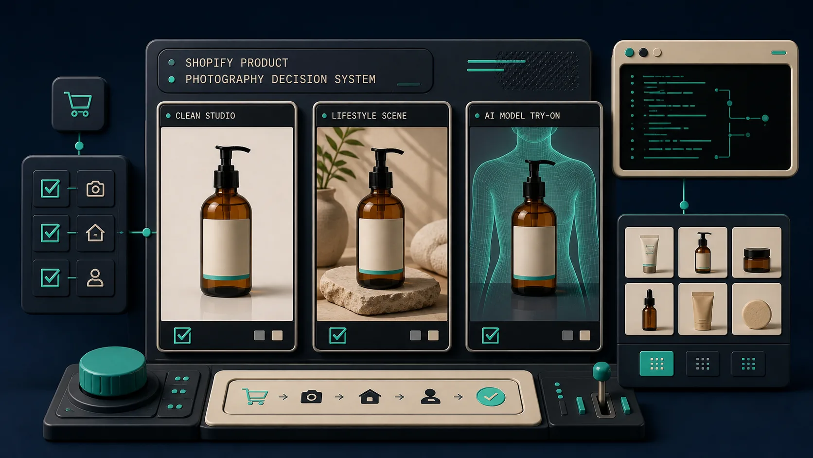
A product photo can be technically usable and still be the wrong thing to publish. That is the trap I kept falling into: an image looked sharper after an edit, so I pushed it to the product page—then realized the color drifted, the crop hid the important detail, or the scene made a very ordinary SKU look oddly premium. The fix was not another folder of exports. It was a small decision system.
I now treat every new image as a candidate with a job: gallery detail, collection card, ad, or social post. Supra AI Photo Studio gives me the useful building blocks inside Shopify—background cleanup, enhancement, object placement, model try-ons, and short video options—but the operating rule is mine: generate broadly, approve narrowly.
Start With a Source Photo I Can Defend
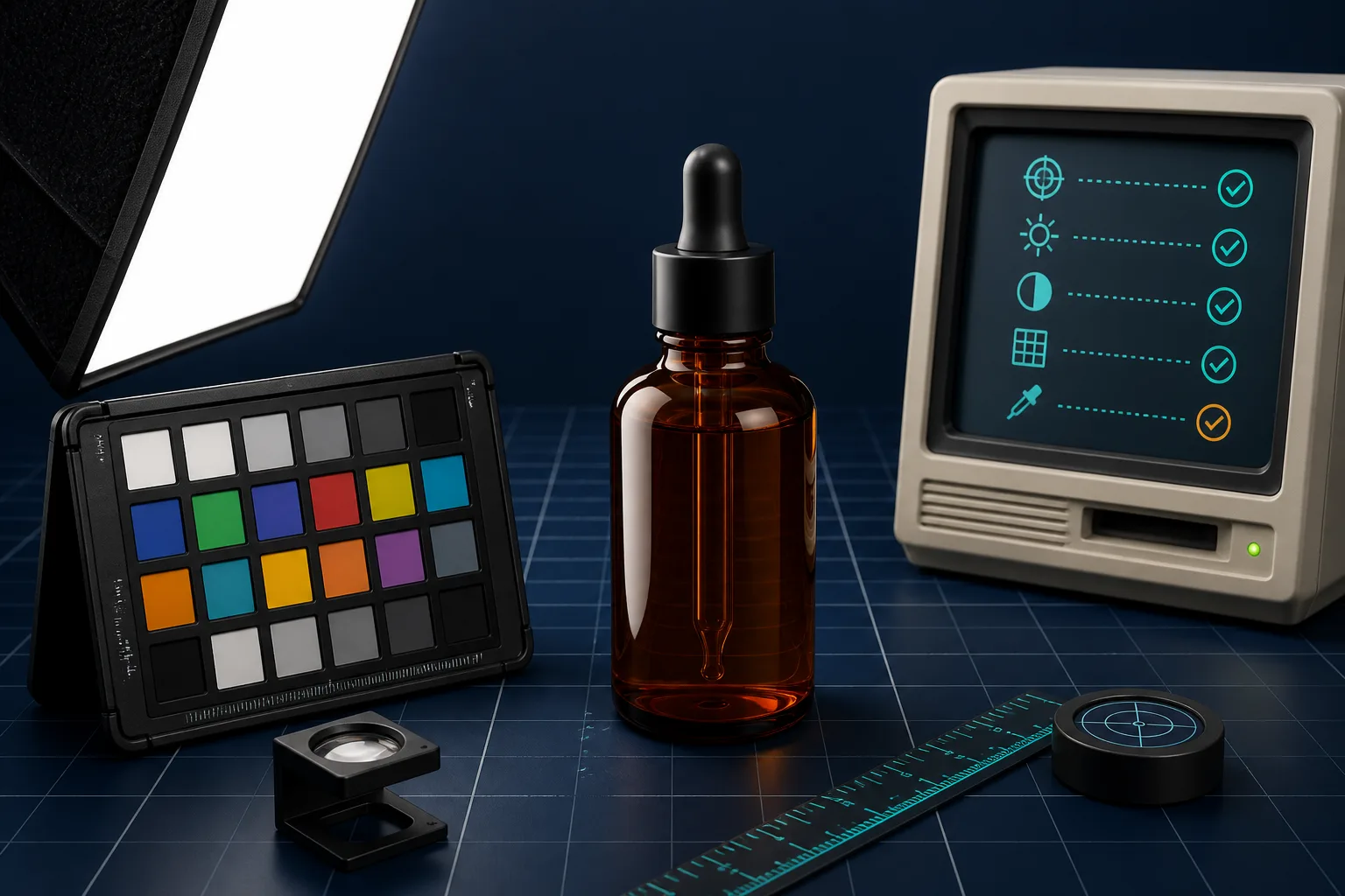
Before I ask AI to make a scene, I make the original boringly inspectable. The product has to be fully visible, in focus, and separated enough from its background that its outline is unambiguous. I look for three failure points: clipped edges, texture that reads as compression noise, and a product color that is already being distorted by the original lighting.
This sounds obvious, but it changes the quality of every downstream version. I use the app’s isolate/background and enhancement tools only after deciding which SKU detail must remain invariant: material texture for a knit, label placement for a supplement, or finish for a ceramic item. If a generated result makes that invariant harder to verify, it is an ad concept, not a catalog image.
That is a refinement of the photo QA pipeline I built for Shopify: source quality is a gate, not a cosmetic preference.
Give Every Variant One Destination
The useful question is not “Can I make this image nicer?” It is “Where will a shopper encounter it?” I use a tiny routing table:
- Product gallery: neutral background, truthful scale, enough negative space for zooming.
- Collection card: consistent crop and a silhouette that survives a small square.
- Lifestyle placement: one believable use context, with the product still visually dominant.
- Creative test: a more opinionated scene or on-model try-on, clearly separated from the canonical gallery assets.
For the third and fourth jobs, Supra AI Photo Studio’s object placement and try-on tools are especially handy. I can start from the same approved source and create a context rather than reinvent the product. That separation also means the catalog can stay dependable while ads get room to be specific. The same idea matters when photos become motion: I keep the structured source data and approval step from my reviewable product-video queue instead of treating a video export as a new source of truth.
Generate Two Directions, Not Twenty
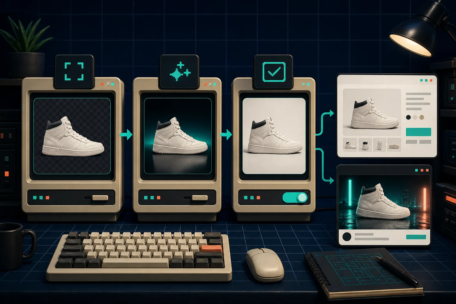
My first pass is deliberately constrained. I make one safe version and one exploratory version. For a candle, that might be a clean warm studio scene and a quiet bedside scene. For apparel, it might be a straightforward product enhancement and one model try-on.
The prompt note I keep beside the work is short: environment, camera angle, lighting style, and the product detail that may not change. The app’s own help guidance makes the same practical point: isolate the product first when you need the generator to pay attention to it, and give specific instructions when the tool accepts them.
A narrow first pass is faster to review, easier to compare, and much less likely to create a gallery full of nearly identical assets. If I need motion afterward, I use the approved still as the input to a short b-roll or UGC experiment, rather than asking an experimental image to carry the entire campaign. My week of UGC video tests uses that same “one job per asset” rule.
Review at the Size Customers Will See
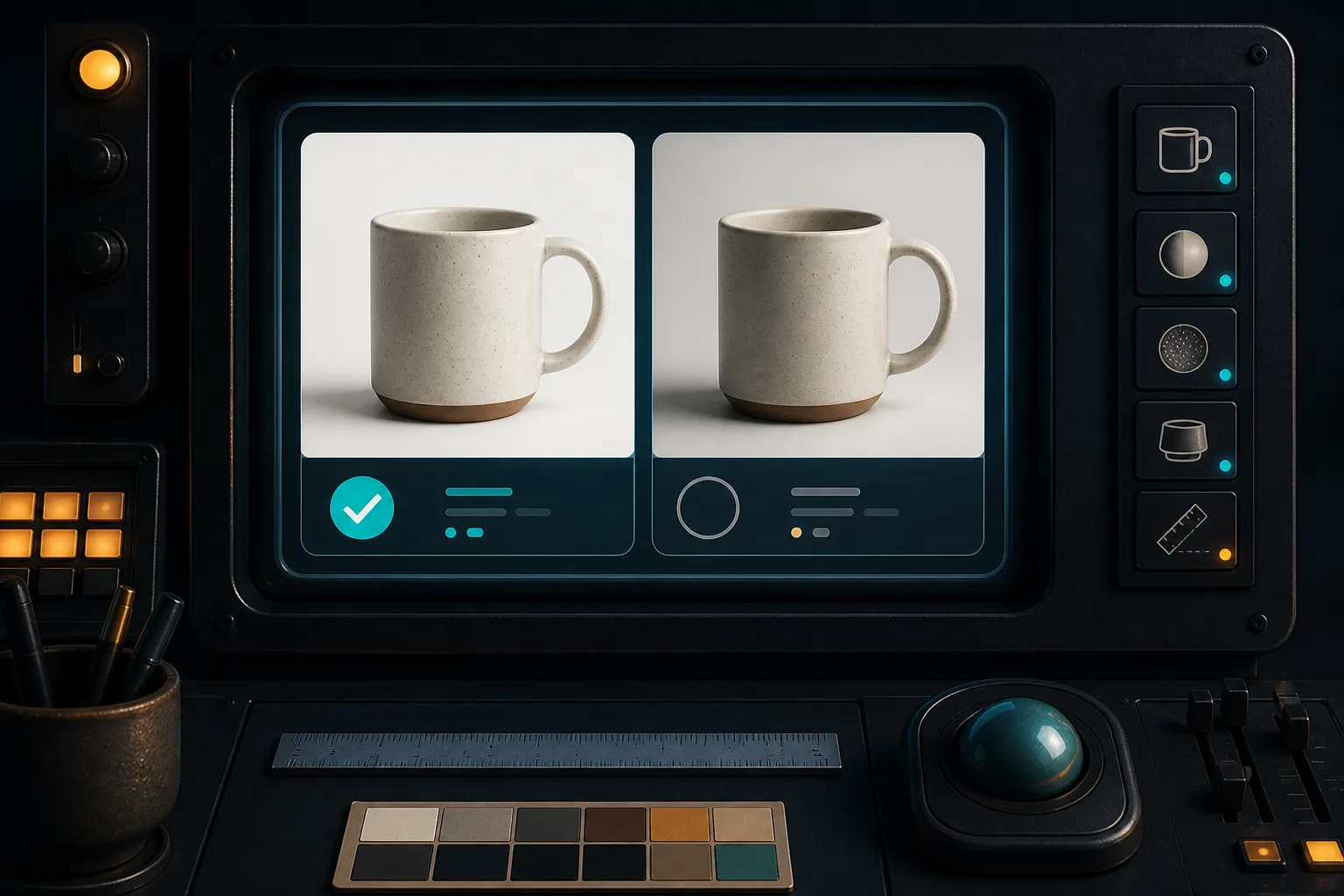
I do not approve from the big editor canvas. I check the collection-card size, the product-page position, and a phone viewport. Then I ask four operational questions:
- Does the product match the thing I sell—color, shape, material, and included pieces?
- Does the crop preserve the shopper’s decision-making detail?
- Would this image look coherent beside the existing catalog?
- Can I say what job it is doing in one sentence?
If the answer to the last question is fuzzy, the asset probably belongs in the experiment pile. This matters even more when a lifestyle scene is attractive: atmosphere can hide a product rather than sell it. For products where dimensional understanding is the decision-maker, I would pair a restrained photo with interactive media rather than force a dramatic angle; my phone-first 3D media pilot is the companion workflow I use for that case.
Publish the Winner, Keep the Receipt
Once an image passes review, I publish it to the intended product location and record the source file, destination, and why it won. The record can be a simple product metafield note, task comment, or small spreadsheet. What matters is that the next person can tell whether the product page is showing a canonical catalog photo or a campaign-specific visual.
If you are testing this workflow, install Supra AI Photo Studio, choose one SKU with a clear source image, and make only two routed variants this week: one gallery-safe and one context-rich. Review them on an actual product page before making more. That one constraint is usually enough to turn AI image generation from a novelty into a repeatable catalog operation.