
July 11, 2026
How I Decide Whether a Shopify Product Photo Needs Try-On, Placement, or Video
A practical decision tree for cleaning product shots, then choosing try-on, placement, or video outputs with Supra AI Photo Studio.
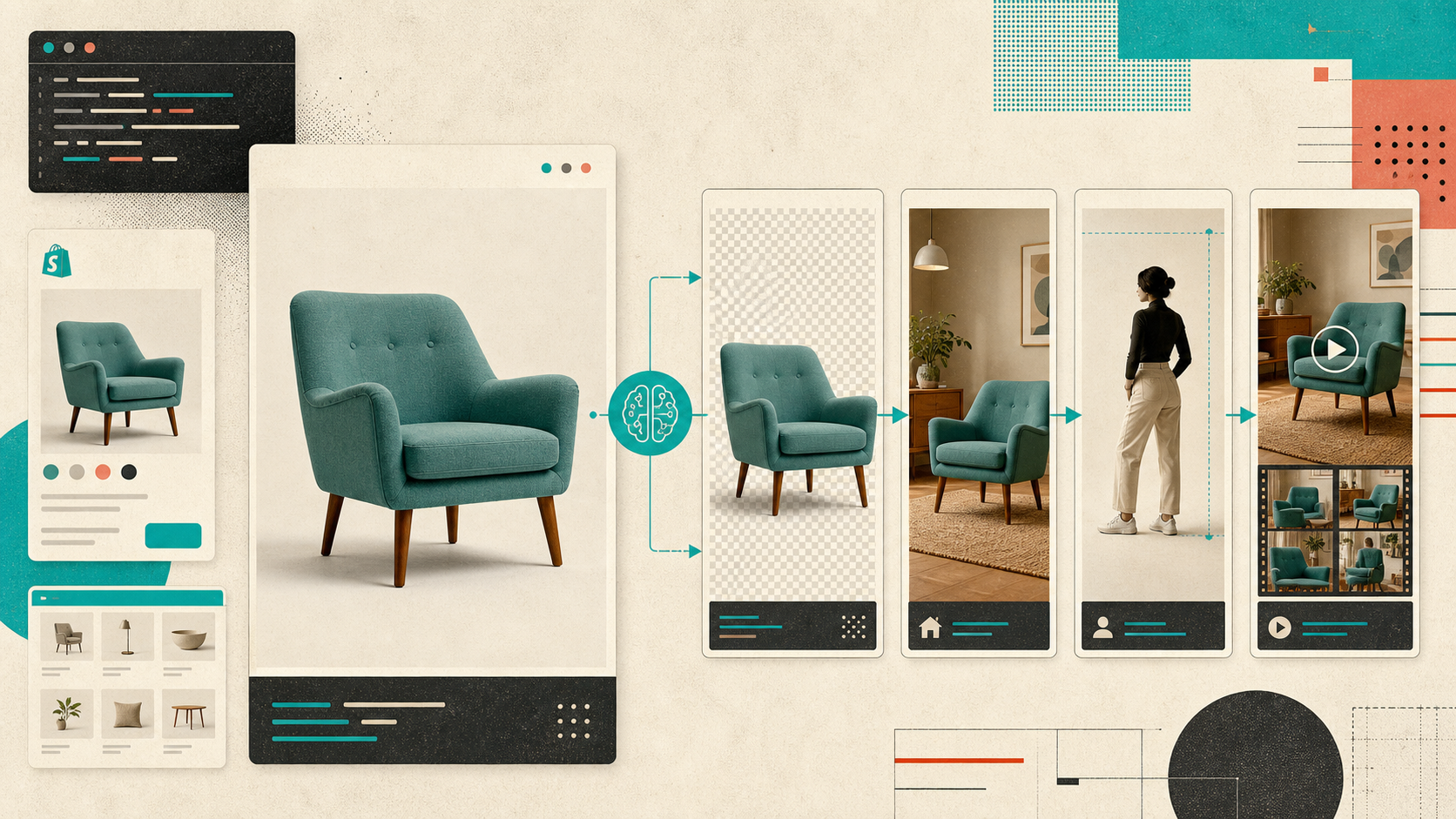
I kept running into the same failure mode: one SKU needed a clean product page image, a better lifestyle shot, maybe a model image, and sometimes a short clip for ads. If I tried to solve all of that at once, I burned time and usually over-styled the image.
Supra AI Photo Studio is the first tool I’ve used that made the choice explicit instead of magical. I can clean the base file, decide whether I need try-on, object placement, or video, and then push the smallest useful transformation. If you want the app itself, start with the landing page or the Shopify App Store listing. The demo trailer is worth watching if you want to see the feature set before you install.
Start by fixing the source image
I almost never begin with styling. I start by making the original photo easier to read: remove the background, correct the lighting, sharpen the image, and upscale only if the file actually needs it.
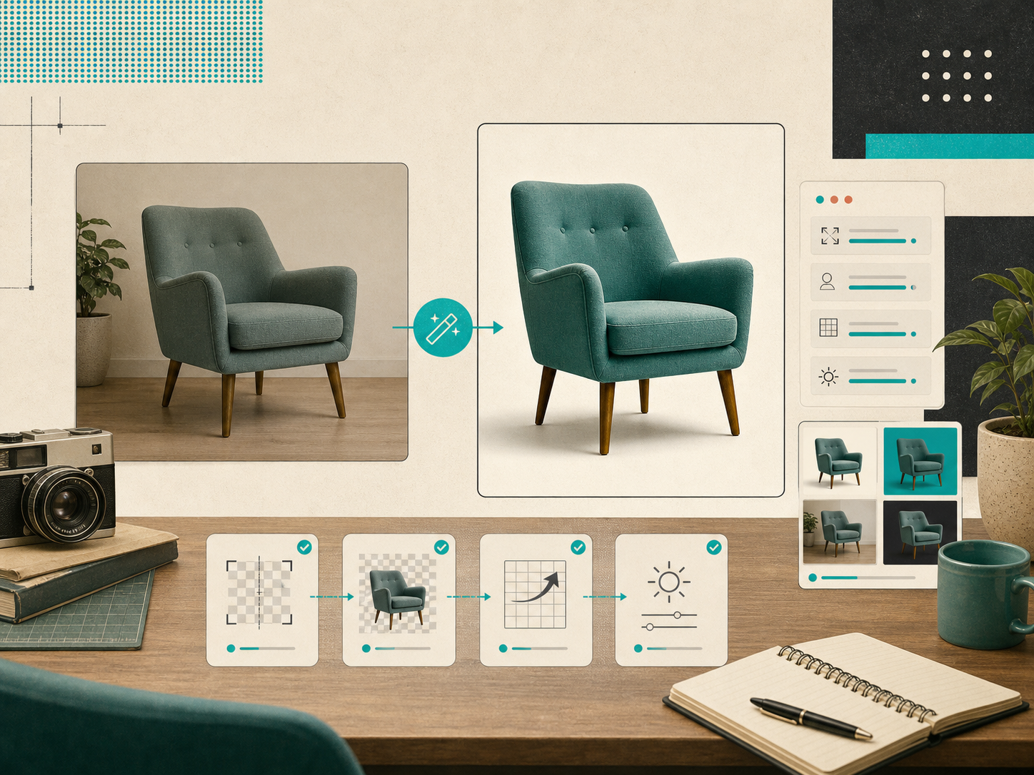
That sounds boring, but it is the part that makes the rest of the workflow usable. If the product is still muddy after cleanup, I stop there and do not ask AI to invent a scene yet. That rule keeps the output closer to the catalog and farther from the uncanny valley.
The faster version of this idea is the no-shoot workflow I wrote about in How to Build a Shopify Product Photo Workflow Without a New Shoot. The point is the same: a good base image survives more downstream uses.
Use the editor to see what is missing
The app editor keeps the decision tree visible. Tools sit on the left, the canvas is on the right, and the image gallery lives underneath. That makes it easier to choose between cleanup, context, or motion instead of guessing from a menu.
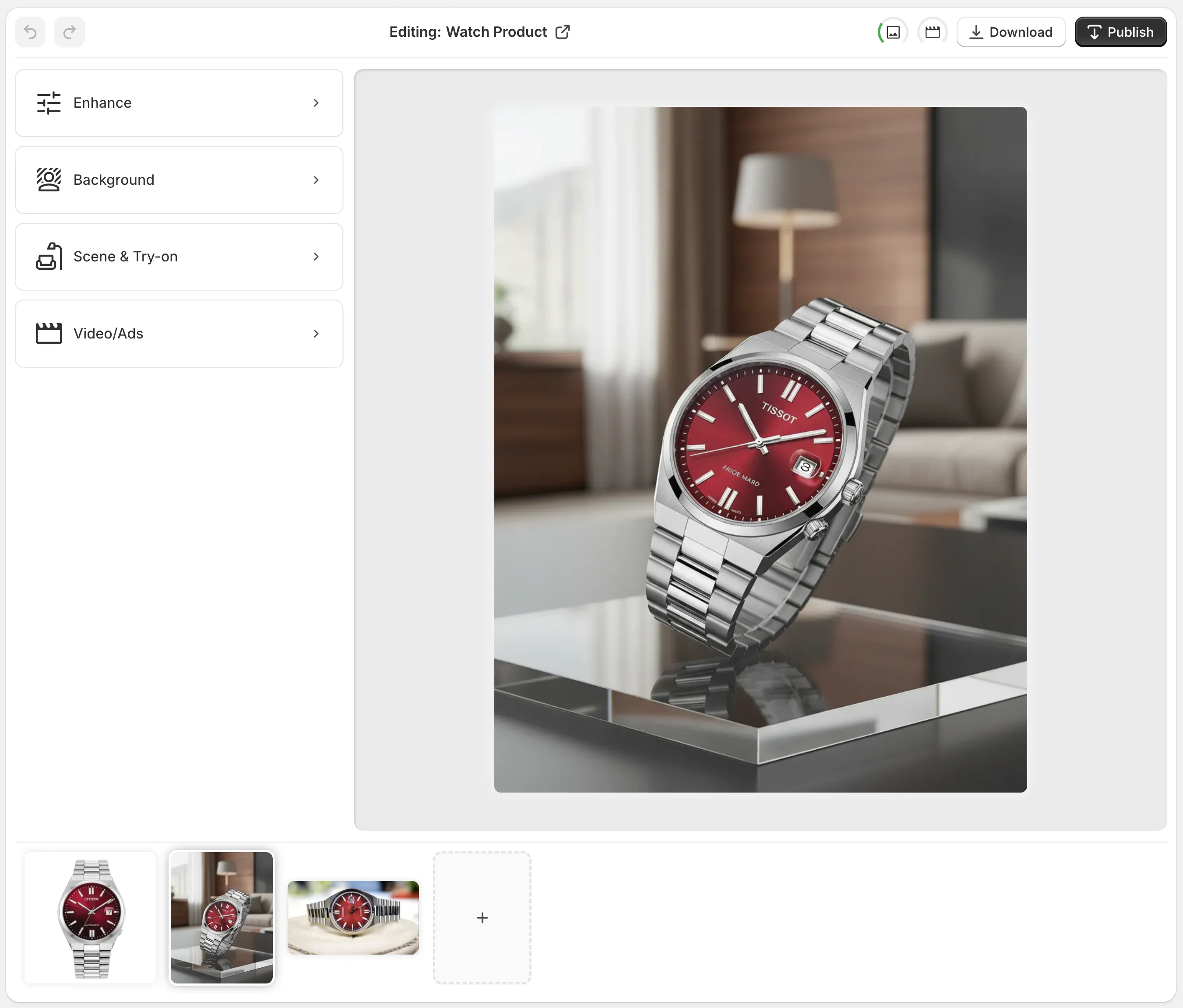
When I open a product, I am usually answering three questions:
- Is the product already legible?
- Do I need context, like a room, a surface, or a model?
- Do I need motion, or is a still image enough?
That tiny checklist matters because every extra effect costs clarity. A clean product shot can stay a clean product shot. A fashion item might need a try-on. A candle, bag, or decor item might need object placement. And if the ad team needs movement, I can move into UGC or b-roll without changing the source discipline.
I expand that logic in How I Build a Shopify Product Photo Pipeline That Feeds Every Channel and How I Turn One Product Photo Into a Channel-Ready Shopify Asset Set. Different ends of the same workflow, same basic rule: the source image has to stay useful after the first edit.
Match the transformation to the product
This is where I stop treating the tool as one big “make it better” button.
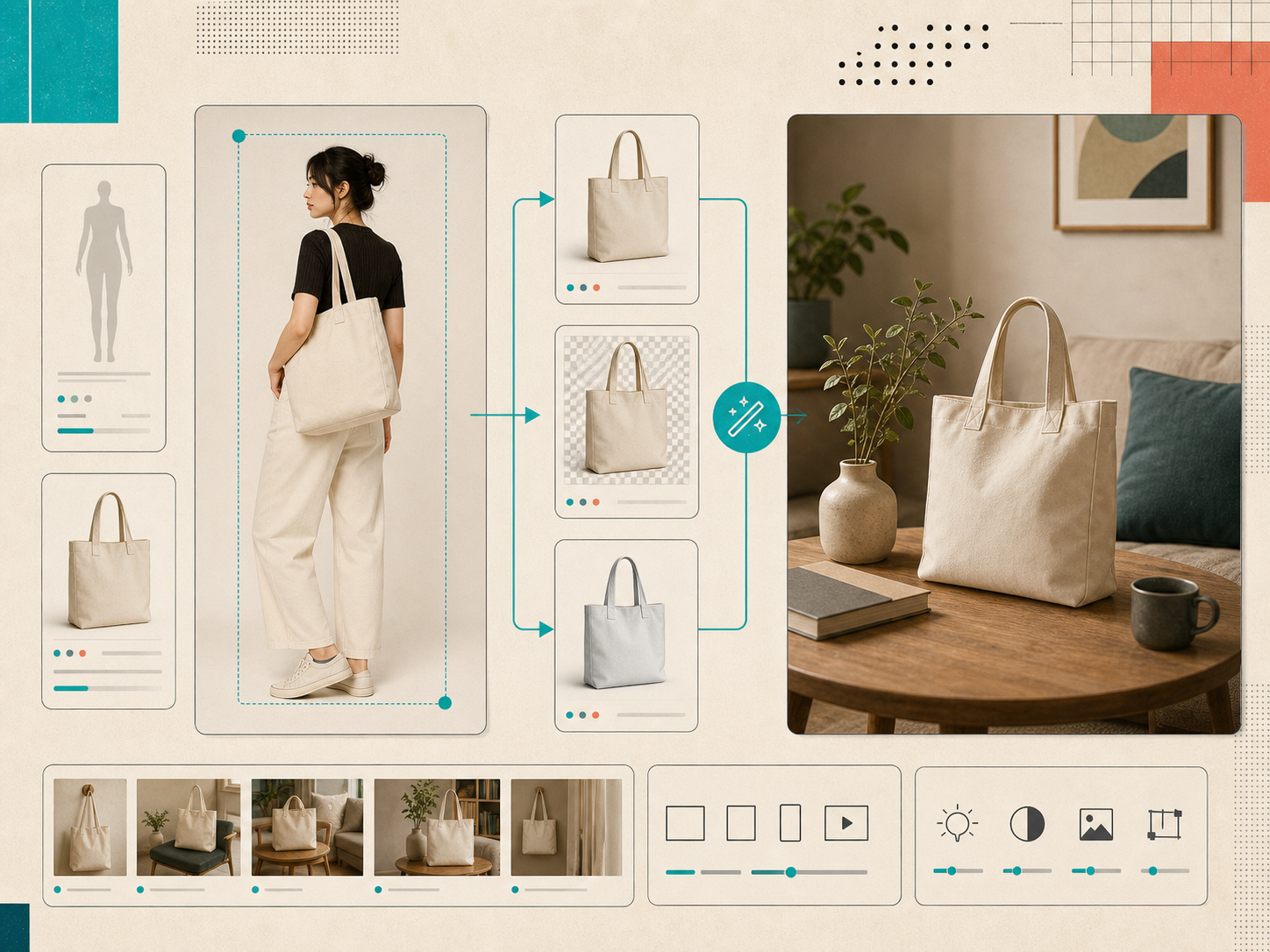
For apparel, jewelry, and accessories, I usually start with try-on. It gives me a realistic sense of fit and scale without scheduling a shoot. If I am working with objects that need environmental context, I use placement to put them into a studio, boutique, kitchen, or outdoor scene.
For social or ad creative, I lean toward motion. The UGC-style and b-roll options help when the listing needs energy, but I still want the product to remain the thing people are looking at. I do not want a pretty video that forgets what it is selling.
This is also where the app’s free plan available detail matters. I do not need to spin up a giant content project to test the workflow on one SKU. I can pick one product, make one clean decision, and see whether the output helps.
If you want the visual-side version of the same idea, How to Turn Plain Product Photos Into High-Converting Shopify Visuals is the closest companion. If you want the more asset-set angle, How to Build a Shopify Visual Kit From One Product Photo is a good follow-up.
Keep the output coherent across channels
The part I care about most is not the effect itself. It is consistency.
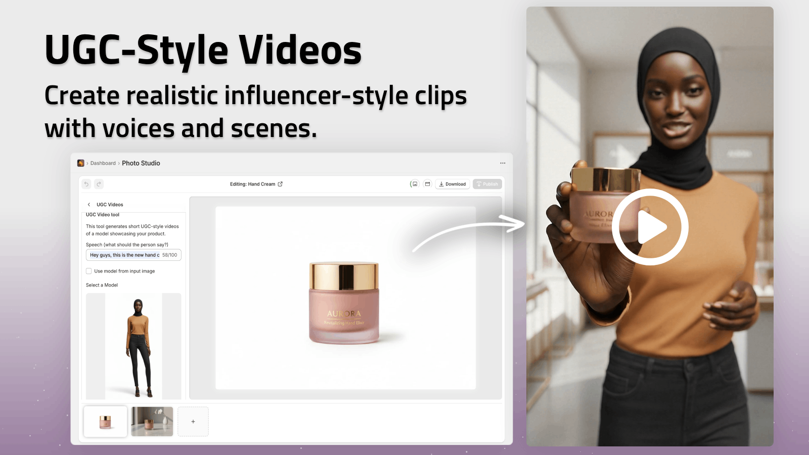
Once I have a cleaned base photo, I want it to feed the product page, the collection page, the ad, the email hero, and maybe a social cutdown without turning into five unrelated assets. That is the real value of the workflow: one product stays recognizably the same while the presentation changes by channel.
That is also why I like the studio-style workflow in the app itself. I can start from a product image or upload a new one, make the edit, and stay inside the same admin-ish loop instead of bouncing between tools. For me, that is the difference between “we made one nice image” and “we built a repeatable visual system.”
The checklist I actually use
Before I call a photo done, I run the same small checklist:
- The product is readable at thumbnail size.
- The background is gone or intentionally part of the scene.
- Lighting and color still match the actual item.
- The output fits the channel I am publishing to.
- The image still looks like the same brand as the rest of the catalog.
If any of those fail, I go back one step instead of pushing harder on styling. That saves more time than trying to rescue an image with another round of effects.
What I would do first
If you want the smallest useful test, do this on one SKU today:
- Pick the product that already has decent demand.
- Clean the source image first.
- Try one contextual version, either try-on or placement.
- If you need motion, generate one short clip.
- Compare the result to the original in the product page and one marketing channel.
That is enough to tell you whether Supra AI Photo Studio fits your store without turning the task into a full rebrand.
If you want to try it, start with the landing page or the Shopify App Store listing. If you already know your use case, watch the demo trailer first, then choose the one SKU that needs the most visual help and start there.