
July 10, 2026
How I Turn One Product Photo Into a Channel-Ready Shopify Asset Set
A practical workflow for turning one Shopify product photo into lifestyle shots, try-ons, and ad-ready visuals with Supra AI Photo Studio.
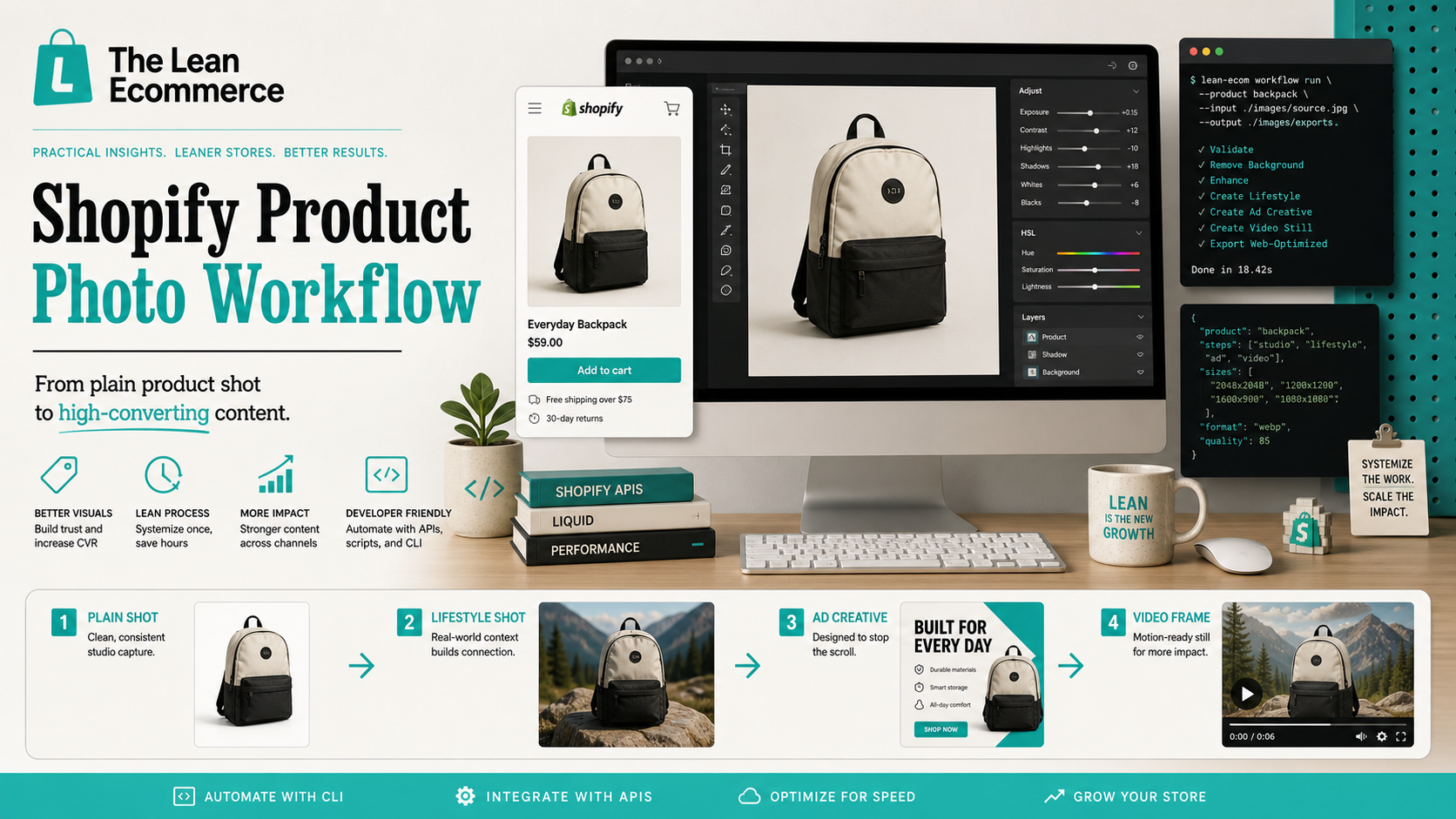
I kept running into the same Shopify problem: one decent product photo had to become the product page image, the lifestyle shot, the ad creative, and the email hero. Rebuilding each version by hand was slow, and the outputs never stayed consistent.
Supra AI Photo Studio gave me a cleaner path. I could start from one source image and turn it into a set of visuals that still felt like the same product and the same brand. If you want the app itself, start with the landing page or the Shopify App Store listing; the demo trailer shows the feature set in motion.
The workflow I actually use
- Start with the cleanest source photo you have.
- Remove the background or isolate the product.
- Fix exposure, color, and sharpness before adding context.
- Generate the channel-specific versions you actually need.
- Export once, then reuse the same source set everywhere.
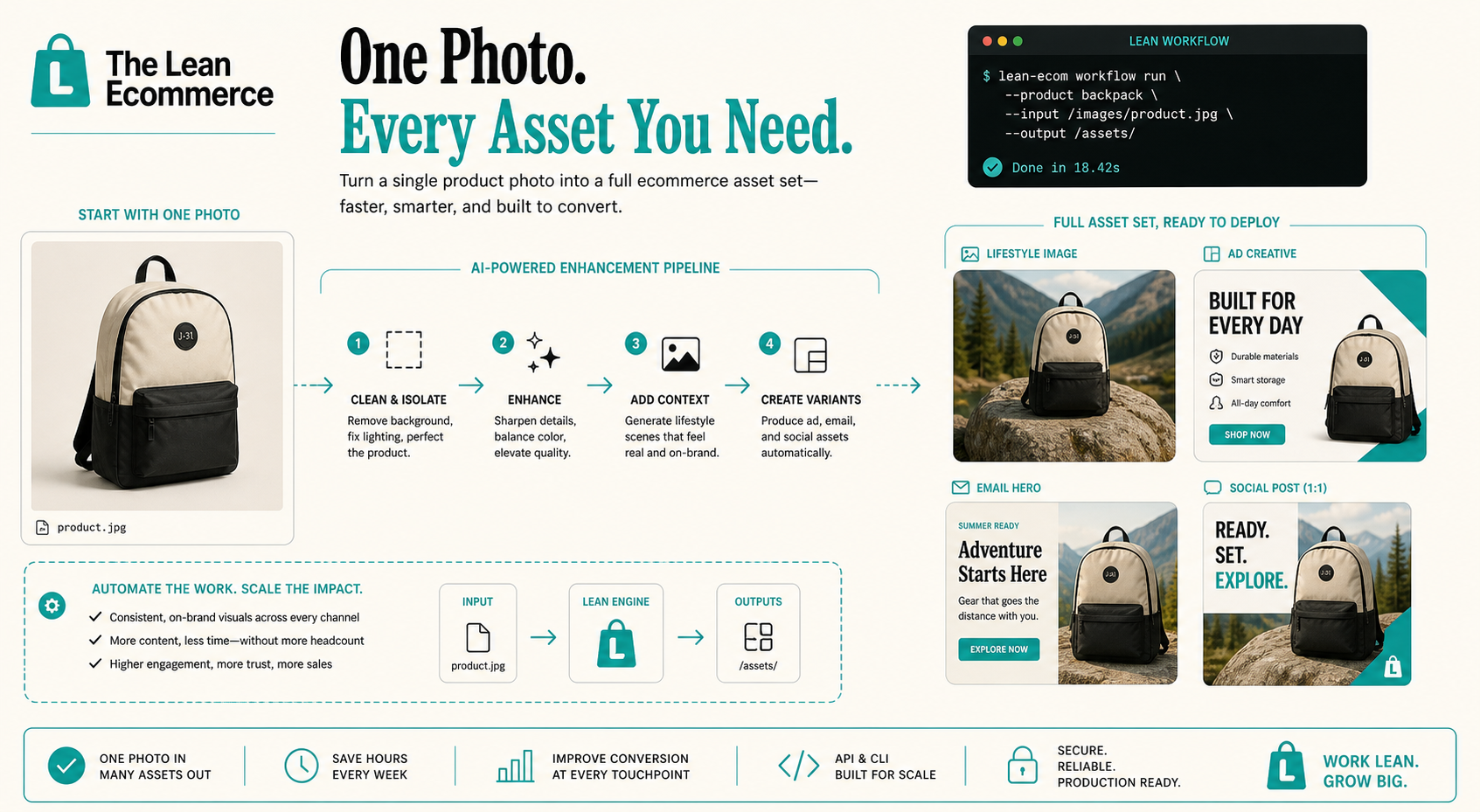
That sequence matters more than the individual effect. If I skip the cleanup step and jump straight to lifestyle generation, I usually get weaker results. The app works best when the product is already easy to read, especially if you need try-on, object placement, or short video output.
This is the same planning problem I wrote about in How to Build a Shopify Product Photo Workflow Without a New Shoot and How I Build a Shopify Product Photo Pipeline That Feeds Every Channel. The tool changes, but the rule stays the same: the base asset has to survive multiple uses.
What the editor is doing
The editor layout is straightforward: tools on the left, canvas on the right, and the image gallery underneath. That sounds small, but it keeps the workflow focused on decisions instead of tabs and file juggling.
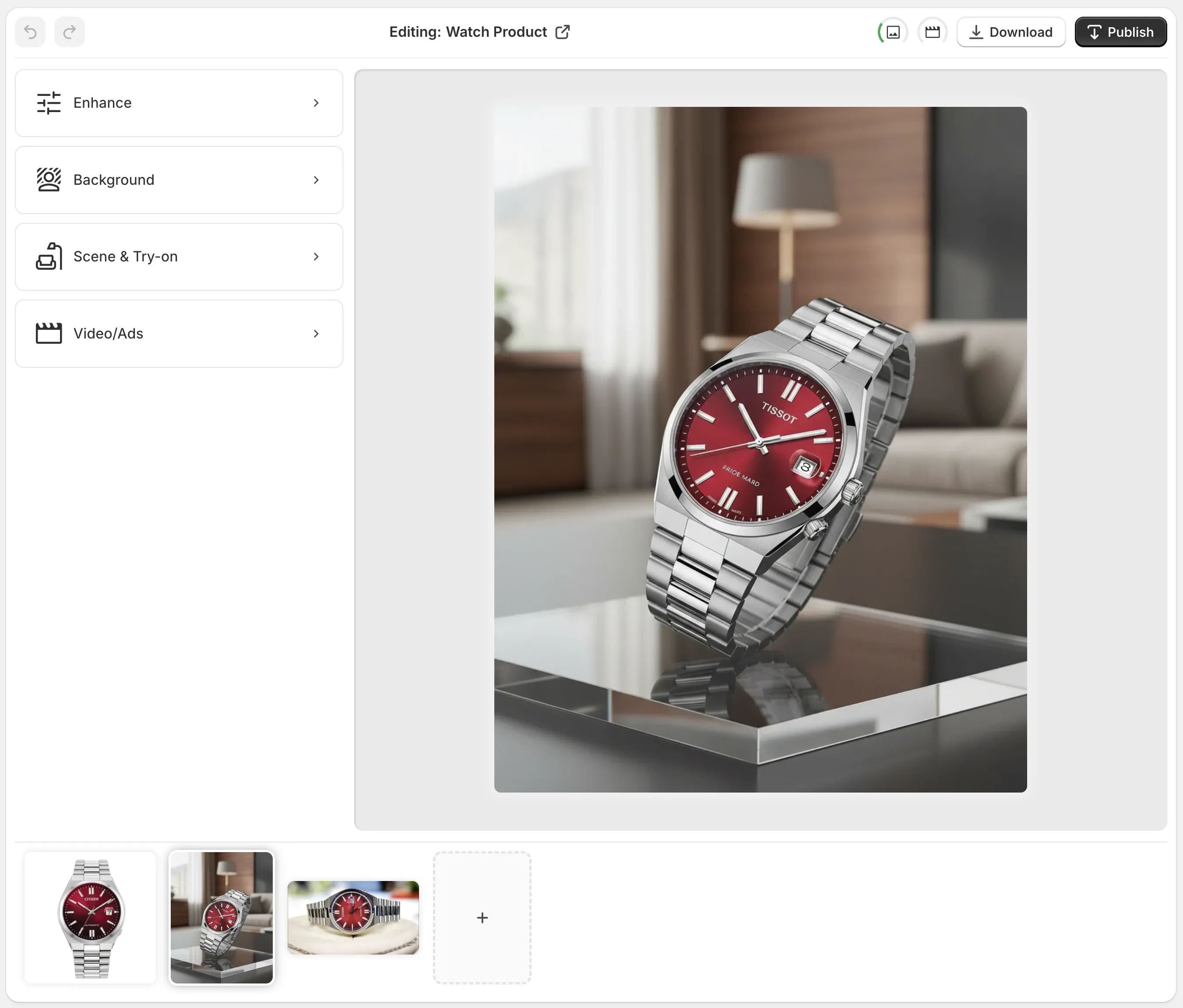
When I’m working through a SKU, I think in this order:
- Can the product be read clearly as-is?
- Do I need a cleaner cutout?
- Do I need context, like a room, a model, or a surface?
- Do I need motion, or is a still image enough?
That decision tree keeps me from over-processing everything. Some products need a detailed hero image and nothing else. Others need a full visual set because the buyer has to imagine fit, scale, or use case before they buy.
Which features I reach for
For apparel, jewelry, and accessories, I usually start with try-on. It gives me a realistic way to see the product in context without scheduling a shoot. For objects that need environment, I use placement to put them into a studio, boutique, kitchen, or outdoor scene.
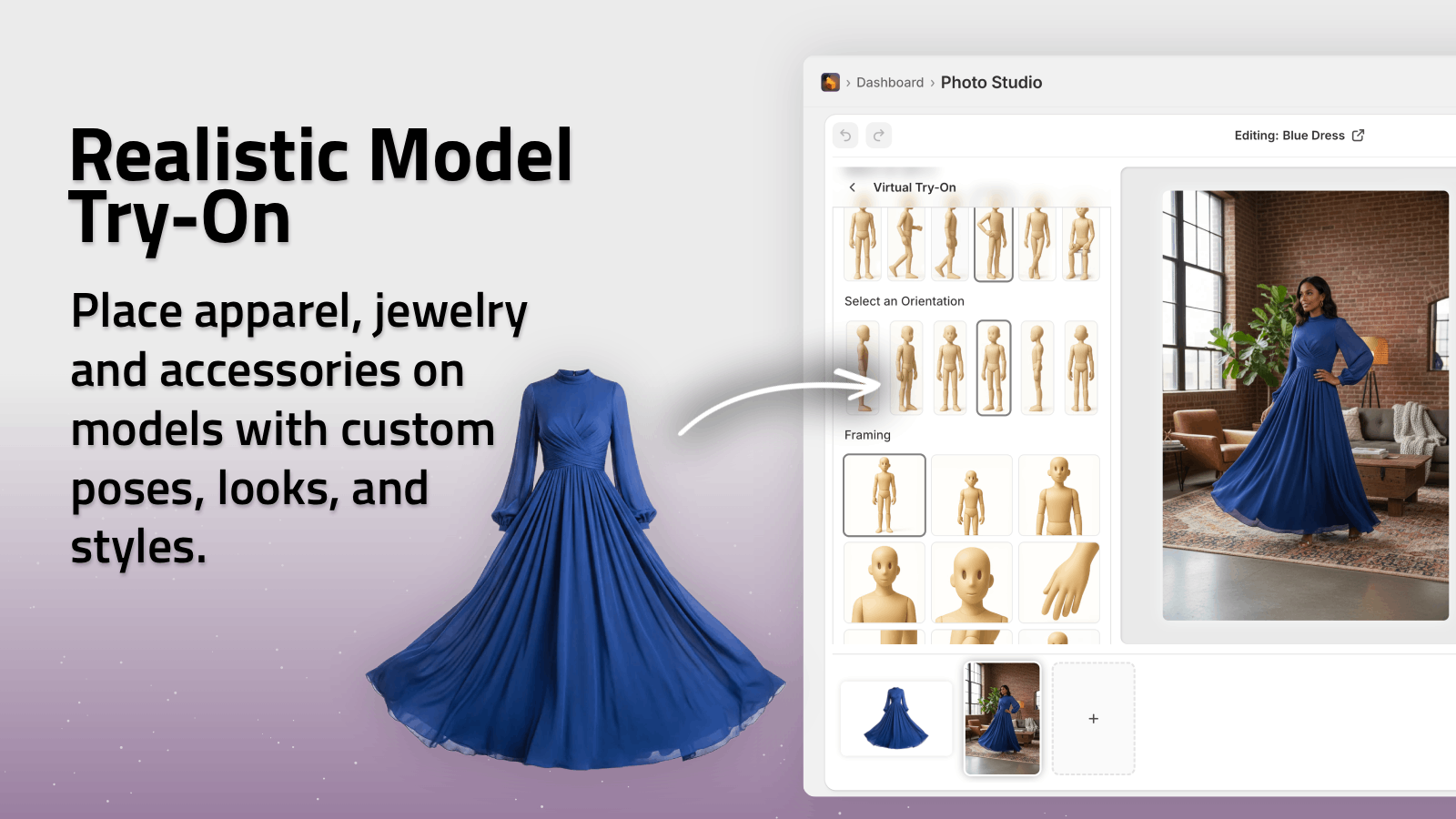
For product pages that need more than a still image, I like the UGC and b-roll options. They are useful when the listing needs movement, a more social feel, or a second asset set for ads and email. I’m not trying to replace every photo shoot with video. I’m trying to make the still images and the motion assets look like they came from the same brand system.
If you want the logic behind splitting static images and motion assets, How to Create Five Shopify UGC Video Ads From One Brief is the adjacent version of the same problem.
The other tools are more basic, but they matter:
- background removal for plain shots that need a cleaner start
- upscaling for files that are too soft to use at full size
- auto-enhance when the lighting is close but not quite there
I use those before I generate anything fancy. That’s the part people skip when they want a quick win, and it’s the part that usually determines whether the output feels usable or artificial.
What the finished set looks like
Once the base photo is clean, the output I want is a small asset system, not just a prettier image. For one SKU, that usually means:
- one clean product page image
- one lifestyle scene
- one ad-ready crop
- one email hero or social crop
- optionally, one short motion clip
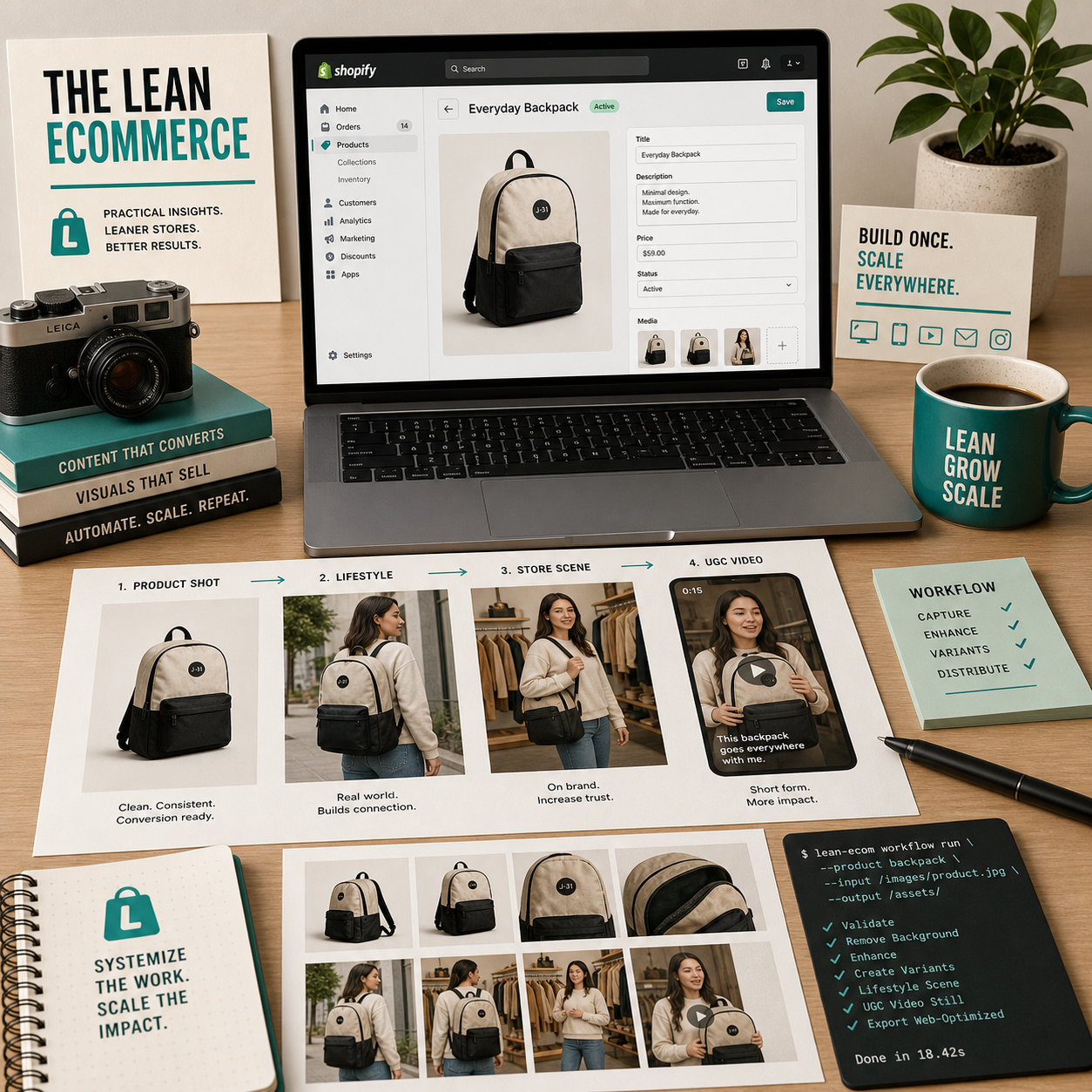
That’s where the workflow starts paying off. Instead of designing each touchpoint separately, I can keep the product language consistent across the store, ads, and email. It also makes it easier to keep the catalog coherent when I’m updating multiple SKUs at once.
If you want a narrower version of this idea, How to Build a Shopify Visual Kit From One Product Photo is the closest match. If you want the more general image-side version, How to Turn Plain Product Photos Into High-Converting Shopify Visuals goes deeper on the same kind of output.
Where I would use this, and where I would not
I would use this when:
- the product photo is clear but lacks context
- the SKU needs a better hero image fast
- I need multiple formats from one source
- I want to test different ad angles without rebuilding assets
I would not use it when:
- the source photo is so bad that the product itself is hard to read
- accuracy matters more than styling
- the scene needs a very specific real-world detail that AI is likely to distort
That trade-off is why I still start with the cleanest possible source image. The app is good at expanding one photo into a set of usable assets, but it is not a substitute for a product that was impossible to photograph well in the first place.
If you want the broader workflow context, How I Build a Shopify Product Photo Pipeline That Feeds Every Channel is the article I’d read next. If you want the exact “start from scratch without another shoot” approach, How to Build a Shopify Product Photo Workflow Without a New Shoot is the tighter playbook.
The short version
The practical win here is not “AI made a prettier image.” It is that one product photo can now feed the page, the ad, the email, and the social crop without me redrawing the same idea four times.
If you want to test that on one product, start with the SKU that already converts, clean the source photo, generate one lifestyle version and one motion-ready variant, then swap them into your next campaign. That’s the smallest version of the system that is actually worth keeping.
You can install Supra AI Photo Studio from the Shopify App Store and use the landing page as the starting point.