
September 23, 2026
I Built a Shopify Swatch Naming System That Survives New Color Drops
A practical system for naming Shopify colors, choosing variant versus linked-product groups, and testing swatches across product and collection pages.
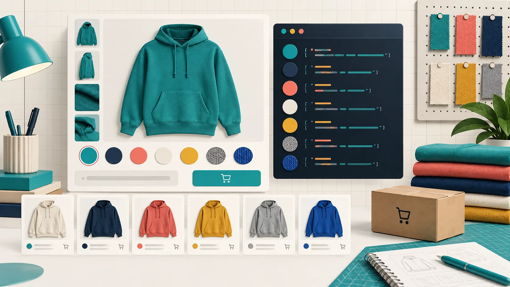
I got tired of a particular Shopify cleanup job: a new color drop would arrive with “Ocean,” “Ocean Blue,” and “Deep Ocean” scattered across products. Each name was defensible on its own. Together, they made the catalog hard to scan, hard to group, and impossible to maintain confidently. The swatches were not the real issue; our names were.
That changed when I started treating color names as catalog tokens rather than marketing copy. The result is a small system that makes it easier to decide which colors belong as variants, which deserve their own product pages, and how to keep product and collection-page swatches coherent as the range grows. I use Supra Swatch Colors for the display layer because it supports both variant colors and linked products, including swatches on collection pages without theme-code surgery. The taxonomy still comes first.
The rule: shopper language and catalog language are different
Product copy can call a jacket “night tide.” Your catalog needs a durable value such as NAVY-NIGHT-TIDE. I keep both: a customer-facing label and a stable internal token. The token is the thing I use in a working sheet, vendor imports, image filenames, and a short product-family brief.
My format is deliberately boring:
BASE-FAMILY-FINISH
NAVY-NIGHT-TIDE-MATTE
RED-CHILI-GLOSS
GREEN-PINE-WASHED
Not every shop needs the finish segment. The useful part is that a new shade has one canonical place to land. Avoid encoding seasons, SKU counts, or subjective adjectives that will stop making sense next year. “Blue 2” is not a system; neither is a dozen near-identical names dreamed up independently by merchandising and production.
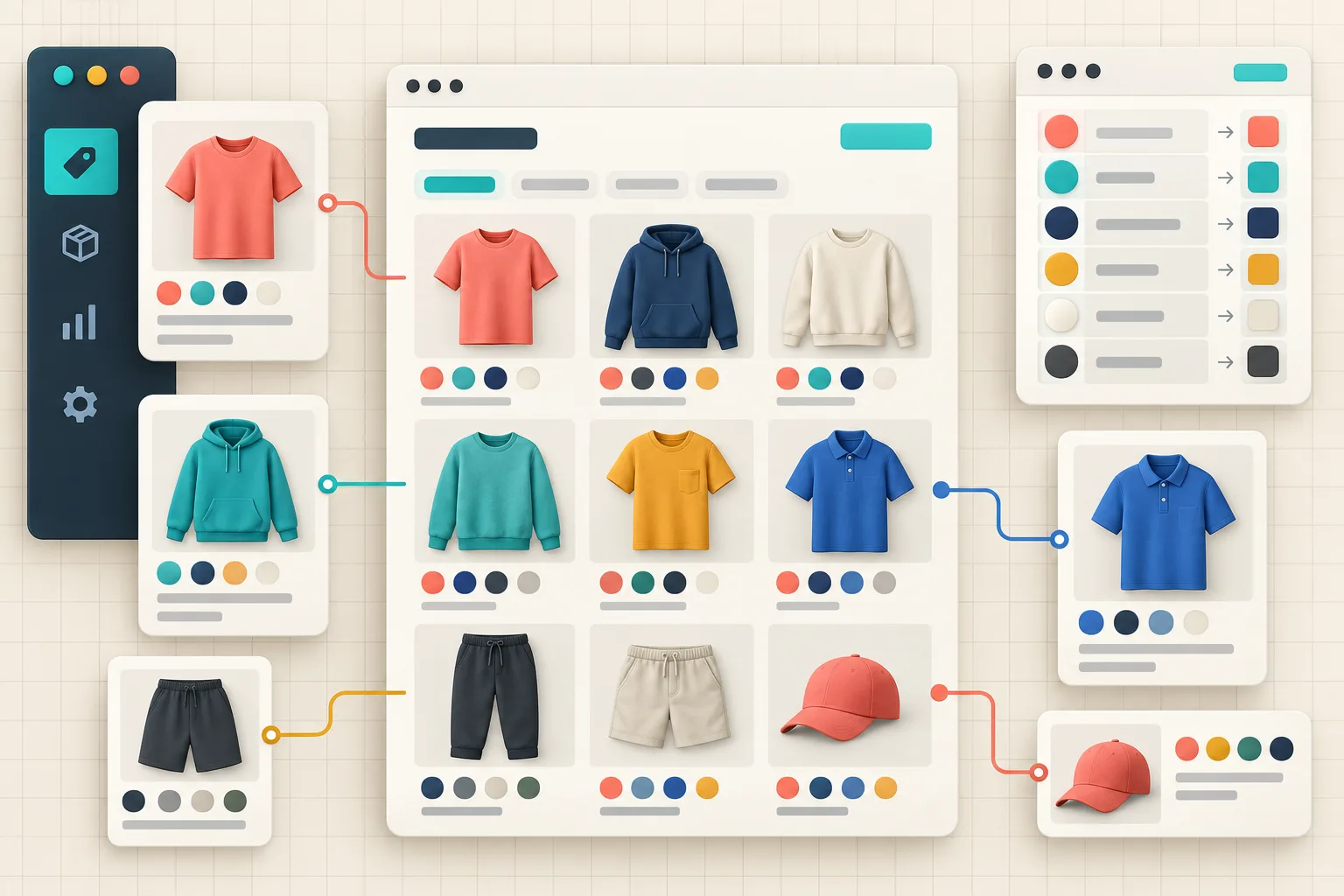
Build a tiny swatch registry before you configure anything
I make a one-row-per-color registry with: canonical token, customer label, source image, product family, whether it is an existing variant or separate product, and a launch status. That is enough to catch two common problems early: the same label pointing to two different visuals, and two labels pointing to the same visual.
This is also where I decide whether a swatch changes a selectable option or moves a shopper to a different product page. If a color shares the same price, fulfillment shape, and product logic, it is usually a variant. If it has its own photography, materials, inventory story, or merchandising copy, I treat it as a linked product. I wrote more about the operational choice in my variants-versus-linked-products decision framework; the important thing here is to make that decision once per product family, not once per new shade.
Let the product model choose the swatch behavior
A swatch should be honest about what happens after the click. Variant swatches should select the option on the current product. Linked-product swatches should take a shopper to the sibling product. Mixing those behaviors within one visually identical row is where stores get confusing.
Supra Swatch Colors is useful here because it supports both patterns, along with color and image swatches. Start with one pilot family, map its names to the registry, then set the visual treatment. I prefer product images only when the pattern or finish matters; a clean color swatch is faster to scan when the distinction is genuinely color.

The temptation is to add every conceivable option. I do the opposite: remove a swatch when it is unavailable, visually indistinguishable at the chosen size, or routes to a product that no longer belongs in the same family. That keeps the interface honest and makes the collection grid less noisy. If you need a broader setup refresher, this guide on product and collection-page swatches covers the baseline configuration.
Test the naming system where customers actually browse
The product page is only one surface. A color model that looks tidy there can fall apart in collection cards, quick views, translated storefronts, and narrow mobile layouts. Supra Swatch Colors supports multilingual shops and product and collection pages, but it cannot decide which names, images, and groups are semantically correct for you.
My pre-launch pass is short:
- Pick one product family with at least three colors and one seasonal rename.
- Confirm every customer-facing label maps to one registry token.
- Click every swatch on the product page and verify the expected variant selection or sibling-product destination.
- Check the same family in its main collection on desktop and mobile.
- Add the customer-facing labels to your translation workflow before the color drop is live.
- Re-check the first product added after launch; that is where drift usually returns.
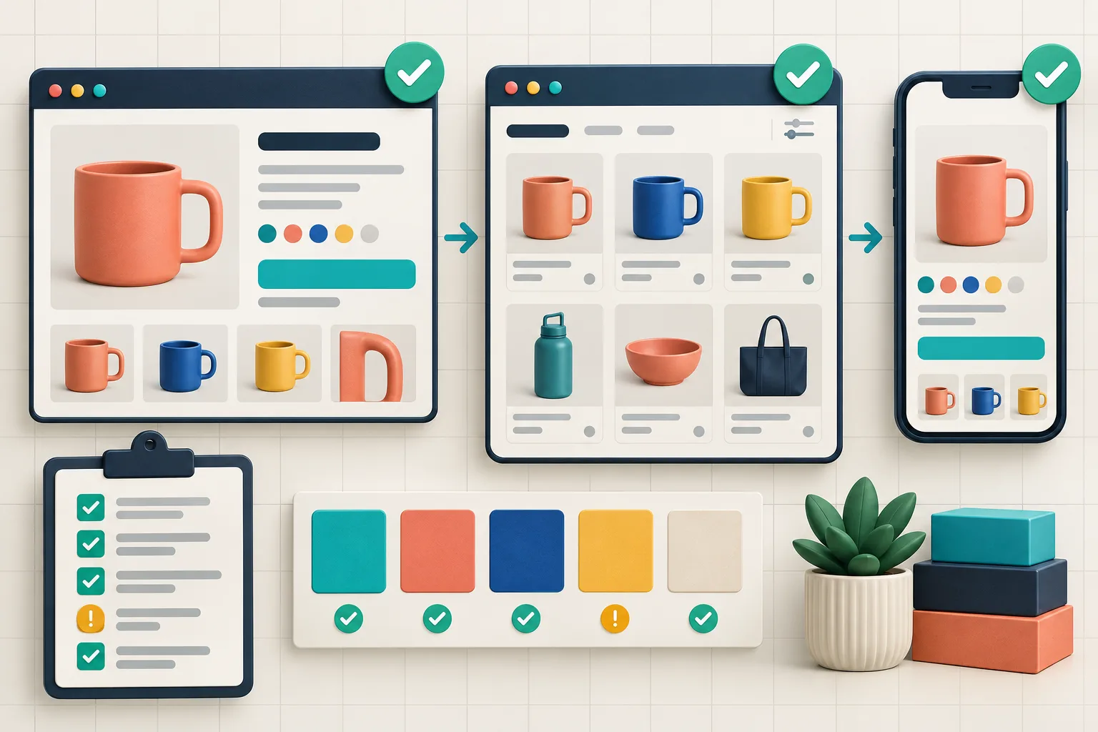
I keep this lighter than a full theme QA plan, but I do not skip it. My collection swatch QA checklist has the longer version, and the color-first collection browse workflow is useful when color is a primary path into the catalog.
Make it repeatable for the next drop
The win is not prettier circles; it is avoiding another catalog archaeology project six months from now. Put the registry review into the same launch checklist as images, inventory, and product copy. Let merchandising propose customer labels, let whoever owns the catalog approve the canonical token, then configure the swatches after that decision is made.
If your current color options are already inconsistent, do not try to repair the whole store at once. Choose one high-traffic product family, create its registry, configure it with Supra Swatch Colors, and test the exact route a customer takes from a collection card to a product. Once that family stays clean through a new color drop, you have a pattern worth reusing.