
September 9, 2026
My Shopify Collection Swatch QA Checklist Before a Product Launch
The practical Shopify collection-page checks I use to make sure color swatches help shoppers browse instead of creating variant confusion.

I Check Collection Swatches Before I Touch the Product Page
Color swatches can make a collection feel immediately easier to browse. They can also make a launch feel broken when the teal option lands on the wrong product, the selected card has no visible state, or the collection sends a shopper somewhere unexpected. I have learned to test the collection grid first because it is where shoppers make their first fast decision.
Supra Swatch Colors gives me two useful models to work with: a swatch can select a built-in variant, or it can link separate product pages. It also supports collection-page swatches without asking me to modify the theme. That flexibility is good, but it makes the data decision more important.
Decide What a Swatch Represents
My first QA question is not visual. It is semantic: does this circle change one variant, or does it move to a different product?
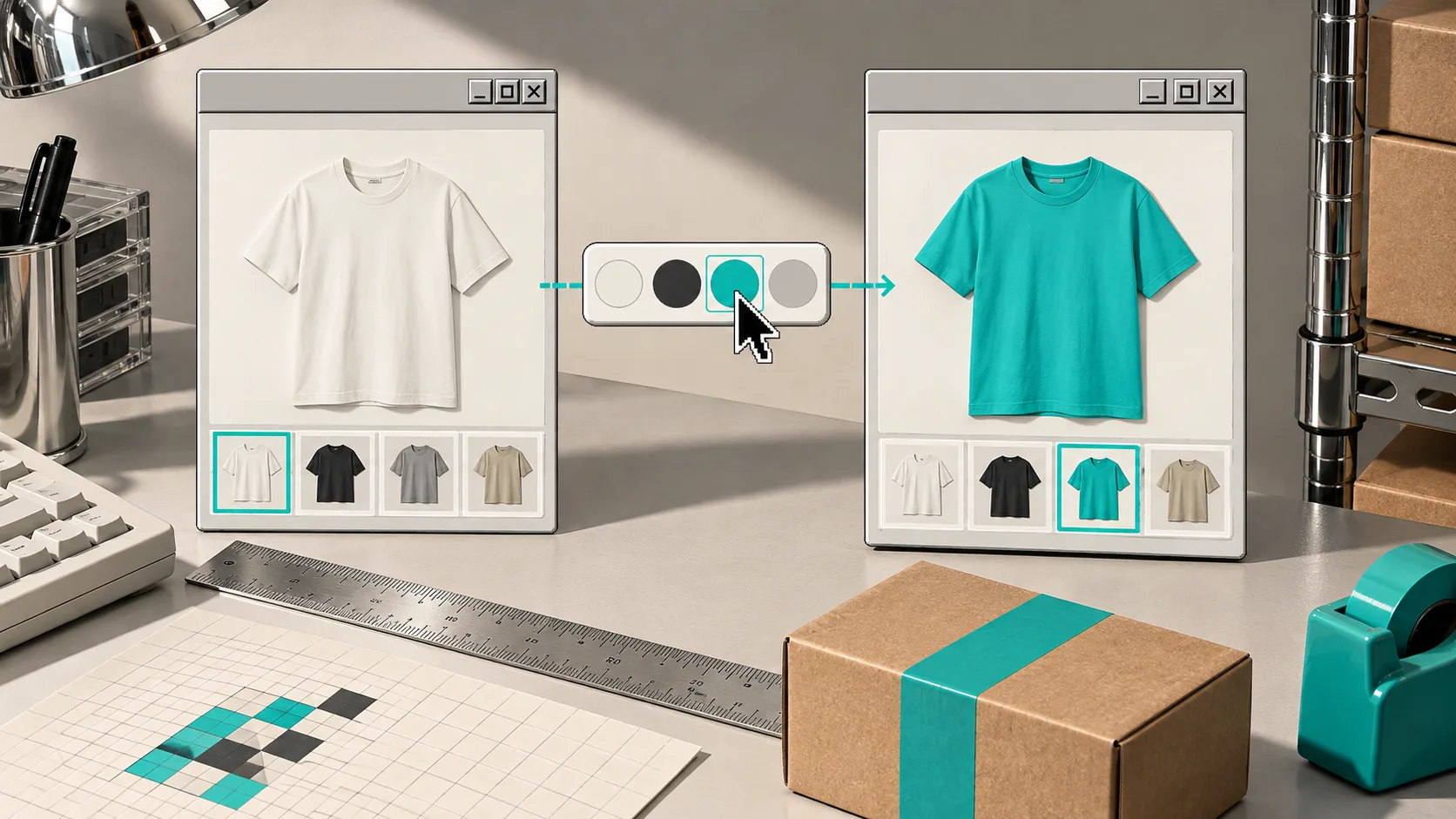
Use a variant swatch when the shopper is still choosing the same product: the same shirt in black, teal, and sand; the same mug with a different finish; the same item with a color-specific SKU. Use linked products when the color family is really a separate listing with its own imagery, copy, inventory logic, or merchandising position.
I make that call before styling anything. If I blur the two models together, I eventually create bad URLs, mismatched gallery images, or stock information that belongs to another product. This earlier build note on turning collection pages into a color-first browse path is still a useful reminder: color should reduce browsing work, not introduce a second guessing game.
Test the Collection Grid Like a Customer
I open the actual collection on a phone-sized viewport and run the same short pass every time:
- Can I tell which color is selected without reading a label?
- Does each swatch match the card image and product title beside it?
- Does a linked-product swatch land on the correct product page?
- Does a variant swatch keep the shopper on the correct product record?
- Do unavailable colors look unavailable without looking broken?
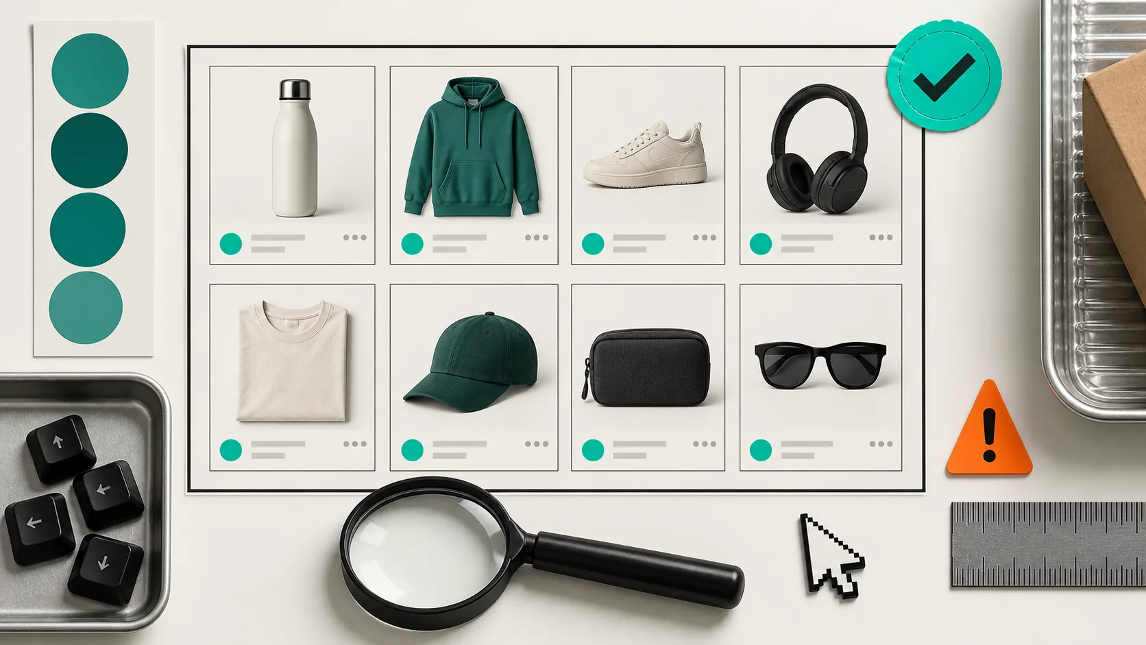
The mobile check matters more than a neat desktop screenshot. On a narrow grid, a swatch row can wrap awkwardly, a tooltip can cover the card, and a subtle selected state can disappear. Supra Swatch Colors has customizable swatch styles, sizes, labels, and tooltips, so I use those controls to make the state obvious rather than treating them as decoration.
For the exact kind of collection-page result I am looking for, the product’s collection swatch example is a helpful reference. The point is not to copy it blindly. It is to keep the color decision legible at a glance.
Check the Product Route After Every Collection Click
The easy failure is a swatch that looks right on the card but routes badly. I click every representative color family after a merchandising change: one normal variant, one linked product group, one sold-out option, and one multilingual label if the store has localized content.
Then I verify three things: the chosen product image is correct, the variant state is correct, and the browser URL corresponds to the same choice. This is where a clean-looking swatch setup can expose an underlying catalog problem. If the image, title, and destination disagree, I fix the product group before I tweak the CSS.
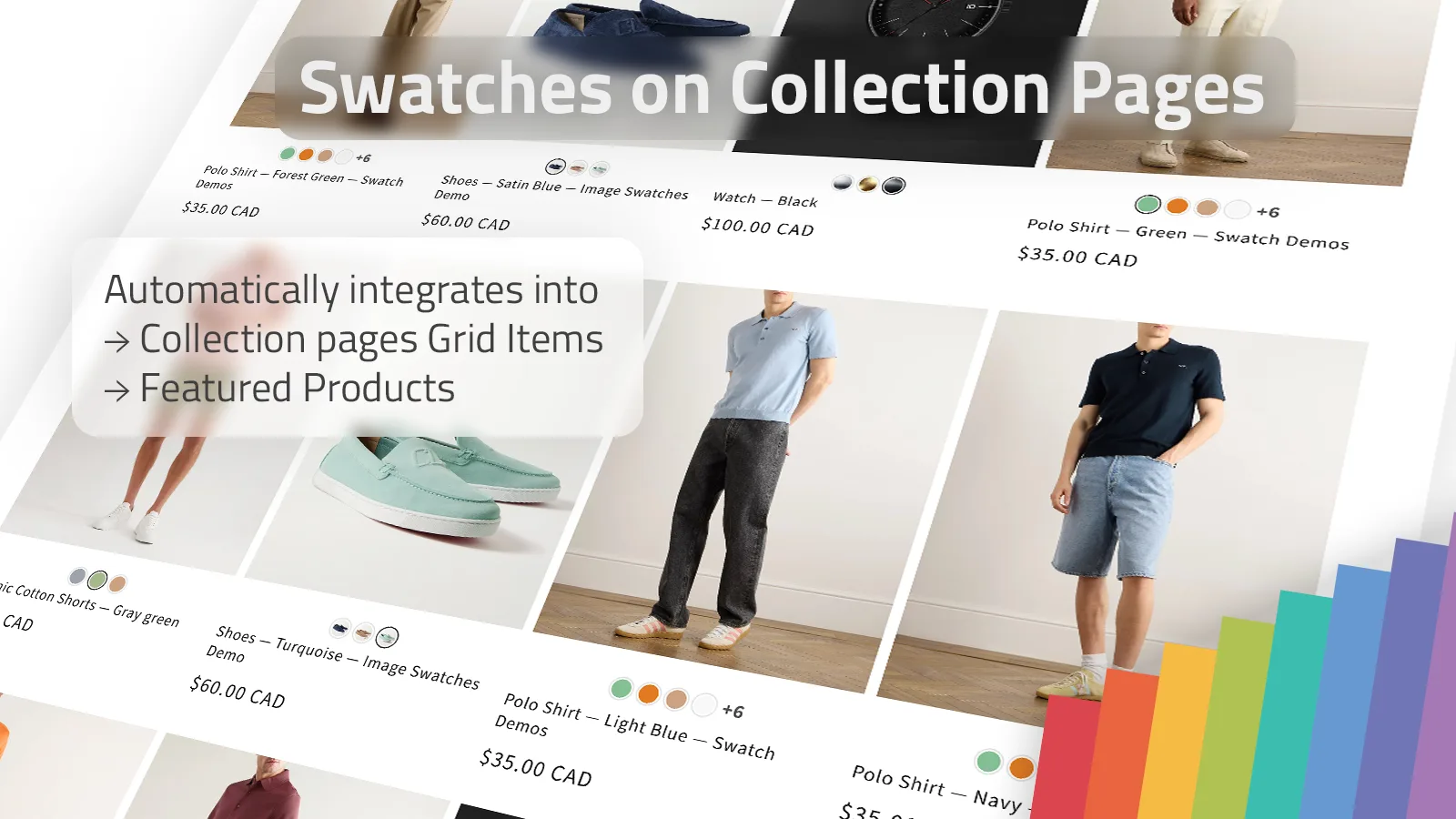
I also compare the setup against a practical collection-browsing guide and a variant-focused swatch walkthrough. They make the same underlying point from different angles: the swatch should clarify the catalog structure a store already has. It cannot rescue a product model that is unclear.
My Launch Gate
Before I publish the collection change, I sample at least one product from each color group and record the expected destination. I check desktop once, mobile once, and a translated storefront once when it applies. I also make sure the chosen swatch has enough contrast against the card background.
If all of that holds, I install or configure the app through Supra Swatch Colors on the Shopify App Store, then I leave the theme code alone. The app is most valuable when it lets the collection and product behavior stay in sync without converting a catalog maintenance task into a theme-maintenance task.
My final test is simple: can a shopper land on the collection, recognize the color they want, and reach the right product without pausing to decode what the swatch means? When the answer is yes, I know the collection is ready for the launch.