
August 27, 2026
I Turned Shopify Collection Pages Into a Color-First Browse Path
A practical way to use Shopify color swatches on collection pages so shoppers can browse related products without opening every product page.
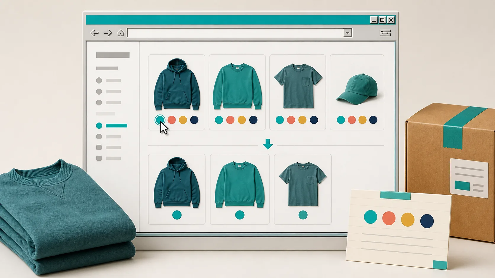
If your collection page makes shoppers open five product pages just to see whether a color is available, the catalog is doing too much work. I ran into this while looking at a small apparel range: the products were logically grouped, but each color lived in its own place and the collection grid gave no hint that the choices belonged together.
The fix was not another filter app or a theme-code project. I used Supra Swatch Colors to make the color choice visible where shoppers were already browsing. It can turn variant options into swatches, link separate product pages with swatches, and show them on collection pages without code. That last part changed the job of the collection page from a directory into a color-first browse path.
Start With the Browse Decision, Not the Swatch Style
Before touching the app settings, I wrote down the customer decision I wanted the grid to answer: Which version of this item fits the color story I came here for? That matters because there are two different catalog structures hiding behind a row of colored dots.
- Variants: one product page owns several colors, sizes, or finishes. Use variant swatches.
- Linked products: each color is a separate Shopify product, often because it has its own imagery, inventory, URL, or merchandising rules. Use product-group swatches.
Mixing those models is where collections get confusing. A linked-product group should feel like one family when a shopper browses, while variants should keep a single canonical product card. I keep the names and color labels consistent first, then use the swatch setup to express that structure. It is the same kind of small preflight that saved me from visual drift when I added a color preflight to campaign pages.
Make the Collection Grid Do Useful Work
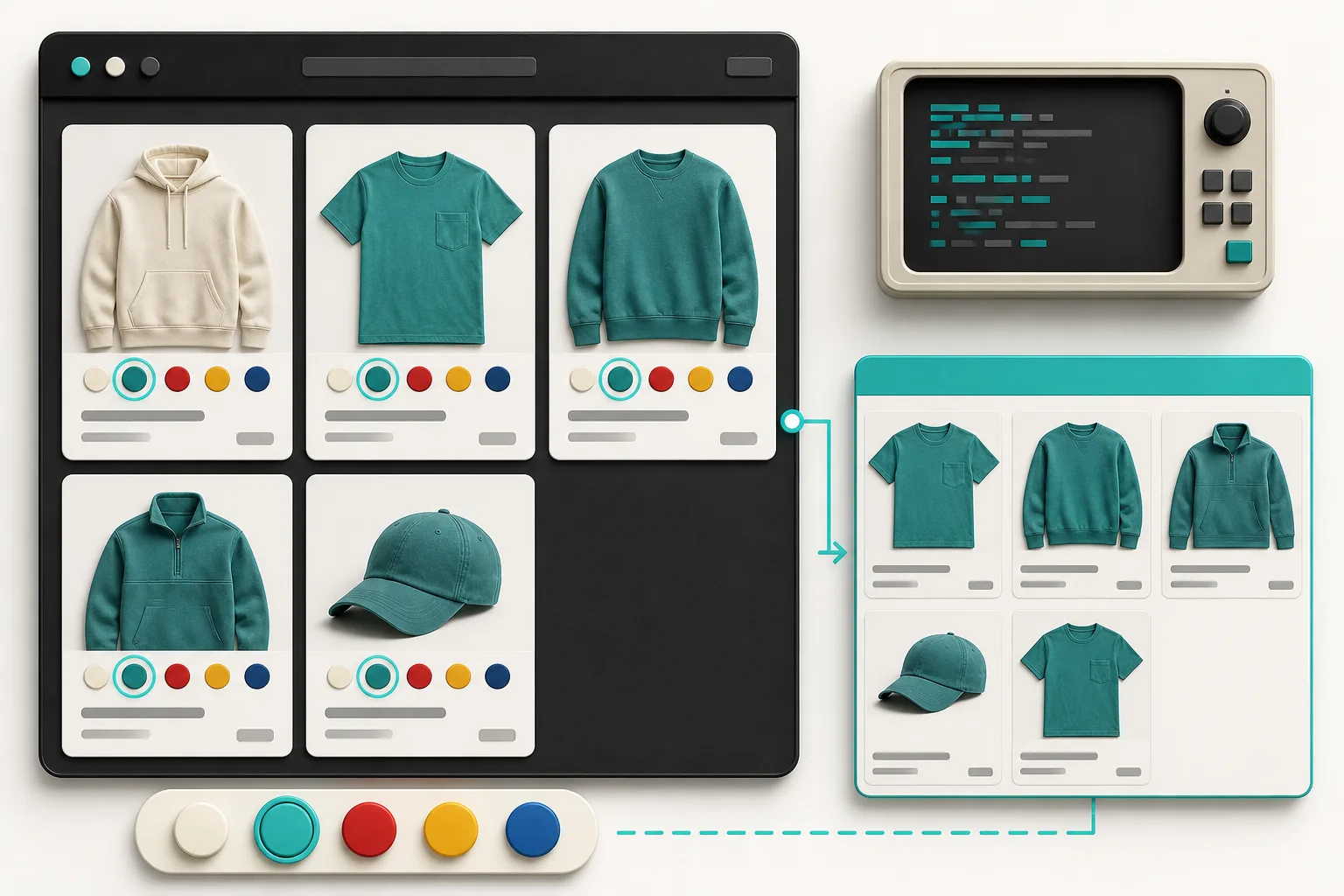
Once the product groups were clean, I configured the swatches to appear on both product and collection pages. That is the practical advantage of using a tool built for this job: Supra Swatch Colors supports linked products and variant colors, plus color or image swatches, across Shopify themes. The collection-page support is built in, so I did not need to splice a custom Liquid snippet into every card template.
I set one visual rule for the grid: swatches need to be recognizable at a glance but never outrank the product image. Start with a restrained size, one selected-state treatment, and labels/tooltips that match the rest of the theme. The app offers more than 20 styles and lets you tune size, shape, labels, fonts, and tooltips, so it is tempting to decorate every option. I found that a simple consistent circle and an obvious selected state shipped better.
If you are unsure about the storefront behavior, the collection-page swatch walkthrough is a useful reference before you commit your whole catalog to one pattern.
Map Products Before You Polish Them
My working order was deliberately boring: create the group, attach the related products or variants, validate the color values, then style the presentation. That keeps a pretty swatch system from masking a messy product model. For large catalogs, this is also the moment to decide which source of truth owns a color name. The product title, option value, swatch label, and image alt text should not all invent their own version of “Deep Teal.”
For separately listed colors, I group only the products a shopper would reasonably treat as substitutions. Similar-looking items that have different material, price, or fulfillment behavior are not automatically a swatch family. A good swatch is a fast route to a meaningful alternative, not a tiny catalog sitemap.

This discipline echoes the safer edit flow I use for bulk catalog work: in my bulk-edit checklist, I separate the changes that belong to a variant from the changes that change the customer-facing product relationship. Swatch groups deserve that same boundary.
Test the State Customers Actually See
A swatch that works in the theme editor can still fail in the collection grid, on mobile, or in a second language. I test four short paths before calling the rollout done: desktop collection page, mobile collection page, product page, and a representative translated storefront. Supra Swatch Colors supports multilingual shops and is designed for product and collection pages across Shopify themes, but the content around it is still yours to verify.
My checks are simple:
- The selected color is visibly distinct and does not rely only on color.
- The target product or variant matches the image and price the shopper expects.
- The same product family reads consistently on desktop and mobile.
- Tooltips, labels, and image swatches do not collide with quick-add or sale badges.

That last pass is why I treat catalog presentation as a release. The approach is similar to the size-chart release gate: test the shopper-facing rule in the real storefront, not just the data behind it.
Roll Out One Collection, Then Expand
I would not enable swatches everywhere on day one. Pick one high-intent collection where colors genuinely drive choice, such as tees, seating, or paintable accessories. Measure whether shoppers use the swatches, whether they reach a product page with a better-qualified choice, and whether support questions about “where is the blue one?” decline. Then apply the same grouping rule to the next family.
If you want the shortest path to a working implementation, install Supra Swatch Colors on the Shopify App Store, configure one representative linked-product group and one variant product, and validate those four storefront paths. A collection page should help a shopper choose a color before it makes them choose a tab. That is a small UX change, but it makes a catalog feel much easier to shop.