
August 7, 2026
I Added a Shopify 3D Model Before Redesigning My Product Page
A practical Shopify build note on using phone photos and a 3D model to make a product page clearer before a full redesign.
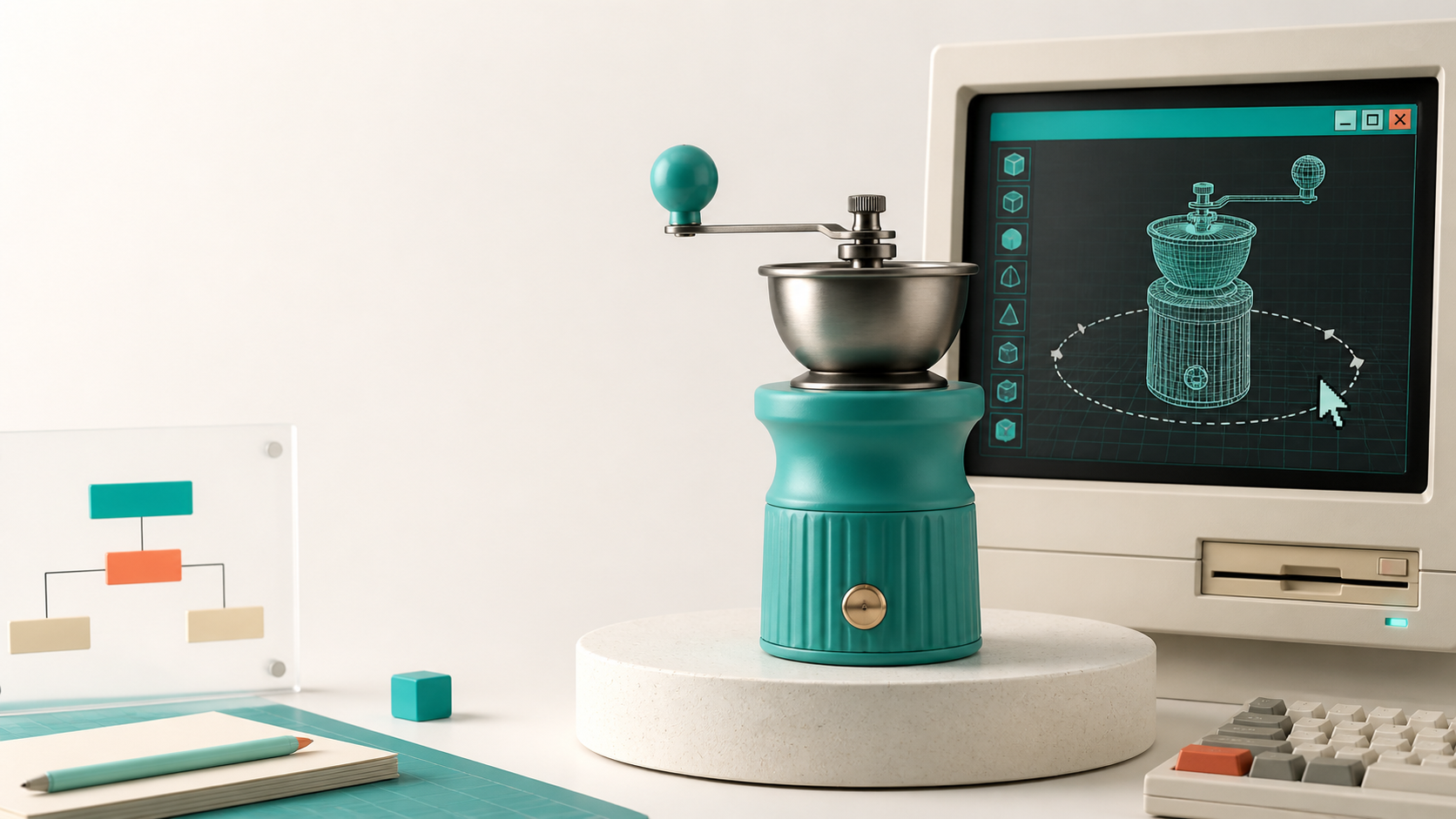
I have a bad habit with product pages: when a SKU is underperforming, I want to redesign everything. New gallery. New copy. New layout. Maybe a fresh theme section while I am there.
For physical products, that can hide the real problem. A shopper may not need a more decorated page; they may simply need a better way to understand the object. Is it deep or shallow? Is the handle awkward? Does the texture look different from the front? Static photos can answer some of that, but they make the customer do the assembly work.
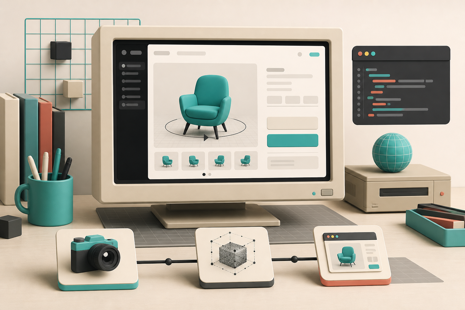
That is why I would add one interactive 3D model before I start a product-page redesign. With Supra 3D Capture, the input is a guided set of phone photos; the output is a web-ready GLB that can be published into Shopify product media or placed with an Online Store 2.0 app block. It is a much smaller experiment than rebuilding a page, and it tells me whether product understanding—not page chrome—is the thing that is missing.
Start with a SKU where shape causes the questions
I would not scan the easiest product just because it is easy. I start with a product that keeps needing extra images, support answers, or return-prevention copy. Think of items where depth, scale, closure, material, or angle changes the buying decision: a bag, a lamp, a tool, a shoe, a piece of furniture, or a product with a working mechanism.
This is close to the prioritization test in What Makes a Shopify Product Worth Scanning in 3D: favor items where a customer has something useful to inspect. If an object is a flat print or visually identical from every angle, a good photo gallery may already be doing its job.
For a first pass, I make a tiny scorecard:
- Do customers ask what the product looks like from another angle?
- Could the product’s depth, proportions, or texture change expectations?
- Is the SKU valuable enough that a clearer product page is worth a little production time?
- Can I photograph it in steady, even light without reflective, transparent, or fuzzy surfaces getting in the way?
That last question matters. I keep the pilot boring on purpose: one matte, reasonably detailed product; a quiet backdrop; even light. The 3D capture priority checklist is still a useful way to avoid burning the first experiment on an impossible SKU.
Capture the object as an orbit, not a photo shoot
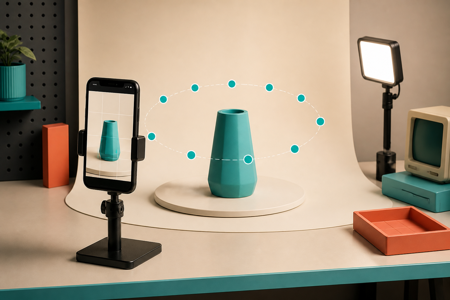
The capture itself is less like art direction and more like gathering useful geometry. I clear visual clutter, set the product in even light, and walk a consistent orbit around it with my phone. Supra’s guided capture is designed around that simple motion: take 10 or more overlapping photos from around the product, then let the photogrammetry pipeline reconstruct the model.
The important detail is overlap. Each photo should share enough of the product with the one before it that the processing step can understand what belongs where. I keep the product still, move myself instead of spinning it halfway through, and avoid dramatic shadows that slide across the surface.
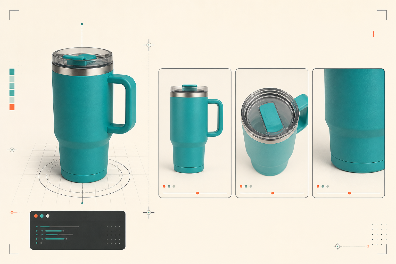
That approach is also why I do not treat a 3D scan as a replacement for product photography. I still want a strong lead image, details, and lifestyle context. The model has a different job: let the shopper choose an angle when the fixed gallery stops answering the next question.
Give the model a real place in Shopify
Once the GLB is processed, I publish it where customers will actually use it. Supra 3D Capture can attach the model to Shopify product media so compatible themes use Shopify’s native 3D viewer. If the gallery is not the right place for my layout, I can use the dedicated Online Store 2.0 theme app block instead.
That distinction is worth checking before I touch the theme. Native product media is ideal when the model belongs beside the normal gallery. An app block is better when I want a more deliberate section lower on the page: for example, after fit notes and before the add-to-cart area. I test both on a single template first, then make the model easy to find without burying the purchase controls.
The integration is not supposed to be a theme rewrite. It is a product-media change with a small placement decision. For a more technical way to frame that decision, the Shopify 3D capture queue guide is a good companion: it keeps the focus on where better product understanding can reduce expectation gaps.
Measure the experiment without inventing a miracle metric
I would not promise that one model guarantees a conversion lift. The more useful first question is whether the 3D media changes the quality of the product-page experience. Watch how shoppers interact with the gallery, which support questions arrive, and whether the SKU’s return reasons include surprises about shape, scale, or finish.
Then compare the page before and after over a sensible window. Keep the price, offer, traffic source, and major copy changes steady if you can. If you redesign the whole template at the same time, you will not know whether the new result came from the 3D model, the new headline, or the new button color.
For teams that need a more deliberate rollout, I like the mechanics in How to Build a Shopify 3D Capture Priority Scorecard. It gives you a way to choose the next SKU based on product-page value instead of whoever shouts loudest.
The low-risk next step
If your product page is starting to feel like a redesign project, pick one SKU that shoppers struggle to visualize. Capture a clean orbit with a phone, process it into a Shopify-ready model, and put it in the gallery or an app block. Supra 3D Capture’s free plan gives you a low-stakes way to test the workflow before you commit to a larger 3D catalog.
My rule is simple: make the product easier to understand before you make the page prettier. A useful interactive model can expose what the page actually needed—and keep you from rebuilding three sections to solve one missing angle.