
July 28, 2026
What Makes a Shopify Product Worth Scanning in 3D
A practical checklist for choosing the right Shopify SKUs, capturing them on a phone, and publishing native 3D media without overengineering the workflow.
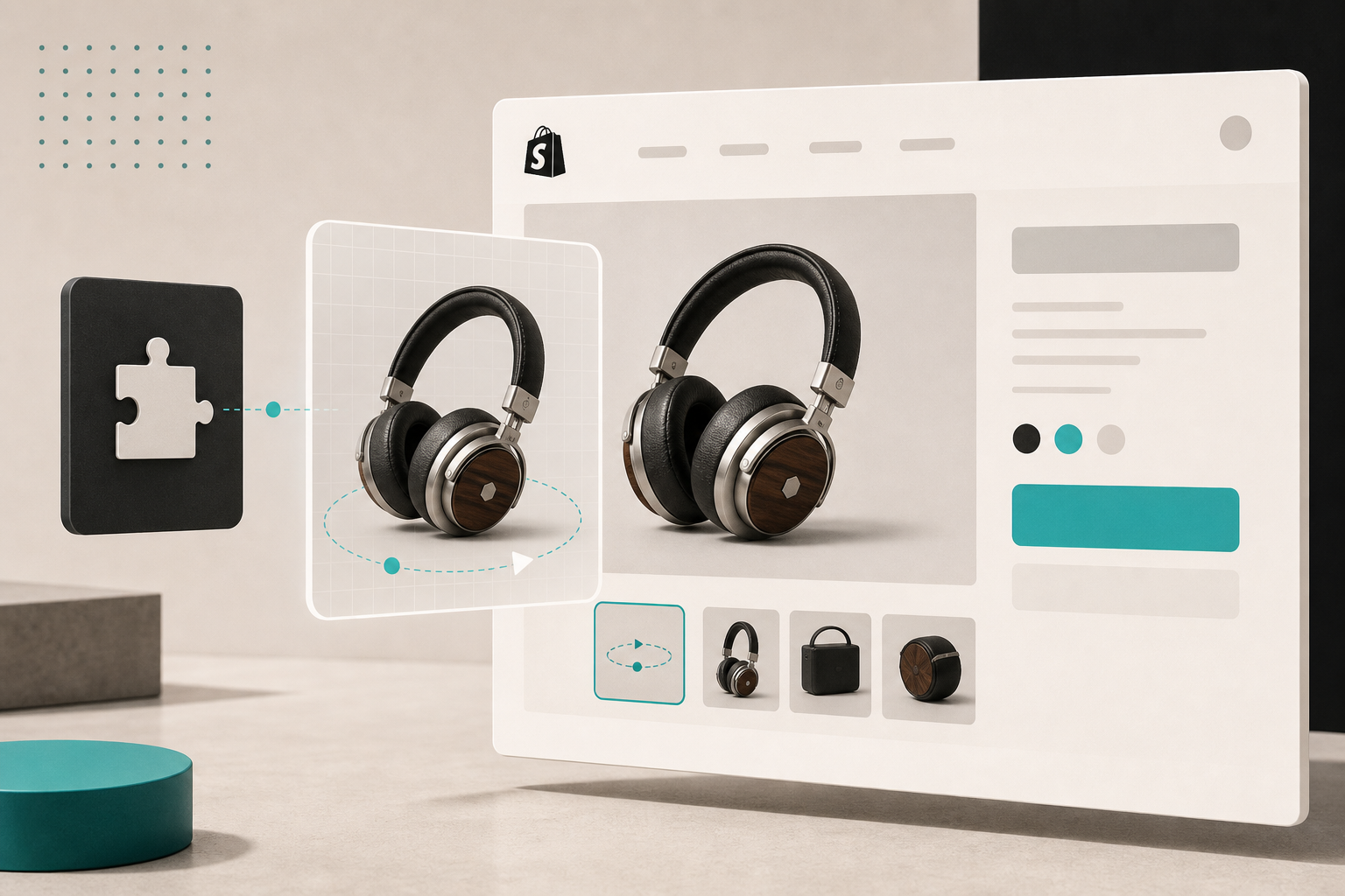
I used to think the answer was “anything that looks nice on a product page.” That turned out to be the wrong filter.
What I actually want is a product where shape, scale, or surface finish changes the buying decision. That is where a 3D model earns its keep. Supra 3D Capture turns a short set of guided phone photos into a web-ready GLB and publishes it into Shopify, so the question becomes less “can I do this?” and more “should I spend the capture time here, or on a better SKU?”
If you want to test the workflow without committing to a bigger rollout, the Shopify App Store listing is the simplest starting point. And if you want the broader context, the product blog lives at supra-3d-capture.sktch.io/blog.
Shopify’s own docs are useful here too. The platform supports product media like images, videos, and 3D models in product media docs, and the theme app extension docs explain how app blocks fit into a product page without editing theme code. That matters because the hard part is usually not “can Shopify show the model?” It is “which product deserves the extra work?”
The products I scan first
I start with SKUs where the flat gallery is hiding something important:
- Products where shape is the selling point, not just the texture.
- Items where scale is easy to misread from a still image.
- Products that trigger “not what I expected” returns because the silhouette matters.
- Objects with enough detail to reward rotation, but not so much complexity that the first scan becomes a science project.
- SKUs that are already photographed cleanly, lit consistently, and easy to stage again.
If a product does not clear those filters, I usually leave it alone for the first pass. A mediocre 3D model is just extra work. A good one gives shoppers a better sense of size, shape, and confidence before they buy.
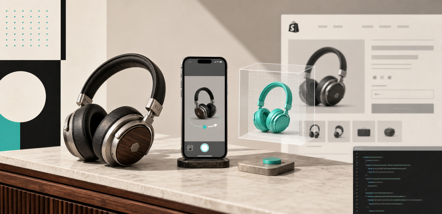
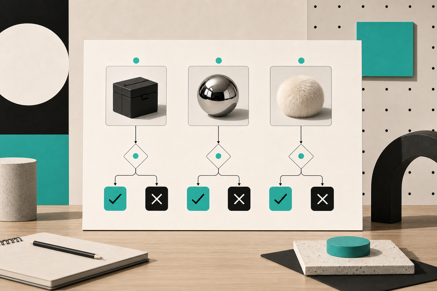
That is also why I do not start with the hardest material first. Reflective, transparent, furry, or otherwise awkward surfaces can work, but they demand more care. I would rather prove the workflow on a sane SKU than burn time trying to rescue a bad first attempt.
The capture session I actually use
The capture step is deliberately boring. That is the point.
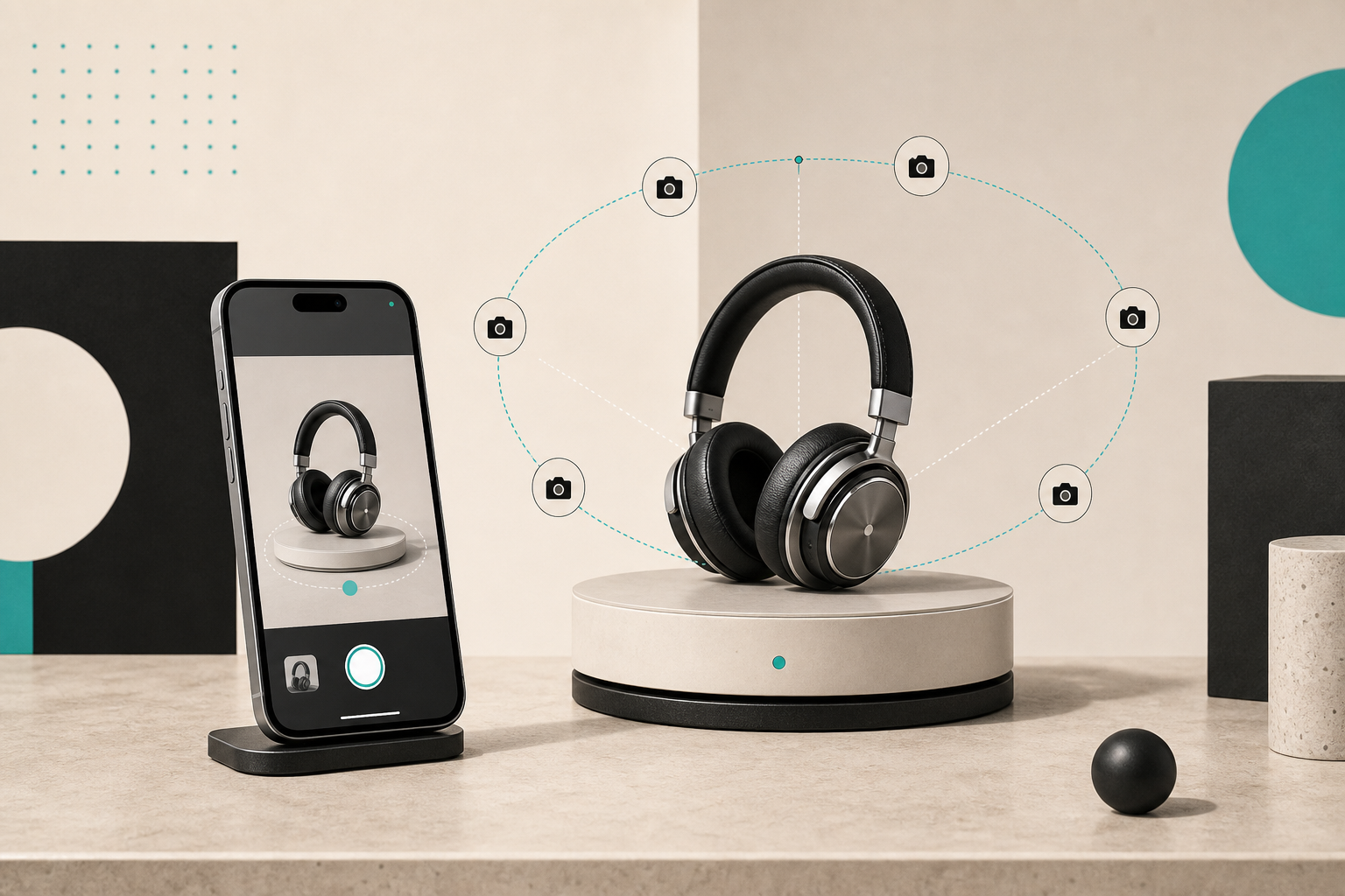
I open the guided phone workflow, orbit the product, and keep the distance and lighting consistent. The product file for Supra 3D Capture says the app guides you through 10+ photos, and that is about the right mental model: not a cinematic shoot, just a clean orbit with enough coverage to reconstruct the object well.
If I want a more formal preflight, I use the same checklist logic I wrote about in How to Build a Shopify 3D Capture Shot List That Actually Works. The main thing I am trying to avoid is variability: moving shadows, shiny backgrounds, or a camera path that drifts so much the reconstruction has to guess.
When the capture feels fussy, I slow down rather than improvising. The right move is usually to fix the set, not to brute-force the app. That is especially true if you are using the product as the first example in a broader queue. I wrote about that prioritization logic in How to Build a Shopify 3D Capture Queue Around Return Risk, and it still holds up: spend the effort where uncertainty is highest.
How I publish it into Shopify
Once I have a clean GLB, I attach it as product media. Shopify’s product media docs cover 3D models, and the theme app block guidance matters if I want the model placed intentionally inside the page layout rather than bolted on later.
That is the reason Supra 3D Capture leans on native Shopify 3D media and an Online Store 2.0 theme app block. It keeps the result close to the rest of the merchandising stack instead of turning the 3D model into a one-off exception.
In practice, that means I can publish the model where it belongs, then let shoppers rotate it in the native viewer when the theme supports it. I am not trying to force a flashy experience. I am trying to make the page easier to understand.
If I am still cleaning up the underlying imagery, I go back to How I Review a Shopify Product Photo Before I Generate Variants and How I Turn One Product Photo Into Try-On, Lifestyle, And Ad Assets. The best 3D results usually come from the same discipline: start with a clean source, then reuse it well.
When I skip 3D for now
I skip a product when the capture cost is obviously higher than the value of the page change. That usually happens when:
- The product is too reflective or transparent for a quick first pass.
- The product is so soft, fuzzy, or irregular that the shape reads better in a close photo set.
- The product already communicates size and detail well enough with flat images.
- The SKU is low volume and unlikely to justify the extra setup.
That is not a permanent no. It just means the SKU is not the first one I would use to validate the workflow.
The next product to try
If you want the simplest next step, pick one product that sells on shape and not just on color. Capture it with Supra 3D Capture, publish the GLB into Shopify, and compare the product page before and after.
If the model makes the page easier to understand, you picked the right SKU. If it does not, you probably learned something more useful than a generic “3D is cool” result: you learned where your catalog actually benefits from interaction.
If you want more examples and capture notes, keep the blog close by. The free plan is enough to test the workflow on a single model and decide whether 3D deserves a wider rollout.