June 26, 2026
My 3D Capture Priority Checklist for Shopify Products
A practical checklist for deciding which Shopify products are worth 3D capture first, with capture workflow, product-page placement, and testing advice.
I keep running into the same Shopify problem: some products really benefit from 3D, and some do not. If a shopper can already understand the shape, scale, and finish from flat photos, I usually leave it alone. If the product still needs the customer to guess from the side, back, or underside, 3D starts to make sense.
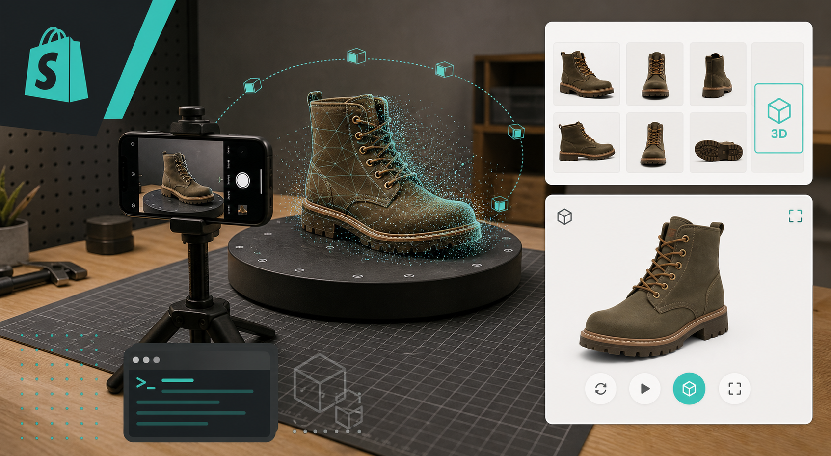
That is the filter I use for Supra 3D Capture, the app that turns guided phone photos into interactive 3D models you can publish into Shopify. The Shopify App Store listing gives the short version. The part I care about is simpler: it lets me test whether a product page gets clearer when the shopper can spin the object instead of scrolling past another static gallery.

The short version
If you want the fastest possible rule of thumb, I would start here:
- Pick products where shape matters more than texture alone.
- Prioritize SKUs that trigger return risk when the buyer misreads size or form.
- Start with products that are stable, solid, and easy to photograph from multiple angles.
- Defer the shiny, transparent, fuzzy, or highly reflective items until you have a baseline.
- Put the model where shoppers will actually use it, not buried below a wall of copy.
That sounds obvious, but it is easy to waste time scanning the wrong inventory. I wrote the decision tree version of this in How to Choose the First Shopify Products for 3D Capture, and the main point still holds: start where a 3D model solves a real buying problem.
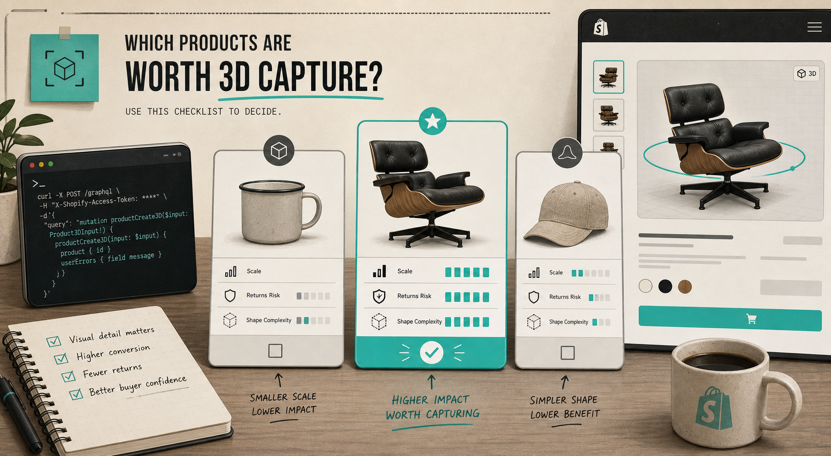
What I look for first
I use five checks before I decide a SKU deserves 3D.
1. Would flat photos still leave questions?
If a product has a strong silhouette, a complex profile, or a part that changes how the item feels from another angle, that is a good sign. Chairs, shoes, bags, decor, and small hard-goods often qualify because the shape itself carries a lot of the value.
If the product is basically a flat graphic, a simple box, or something the customer understands from one hero image, 3D is usually not the best place to start.
2. Would the wrong expectation be expensive?
I care about products where a bad mental model creates a return, a support ticket, or an annoyed customer. That is usually more important than the novelty of 3D. If the shape is easy to misunderstand, the interactive model earns its place fast.
3. Can I photograph it without fighting the material?
This is where the easy wins and the hard wins separate. I would rather start with a matte, opaque object than something mirrored or glassy. Shiny, transparent, or fuzzy surfaces can still work, but they are not my first test case.
4. Is the product valuable enough to justify the extra step?
I do not need every SKU to be 3D. I need the products where the extra clarity can change the buying decision. If a product is already low-risk and low-ambiguity, the work is probably not worth it yet.
5. Will the model fit the page experience?
If the theme can show native Shopify 3D media or an Online Store 2.0 app block, the model feels like part of the page rather than a separate asset you have to explain. That matters more than people expect.
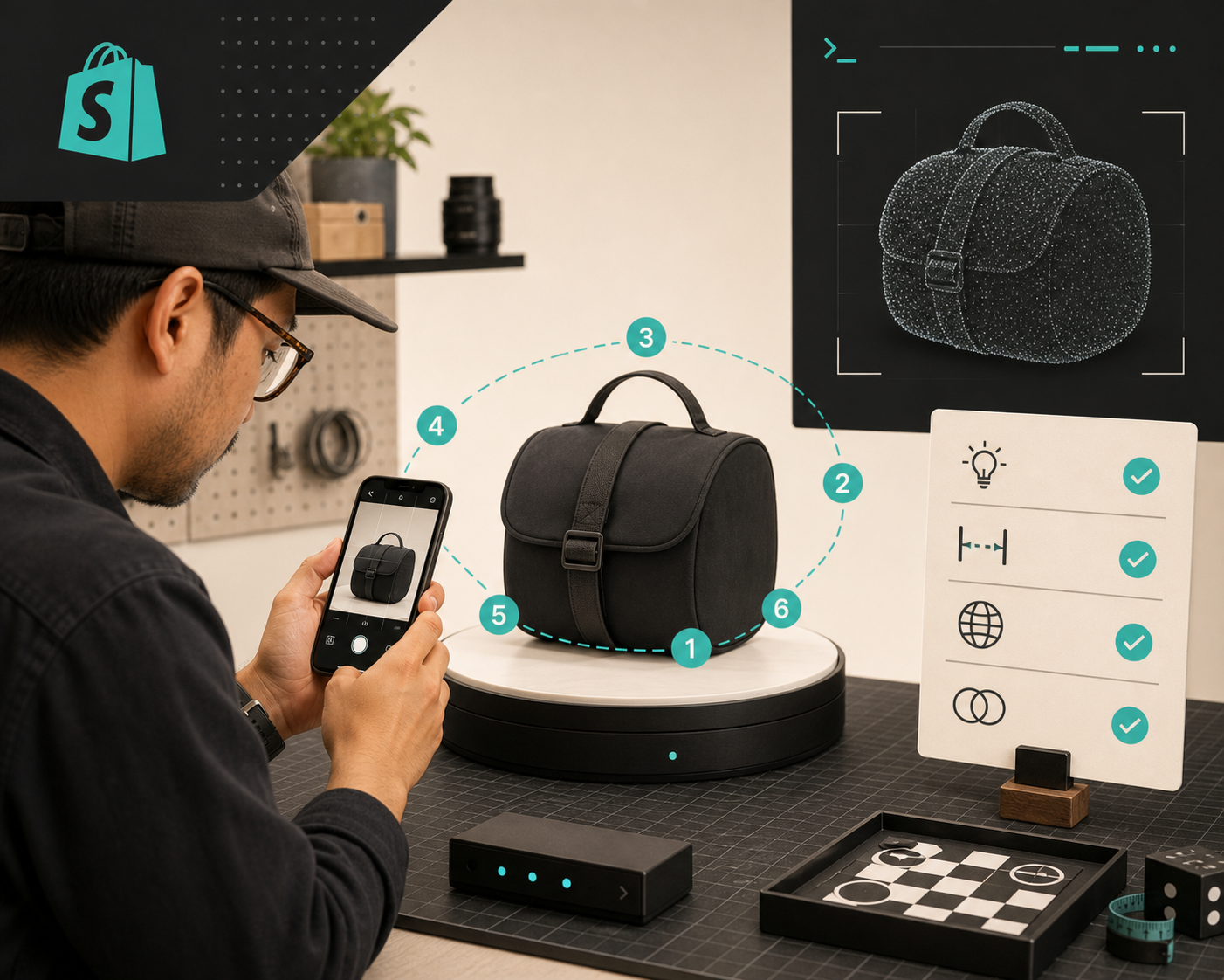
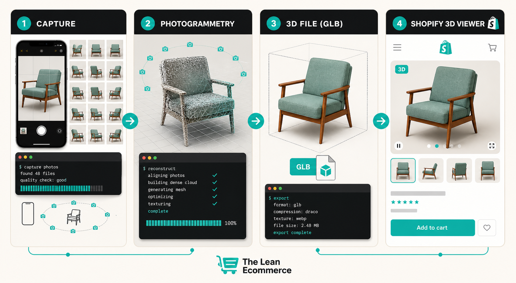
How I would run the first capture
The capture itself should stay small. I would not start by trying to model the whole catalog.
- Choose one product that is already hard to explain in photos.
- Set up stable lighting and a clean background.
- Walk the camera around the object with guided shots, keeping the distance and height consistent.
- Make sure you have enough angles to reconstruct the shape cleanly, not just the front face.
- Process the photos into a GLB and inspect the result before you publish it.
- Attach the model to the product and check how it looks in the theme.
If you want the shot-by-shot version of that sequence, I wrote it up in How to Build a Shopify 3D Capture Shot List and a tighter execution checklist in How to Build a Shopify 3D Capture Checklist That Works.
Where the model should live on the page
I do not like hiding 3D below the fold and calling it a feature. If the model is meant to increase confidence, it should sit where a buyer is already evaluating the product.
My preferred setup is:
- keep the static photo gallery
- add the 3D model as an obvious option in the media stack
- use a short caption that tells the shopper why the model matters
- test the page on mobile, because touch interaction is where the viewer either feels great or feels awkward
That is also why I think the product-page side matters as much as the capture side. Once the model exists, the page still needs to frame it correctly. I covered the placement logic in How I Build a Shopify Product Page Around a 3D Model.
The products I would not start with
If I were choosing the first SKU, I would avoid the awkward edge cases unless they are the whole reason for the test.
- mirror-like products
- transparent or glass-heavy items
- very fuzzy or hairy surfaces
- tiny objects that are hard to frame consistently
- products that already read clearly in a single flat photo
That does not mean those products cannot be modeled. It just means I would not make them my first proof point. I want the first test to tell me something useful, not to become a rescue mission.
The test that matters
The real question is not whether 3D looks cool. It is whether the page gets easier to understand.
If the model helps a shopper answer the question they already had in their head, it is doing its job. If it only adds a new toy to the page, I move on.
That is why I like starting with one product, one page, and one decision: does the interactive model reduce uncertainty enough to justify the extra workflow?
If the answer is yes, I would keep going. If it is no, I would leave that SKU as-is and pick a better candidate next time.
For a first run, I would use Supra 3D Capture on the product that is most expensive to misunderstand, then compare the result against the flat gallery. If the model makes the page easier to trust, you picked the right product.
Start there, and only then scale it to the rest of the catalog.