
August 3, 2026
How I Build a Shopify Photo Routing System for Product Pages and Ads
A first-person workflow for routing one Shopify product photo into cleanup, context, try-on, and motion assets.
How I Build a Shopify Photo Routing System for Product Pages and Ads
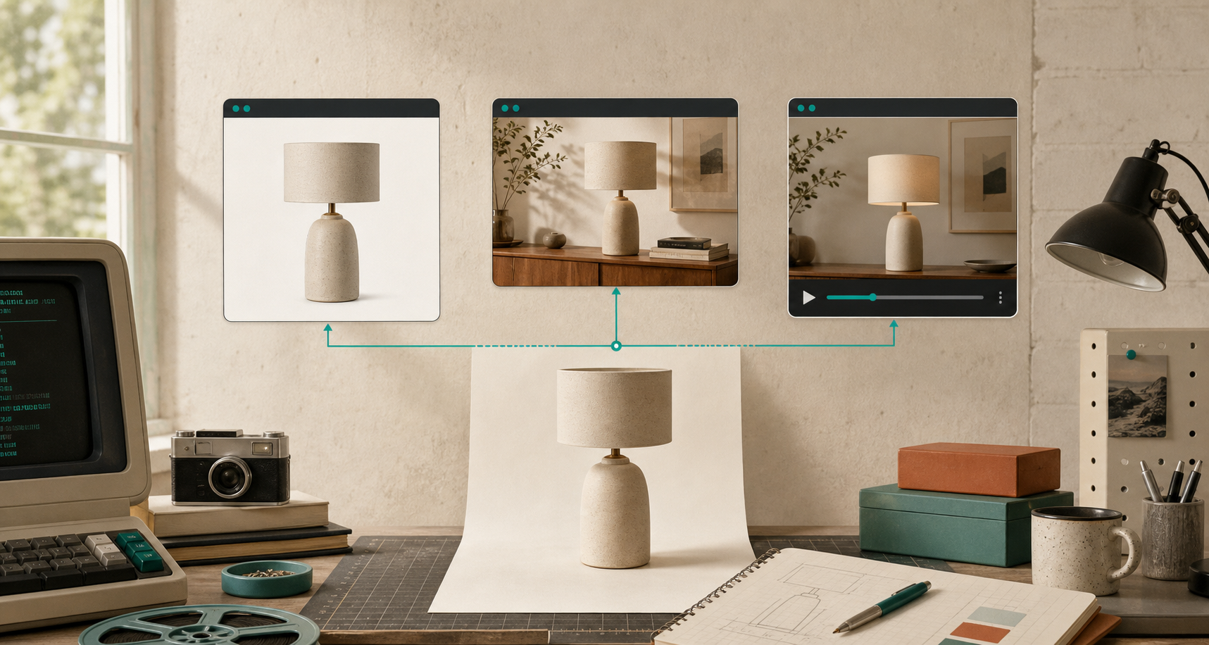
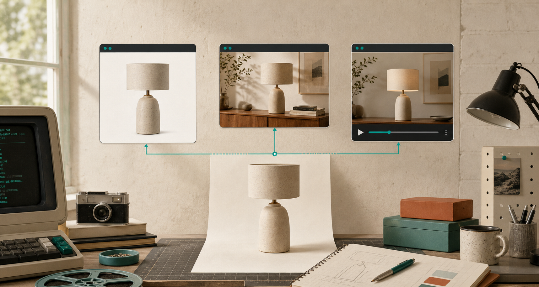
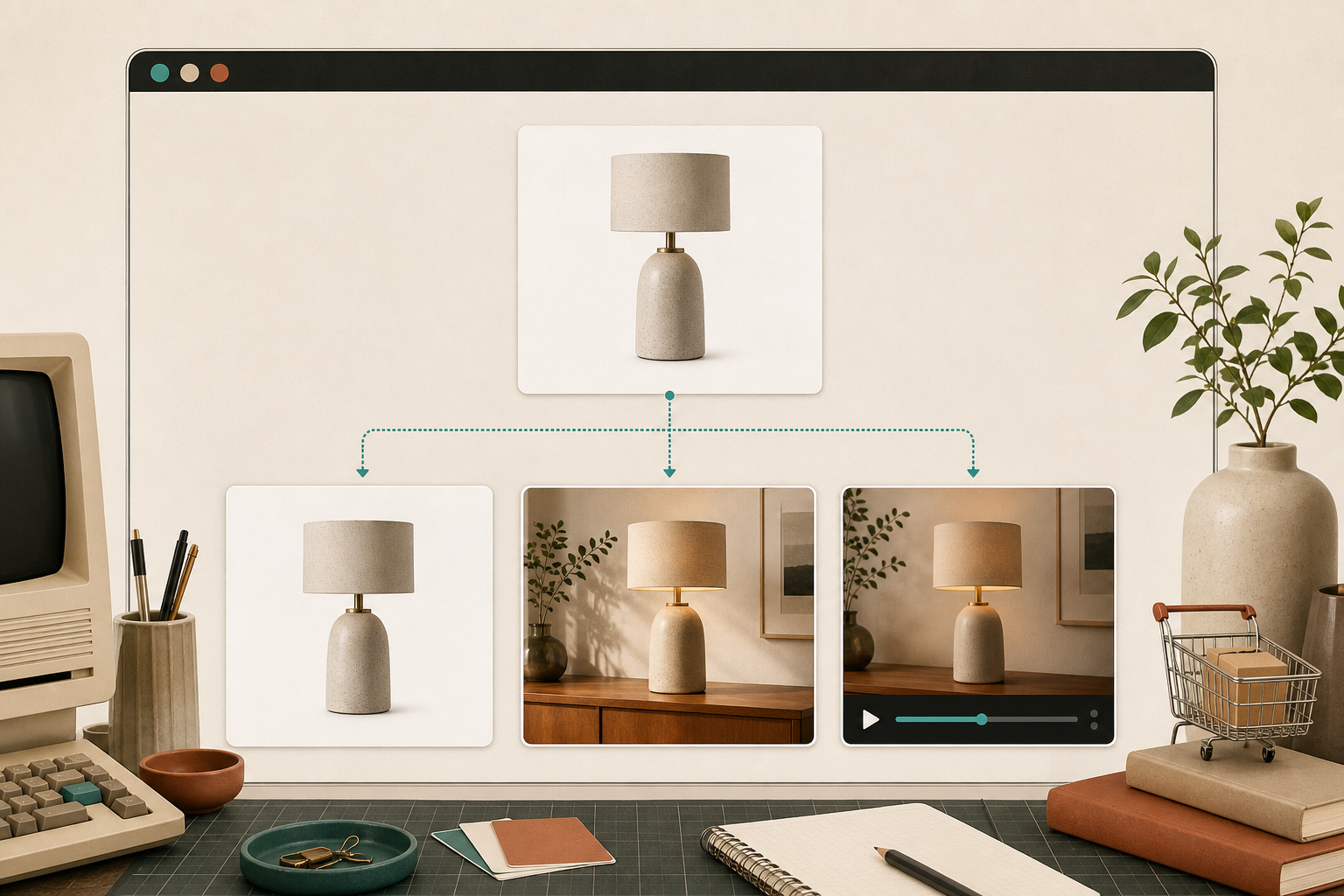
I stopped treating product photography as a single edit problem. Now I treat it like a routing problem: one decent source photo goes through the smallest useful branch, and each branch serves a different job. For catalog cleanup, I want a cleaner listing image. For product pages, I want context. For apparel, I want try-on. For ads, I want motion.
Supra AI Photo Studio is the tool I’ve been using for that workflow because it keeps the cleanup, placement, try-on, upscaling, enhancement, and video steps in one place. The landing page lays out the same idea clearly: turn product photos into more usable visuals without turning the process into a separate production job.
Start With The Source, Not The Mood Board
I do not start by asking what looks cool. I start by checking whether the source image is good enough to route.
If the file is soft, badly lit, or cropped too aggressively, the first step is usually cleanup:
- remove or replace the background;
- upscale if the image is holding detail back;
- denoise or deblur if the source is borderline;
- correct light and color before I ask for anything fancier.
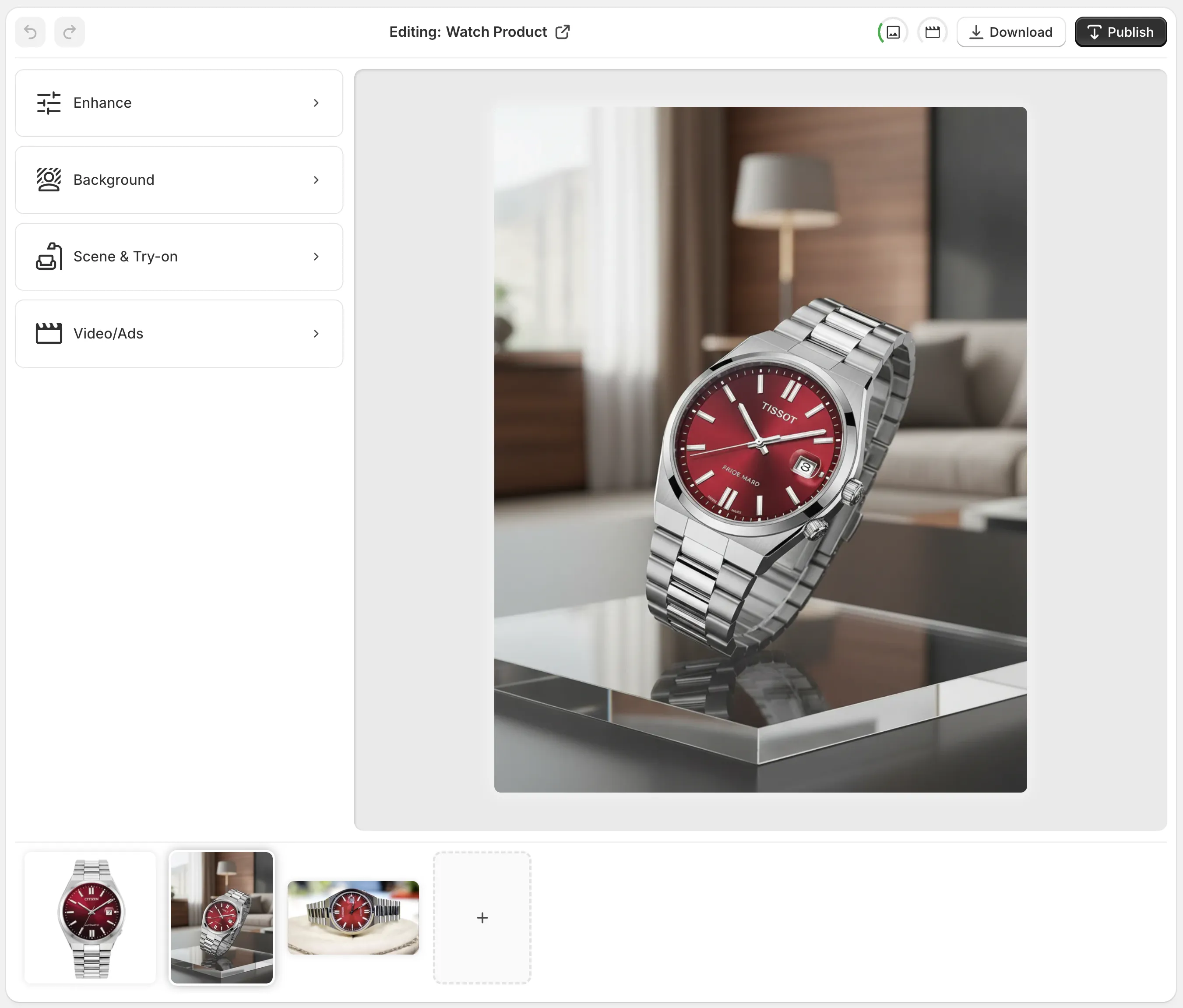
That matters because every later branch depends on the source staying believable. The app’s editor makes that practical by keeping the top-bar actions, tools, canvas, and image gallery in one workspace. I do not have to jump between separate tools just to decide whether the image is ready.
Decide The Branch Before You Touch The Image
I ask three questions before I spend time on a file:
- Does this need cleanup only?
- Does this need context?
- Does this need motion?
That sounds obvious, but it stops me from over-editing.
If the answer is cleanup only, I stop after the product is clean and consistent.
If the answer is context, I move the product into a studio, boutique, kitchen, office, or outdoor setting with object placement.
If the answer is motion, I decide whether the product needs a short b-roll clip or a UGC-style ad asset.
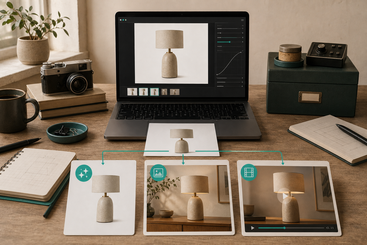
That branching logic is why the product feels more useful than a generic image generator. It is not trying to force every item into the same visual treatment. It gives me enough control to match the edit to the actual job.
Use The Right Branch For The Product Type
For apparel, the obvious first branch is try-on. The app lets me create or choose models and place the product on them, which is much more useful than trying to fake a lifestyle scene when the item is the thing the customer needs to inspect.
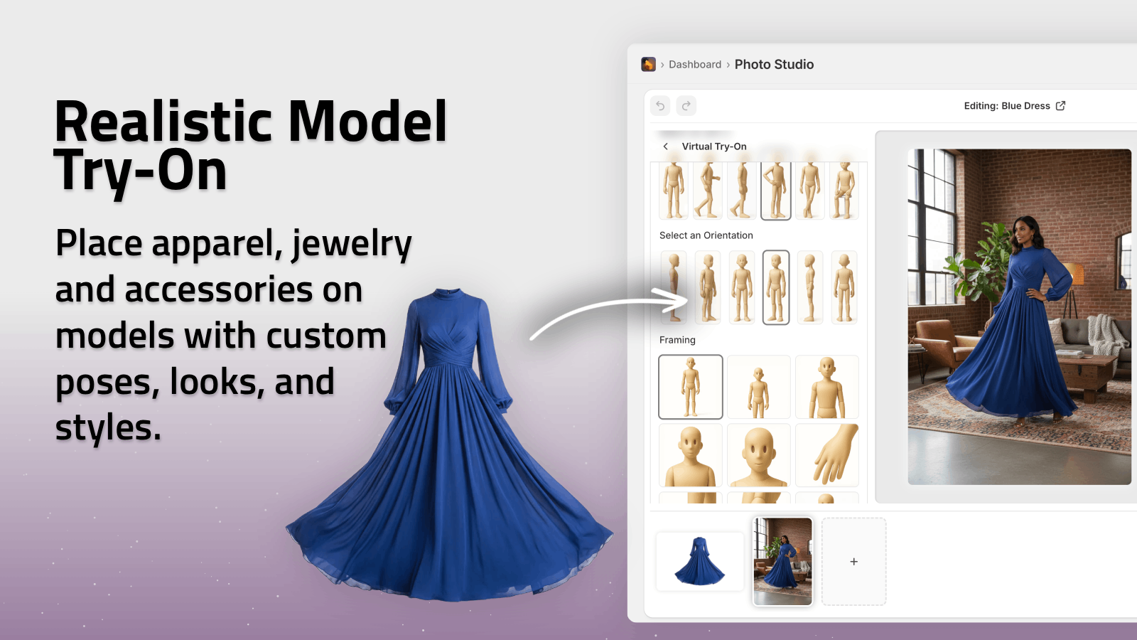
For home goods, decor, and accessories, object placement usually wins first. I want the product to sit in a believable environment without losing its shape or texture.
For ad creative, I care less about a perfect catalog shot and more about whether the image can become motion. That is where the UGC video and b-roll features matter: they let me test whether the product has enough visual interest to carry attention in a feed.
The main restraint I use is simple: I do not spend motion budget on products that still need cleanup. If the source is not trustworthy, the output gets noisy fast.
Keep The Review Loop Tight
This is the part I kept coming back to in earlier posts like How I Review a Shopify Product Photo Before I Generate Variants, A Practical Shopify Product Photo Decision Tree for AI Editing, How to Build a Shopify Product Photo Workflow Around One Source Image, and How I Turn One Product Photo Into a Full Shopify Visual Set.
The pattern is the same in every case:
- review the source first;
- pick the smallest edit that solves the problem;
- branch only when the next output has a clear job;
- keep the review step before I publish anything.
That is also why the app’s pricing and free plan matter. I do not need a giant commitment to test the workflow on one product and one channel. I can start small, compare the outputs, and see whether the visual system is actually improving the store instead of just making more versions.
What I Ship First
If I am starting from one product photo, this is the sequence I trust:
- Clean the source and make it trustworthy.
- Export a catalog-safe version.
- Make one contextual version for the product page.
- Only then decide whether try-on or motion adds real value.
That order saves me from doing elaborate work too early. It also keeps the asset set coherent, which matters when the same photo has to show up on the product page, in ads, and in social without feeling like three different products.
If you want to see whether the workflow fits your store, start with the Shopify App Store listing and the landing page. I would test one product, one source photo, and one branch first. The free plan is enough to see whether the routing model is actually useful for your catalog.
The Part That Actually Matters
I do not care about having the most dramatic edit. I care about having the right version for the right job.
That is the real value of Supra AI Photo Studio: it turns one product photo into a small routing system instead of a dead end. Once that is in place, I can keep the workflow clean, keep the product believable, and ship better visuals without turning every image into a new project.