
July 22, 2026
A Practical Shopify Product Photo Decision Tree for AI Editing
A practical decision tree for turning Shopify photos into try-ons, lifestyle scenes, and ad-ready video without a reshoot.
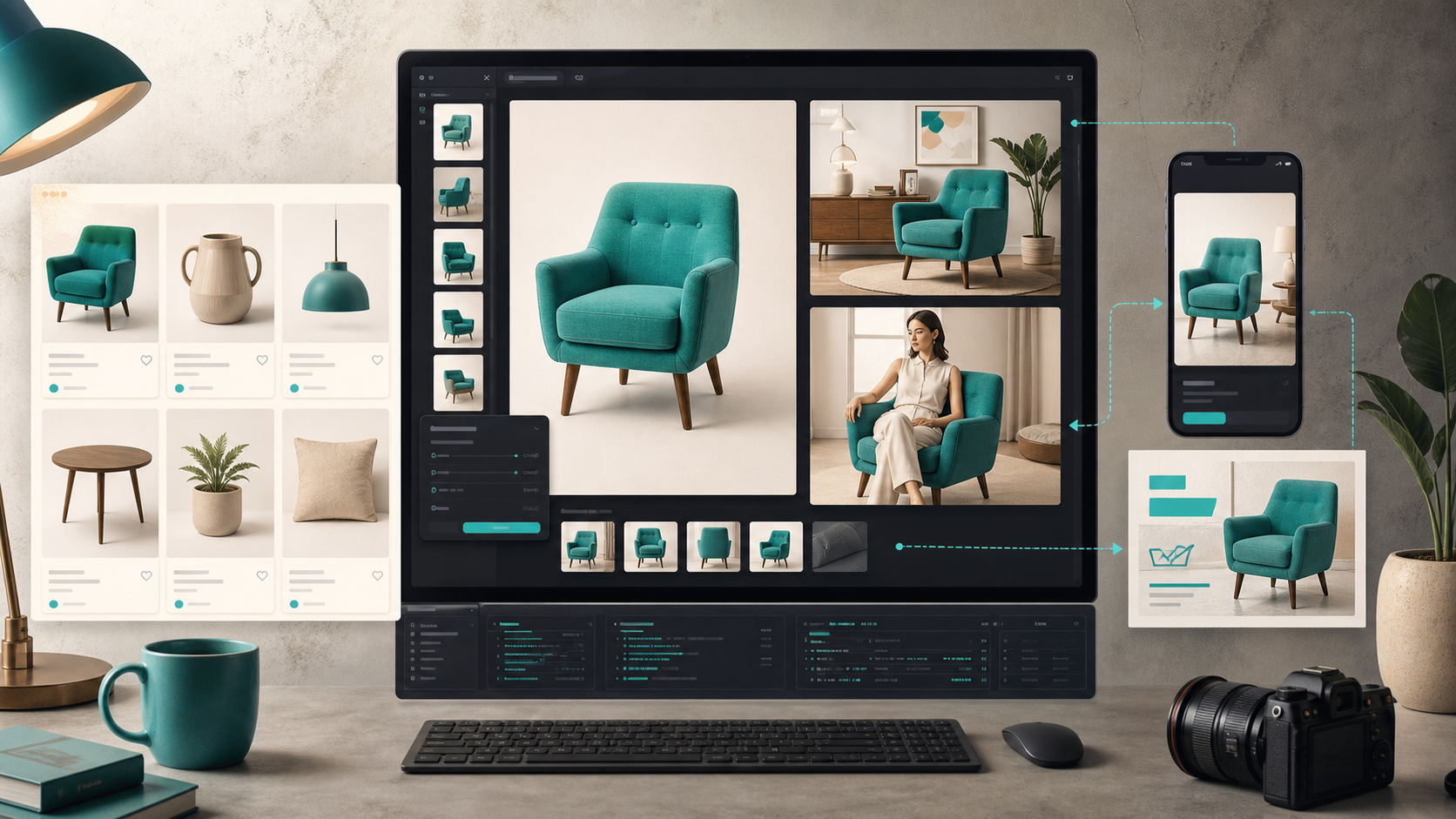
A Practical Shopify Product Photo Decision Tree for AI Editing
When I look at a Shopify product photo, the wrong question is “can I make this prettier?” The useful question is “what job does this image need to do?” That answer decides whether I use background removal, enhancement, a try-on, object placement, or a video cutdown. In Supra AI Photo Studio, that decision happens inside one workflow instead of a pile of separate tools.
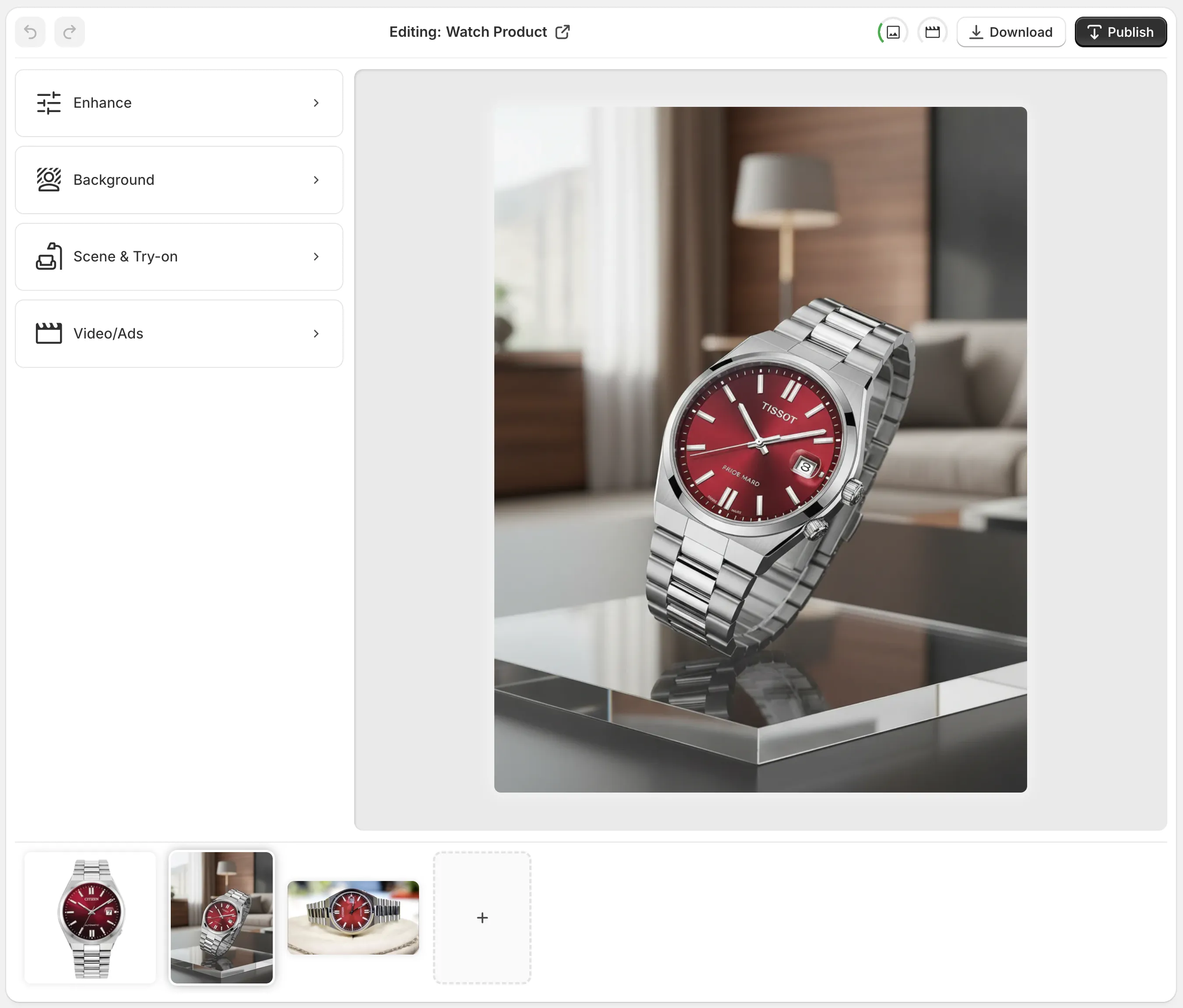
This matters because most stores do not need a perfect image in the abstract. They need one hero image for the PDP, a few catalog-safe variants, a lifestyle shot for ads, and maybe a short clip for social. If I push every shot through the same transformation, I waste time and I usually damage the product signal.
1. Start With the Source Shot
I want the cleanest file that still shows the product honestly. If the source is blurry, dark, or color-shifted, I fix that first. That is where the app’s background removal, upscaling, and auto-enhance tools make sense.
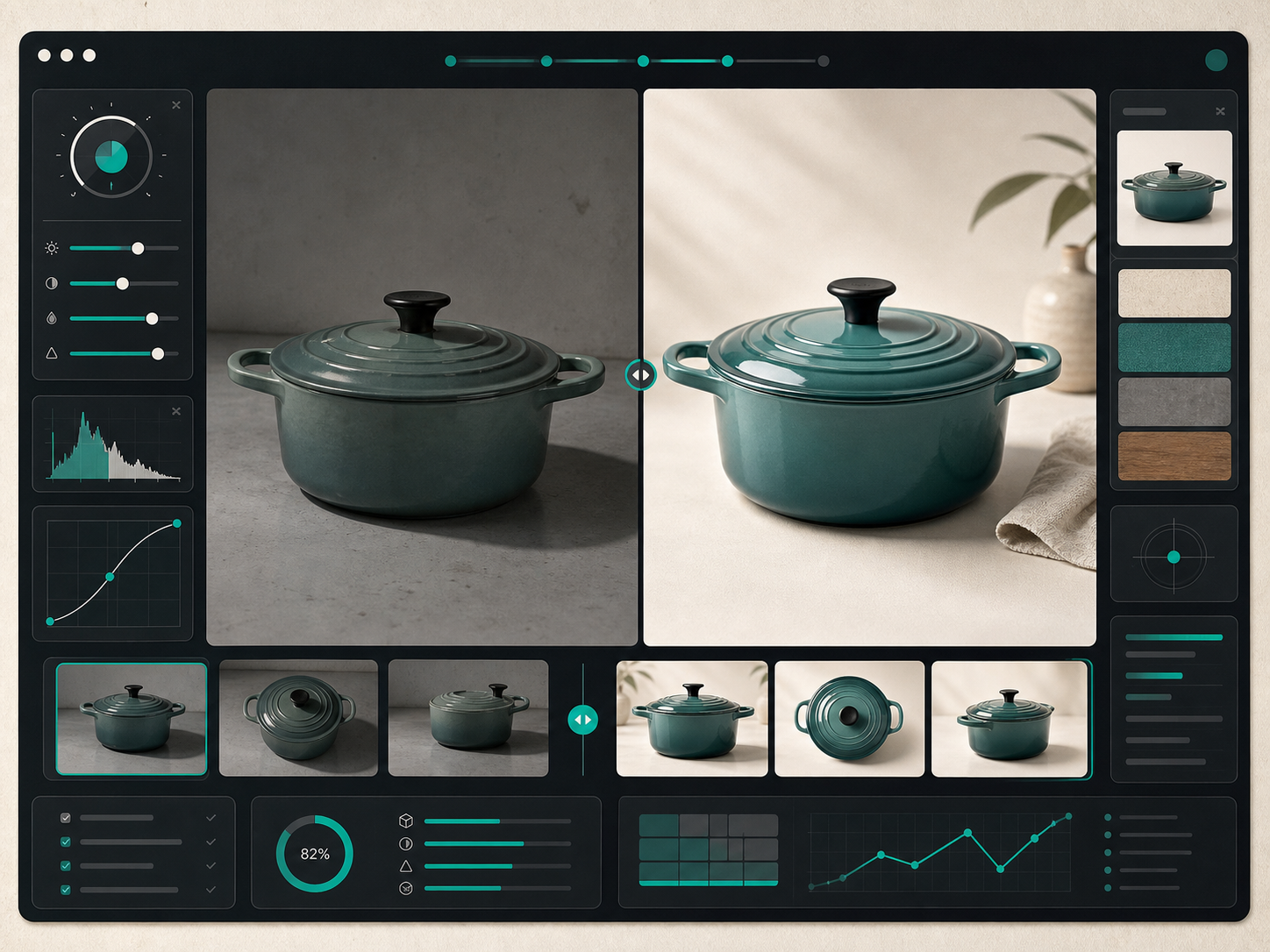
In practice, I use enhancement when the image is close but not usable yet:
- lighting is flat
- the background is distracting
- the edges are soft
- the product color needs correction
- the shot is already good, but not store-ready
I do not use enhancement as a substitute for a bad source image. If the angle is wrong or the product is partly hidden, no amount of cleanup will make it a better merch photo.
2. Pick the Right Transformation
Once the base image is stable, I decide whether the product needs a story, a human context, or just a cleaner presentation.

For fashion, jewelry, and accessories, I use try-on. It solves the biggest gap between a flat product shot and a buying decision: scale and fit.
For home goods or decor, object placement is usually a better move. Put the product into a kitchen, office, boutique, or studio setting and keep the composition controlled. The point is not realism at any cost. The point is to create a believable scene that still feels catalog-safe.
For ad creative, I use b-roll or UGC-style video when I need motion, attention, and a faster hook. A static image can sell the product. A short clip can stop the scroll.
3. Keep the Catalog Consistent
This is the part that matters once the first image looks good. Consistency wins over novelty.
I try to keep the following stable across a SKU set:
- lighting direction
- background warmth
- crop and framing
- shadow behavior
- model style, if I am using try-on
- color accuracy against the original product
That consistency is why I like keeping the workflow inside one app. I am not bouncing between a background remover, a mockup builder, a video tool, and a separate editor that all interpret the source differently.
The app listing calls out the core stack clearly: studio-quality image enhancements, AI model try-ons, object placement in lifestyle scenes, and AI product videos and b-roll. That is the shape of the workflow I want when I am moving fast.
4. Use the Editor Like a Review Queue
The editor layout itself makes more sense once I think of it as a production queue.
Top bar is for undo, redo, download, and publish. The left panel is where I pick the transformation. The canvas is where I inspect the actual result. The image gallery is where I compare variants and keep the best candidate around.
That setup sounds basic, but it keeps me from over-editing. If I have to keep flipping between tabs, I usually make the photo worse before I make it better.
5. Decide Before You Generate
The easiest way to waste time is to generate everything and sort it out later. I get better results if I ask one of these questions first:
- Is this a product-page image, or a marketing image?
- Does the shopper need to see fit, scale, or context?
- Do I need a cleaner version of the same shot, or a new scene?
- Is video actually useful here, or am I forcing it?
That decision tree saves credits and avoids weird outputs. It also keeps me from pretending every product needs the full treatment. A bottle, a chair, and a hoodie all want different output shapes.
If you want the preflight side of this, I already wrote about how I review a Shopify product photo before I generate variants. I also covered how I build a Shopify product photo pipeline that covers every channel, how I turn one product photo into a full Shopify marketing kit without a shoot, and how I turn weak Shopify product photos into studio-grade listings. Those pieces fit together as one workflow, not four separate ideas.
6. Ship With a Short Checklist
Before I publish, I check the same things every time:
- the product still looks like the product
- the colors still match the real item
- the scene supports the SKU instead of distracting from it
- the image size works in Shopify
- the hero image is strong enough to carry the listing
That last one matters more than people admit. If the first image is weak, the rest of the set has to work much harder.
Final Take
If you are already editing product photos by hand, Supra AI Photo Studio is most useful when you treat it as a decision engine: enhance the source, pick the right transformation, keep the result consistent, and stop before the edit becomes decoration.
The product has a free plan, so the lowest-risk next step is to install it, run one SKU through the workflow, and compare the before/after against your current process. If the result saves time without making the image feel generic, you have a real system.