
July 14, 2026
How I Build Shopify Swatches That Match the Theme
A practical rollout for Shopify swatches that match the theme, stay fast, and work across product and collection pages without rebuilding the storefront.
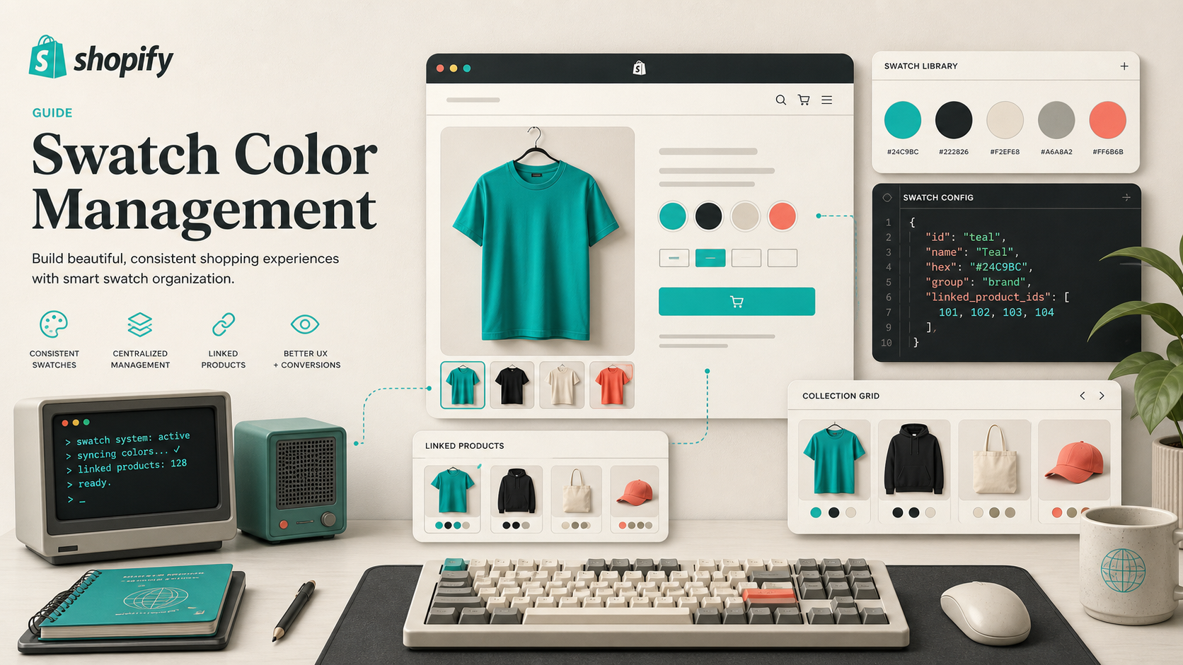
I kept seeing the same pattern on Shopify stores: the product itself was fine, but the swatch UI looked bolted on. One collection page had neat color chips, another had tiny pills, and the third still had a dropdown. Once the catalog got bigger, that inconsistency made the store feel stitched together instead of designed.
Supra Swatch Colors is the app I use when I want one swatch system for built-in variants, linked products, and collection-page browsing. It handles the part most stores miss: making the swatches look like they belong in the theme instead of sitting on top of it.
If you want the deeper decision tree behind the product model, I wrote about that in How I Choose Between Variant Swatches and Linked Products in Shopify and How to Build a Shopify Swatch System for Variants and Linked Products. The short version is simple: keep true variants as variants, and use linked products when the choice really deserves its own page.

Start With The Product Model
I do not start by styling anything. I start by deciding what the swatch is supposed to mean.
If the shopper is choosing between colors, finishes, or small cosmetic differences inside one SKU family, I keep it as a variant. If the choice changes the title, the imagery, the SEO text, or the inventory behavior, I split it into separate products and connect them with swatches.
That distinction matters because swatches are not just decoration. They are part of the catalog structure. When the structure is wrong, the UI starts lying to the shopper.
That is why I keep How I Replaced Dropdown Variants With Shopify Swatches That Load Instantly close by when I am setting up the product page side. It is the same principle: make color choices visual, but do not blur the line between one product and many.
Make The Swatch Look Like The Theme
Once the data model is clear, I tune the presentation.
Supra Swatch Colors gives me more than 20 styles, plus control over tooltip, label, swatch size, and shape. That sounds cosmetic, but it is where most of the perceived quality comes from. A swatch that is too small, too loud, or too generic can make an otherwise clean product page feel cheap.
The fastest way to make swatches look bad is to leave the defaults untouched.
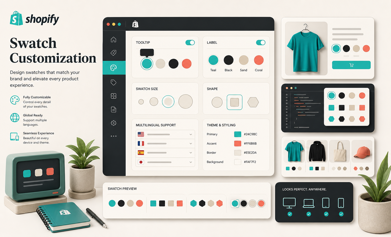
What I usually tune first:
- Swatch size against the card and product photo scale.
- Shape so it matches the brand language instead of the theme default.
- Tooltip text so mobile shoppers get useful hover or tap context.
- Labels so multilingual stores still read cleanly.
- The color palette so the control feels like part of the design system.
The app can auto-detect store colors or use product images to set swatches quickly, which helps a lot once a catalog has enough SKUs that hand-building chips would become a maintenance job.
If you want the configuration-oriented follow-up, How I Choose Between Variant Swatches and Linked Products in Shopify covers the decision side, and How to Roll Out Shopify Swatches Without Touching Theme Code shows the no-code rollout pattern I would use on a live store.
Put Swatches Where People Browse
Collection pages are where swatches start to pay off.
That is the point where a shopper is comparing, not committing. If the swatches are visible in the grid, they can narrow the catalog before they open a product page. That usually means less backtracking, fewer extra clicks, and a cleaner browse path.
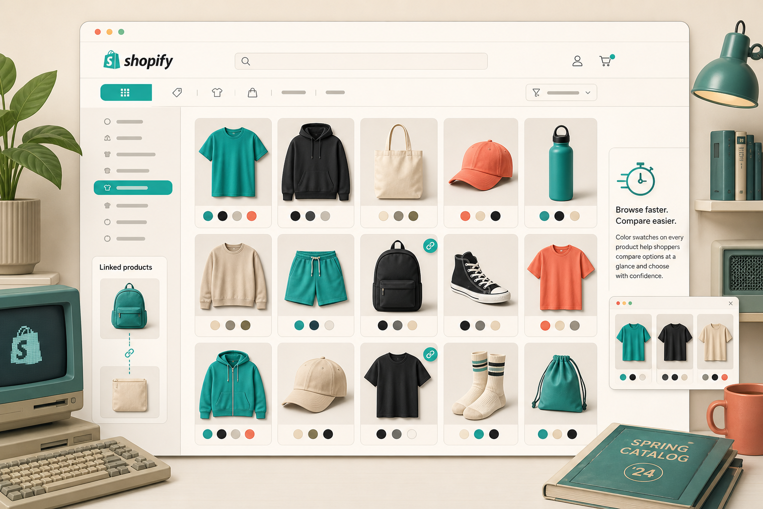
This is also the part I care about when I am checking a store across devices. A collection grid that looks fine on desktop but collapses into noise on mobile is not a real rollout. The swatches need to remain readable when the cards get narrower and the catalog gets denser.
Supra Swatch Colors supports collection pages built in, works across Shopify themes, and supports multilingual shops. That combination matters more than a flashy preview screen. In production, I want the same merchandising rule to survive theme changes, product updates, and language expansion.
If you want the shorter walkthrough for the collection-page side, I would read How I Replaced Dropdown Variants With Shopify Swatches That Load Instantly and the related collection-page note in How I Set Up Color Swatches for Shopify Collection Pages Without Theme Code.
Keep The Family Consistent
The best swatch systems do not feel clever. They feel consistent.
That means the same visual language should show up on the product page, the collection page, and any linked-product family that shares the same options. A shopper should not have to re-learn the control just because they moved one click deeper into the catalog.
This is where I like the linked-product flow to stay honest. If one color needs its own page, I still want the swatch to look like part of the same family. The UI should say, “same system, different destination,” not “new trick every time.”
That is the core idea behind the post I linked earlier, How I Choose Between Variant Swatches and Linked Products in Shopify. The product structure can be different without the shopping experience feeling different.
The Rollout I Use
When I am putting this in place on a live store, I keep the rollout small:
- Pick one product family that already has meaningful color or finish choices.
- Decide whether the options belong to one product or separate products.
- Match the swatch size, shape, and tooltip to the existing theme.
- Turn the swatches on for one high-traffic collection first.
- Check the result on mobile and in any secondary languages before expanding.
That sequence tells me quickly whether the setup is helping the catalog read faster or just adding a new layer of UI.
If you prefer the vendor-side overview, the Shopify App Store listing and the product site are the fastest places to compare the feature set. The videos I would open first are Getting Started Tutorial, How to Link Shopify Products with Color Swatches, and How to add Swatches on the Collection pages of your Shopify Store.
The practical win is not that swatches look nicer. It is that the catalog becomes easier to scan without forcing a theme rebuild. Start with one family, one collection, and one clear decision rule. If that feels better, expand it. If it does not, the product model probably needs another pass before the styling does.