May 21, 2026
How I Replaced Dropdown Variants With Shopify Swatches That Load Instantly
A practical Shopify swatch setup for product pages, collection pages, and linked products without theme code.
I kept running into the same problem on Shopify stores: the product was fine, but the variant picker made the page feel like a form instead of a shopping experience. If a customer is choosing between colors, a dropdown makes them think. A swatch lets them compare.
That is why I reach for Supra Swatch Colors when I want to clean this up without a custom theme project. It covers the three cases I actually care about: variant swatches, linked-product swatches, and collection-page swatches.
The rule I use before I touch anything
I keep the decision simple:
| Situation | What I use | Why |
|---|---|---|
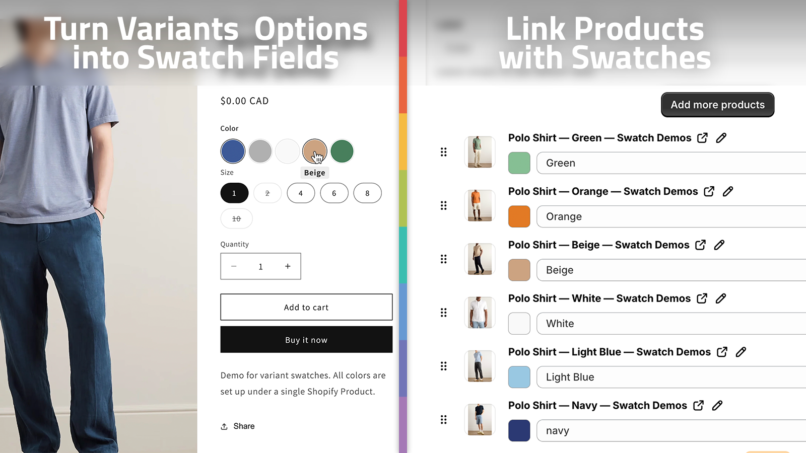
| Same product, different colors or finishes | Variant swatches | Keeps the page clean without changing the product structure |
| Color or style should have its own page | Linked-product swatches | Better when each option needs its own URL, media, or SEO treatment |
| Shoppers compare options from a collection grid | Collection-page swatches | Helps people browse before they click into a PDP |
That is the part I like about this app. It does not force one model everywhere. You can use built-in variants where that makes sense, and link separate product pages where that makes more sense.
Product pages should feel visual, not bureaucratic
Dropdowns are efficient for a warehouse. They are not great for a store where color is part of the purchase decision.
When I convert variant options into swatches, I am usually trying to fix one of three problems:
- The store has too many visually similar products, and the picker is doing too much work.
- The product page has enough imagery that color is the primary decision, so the selector should behave like part of the gallery.
- The merchant needs a cleaner mobile experience, where dropdowns add friction and hide the choice.
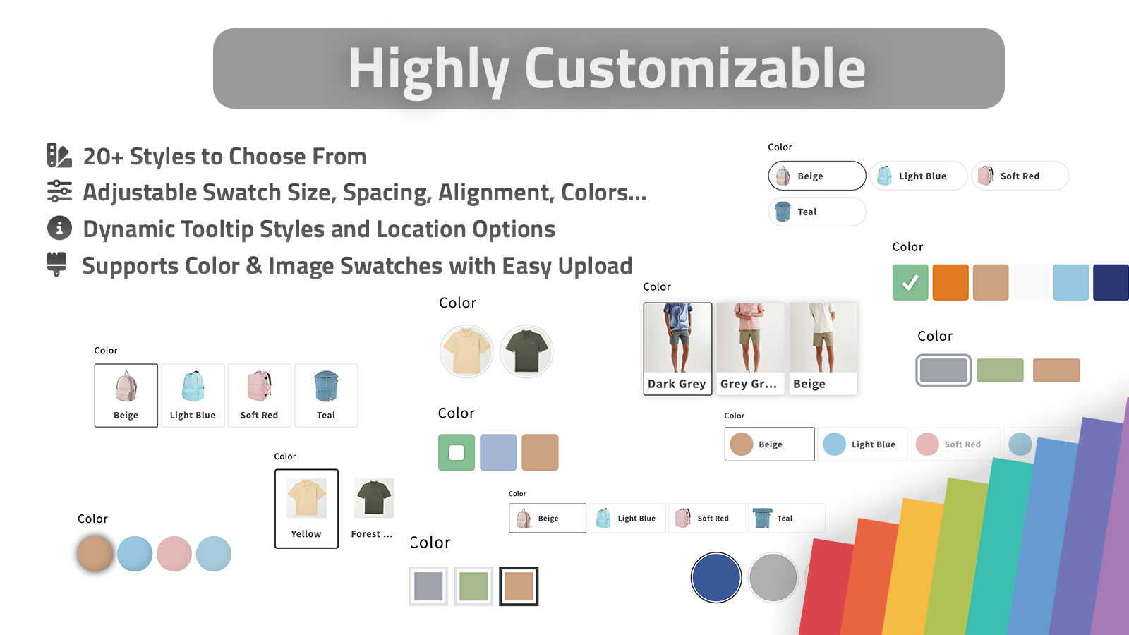
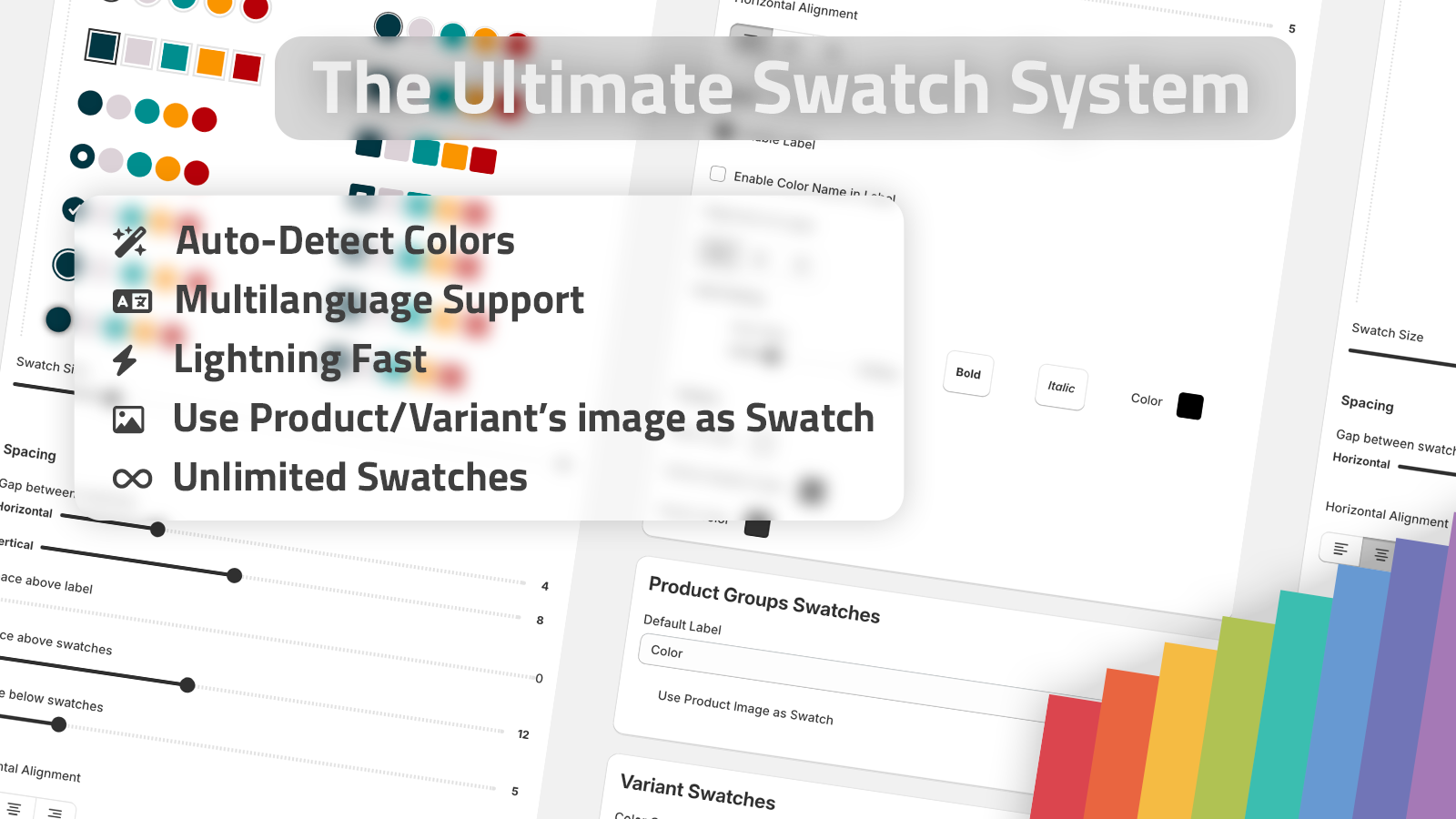
Supra Swatch Colors supports color swatches and image swatches, so I can match the selector to the product instead of forcing every product into a single generic control. It also works across all Shopify themes, which matters more than people expect. A swatch app that only behaves on one theme is not really a solution.
If you want the setup walkthrough I would send to a merchant, the getting started tutorial is a good place to start.
Linked products are the part most stores get wrong
I see this mistake a lot: every color becomes a variant even when the color really deserves its own product page.
That usually creates one of two headaches:
- the product page becomes bloated with too many options and images
- the merchant loses flexibility around SEO, merchandising, or separate content per color
When that happens, I prefer linked-product swatches. The shopper still experiences the choice as a swatch, but the store keeps separate product pages behind the scenes. That gives you more control without making the UI feel fragmented.
This is also the point where auto-detecting store colors or using product images to build swatches becomes useful. If you are managing a large catalog, you do not want to hand-build every square one by one.
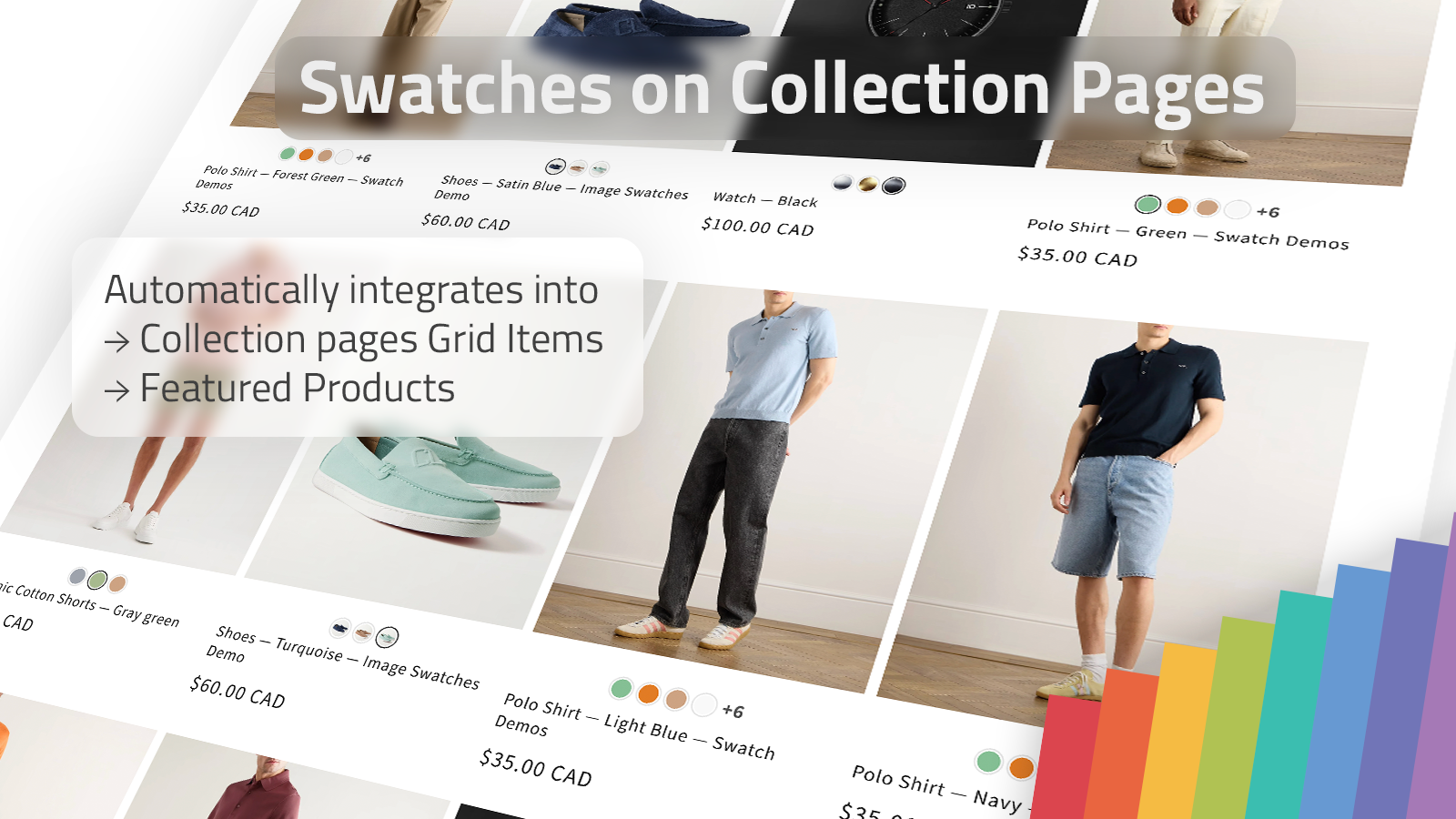
Collection pages are where swatches pay off
Collection pages are where swatches start to save real time.
If the shopper can see the color family directly in the grid, they do not need to click into every product just to understand the available options. That improves scanning, and it also makes the catalog feel more intentional.
I like this for stores with:
- apparel in multiple colors
- home goods with finish or material variants
- accessories where color is the main buying signal
- seasonal collections that need a clearer browse path
The app supports swatches on collection pages without code, so this is one of the rare merchandising changes that can improve browsing without dragging a developer into theme files.
If you want a quick demo for the collection-page side specifically, the walkthrough How to add Swatches on the Collection pages of your Shopify Store is worth bookmarking.
Style matters more than merchants think
The selector has to look like part of the store.
That is where the customization side matters. Supra Swatch Colors gives you 20+ styles, plus control over tooltip, label, swatch size, and shape. I use that flexibility to keep the selector readable without making it loud.
The fastest way to make swatches look cheap is to leave the defaults untouched.
What I usually check before going live:
- Does the swatch size fit the product image and headline scale?
- Is the tooltip useful on mobile, or does it add clutter?
- Do the labels read clearly in the store’s languages?
- Does the collection page still scan cleanly with the swatches visible?
- Does the control still feel fast when you tap through it on a phone?
That last one matters. The app is built to load instantly, and on a store with real traffic, that is the difference between a nice visual detail and an interface that actually helps conversion.
What I would do first if I were setting this up today
- Pick one product family that sells by color or finish.
- Decide whether the options belong on the same product page or should be linked products.
- Turn the relevant options into swatches.
- Add collection-page swatches if shoppers browse that category heavily.
- Adjust size, tooltip, and labels until the control feels native to the theme.
- Check the same setup on mobile before rolling it out broadly.
If you are serving multiple languages, this is also where multilingual support saves you from building separate workarounds.
If you want the shortest path to a working setup
Start with the Shopify App Store listing, then use the product site at supra-swatch-colors.sktch.io if you want the positioning and feature overview in one place.
Then watch the two videos that map best to the setup:
- Supra Swatch Colors - Shopify App to add Color Swatches to Products
- How to Link Shopify Products with Color Swatches
Related reading
If you are cleaning up the rest of the swatch stack, these are the follow-up posts I would read next:
- How to Add Color Swatches to Shopify Collection Pages Without Code
- How to Turn Shopify Variants Into Brand-Matched Swatches
- How to Build a Shopify Swatch System for Variants and Linked Products
- How I Set Up Shopify Color Swatches on Product and Collection Pages Without Code
The practical move is simple: replace the dropdown where color is visual, keep the product structure honest, and make the catalog easier to scan. That is usually enough to make a store feel faster without turning it into a code project.