June 23, 2026
How I Choose Between Variant Swatches and Linked Products in Shopify
A practical way to decide when Shopify swatches should map to variants or linked products, plus how I set up Supra Swatch Colors.

When I review a Shopify catalog, the first thing I look for is not color. I look for structure.
If a store has both true variants and separate product pages dressed up like variants, the browsing experience usually gets noisy fast. The customer clicks into a collection, sees a color chip, expects one kind of behavior, and lands somewhere different. That mismatch is where swatches either help the store feel native or make it feel broken.
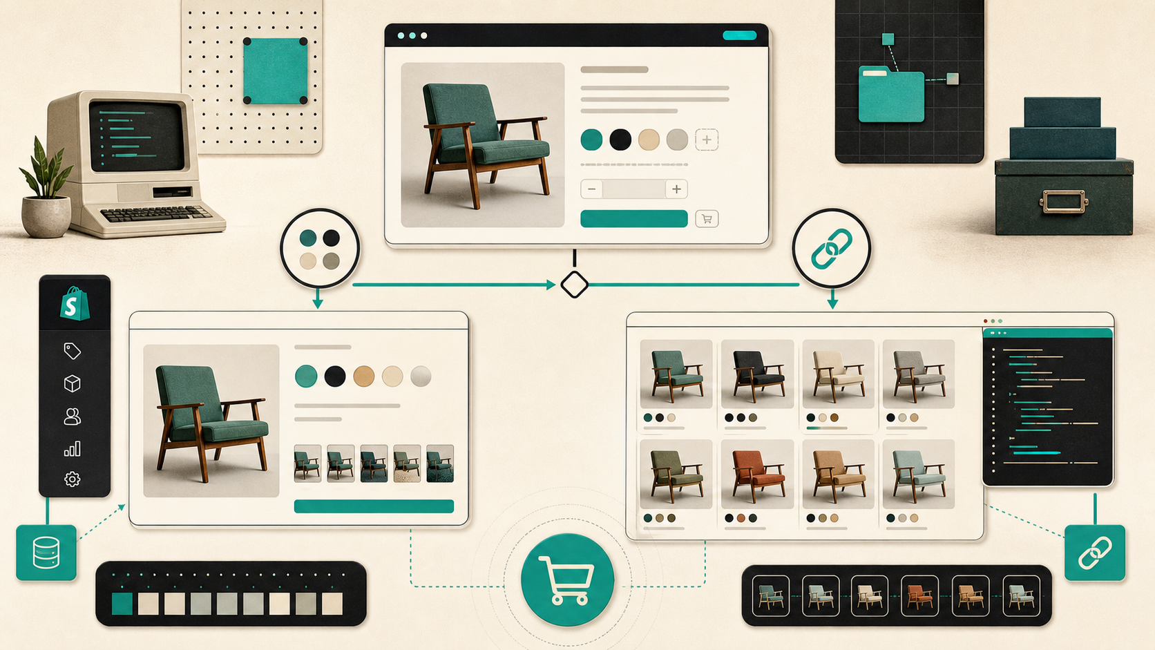
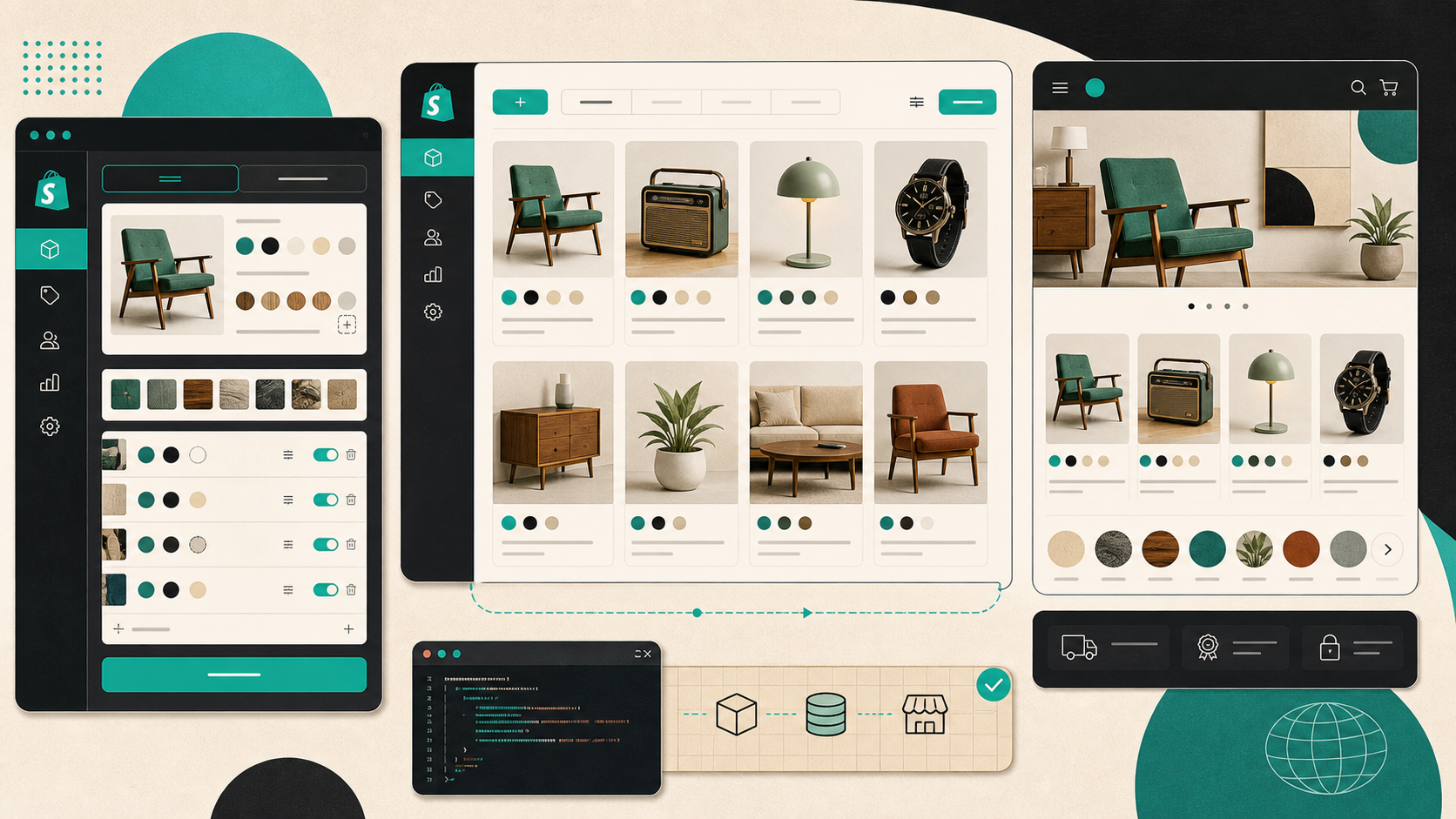
Supra Swatch Colors is the app I use when I want one swatch system that handles both jobs: turning built-in variants into clean color or image swatches, and linking separate product pages with the same UI. It also supports swatches on collection pages without code, which matters more than people think once the catalog gets large.
The Decision I Make First
I start by asking one question: is this still the same product?
If the answer is yes, I keep it as a variant. If the answer is no, I treat it as a separate product and connect the products through swatches.
That sounds obvious, but it prevents most of the bad setups I see:
- Use variants when the SKU family is really one product with a few options.
- Use linked products when each option deserves its own product page, its own imagery, or its own content.
- Put the swatch choice where shoppers already browse, including collection pages, so the catalog does not depend on extra clicks.
That is also why I like Supra Swatch Colors instead of stitching together theme hacks. It supports both product-page swatches and collection-page swatches, so I do not have to redesign the storefront around a single merchandising pattern.
When Variants Are Enough
Variant swatches work best when the differences are mostly cosmetic or selection-based.
Think of a mug that comes in three colors, a notebook with a few cover options, or a shirt where size and color live under the same product. In those cases, I want the shopper to see the choice immediately, not dig through dropdowns.
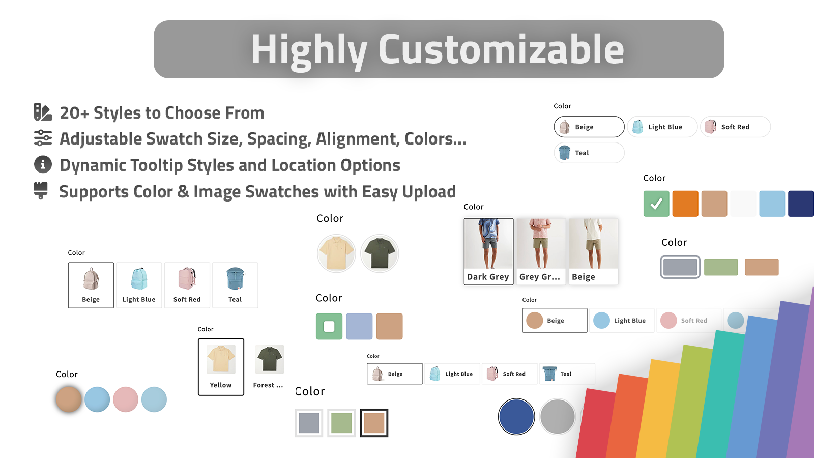
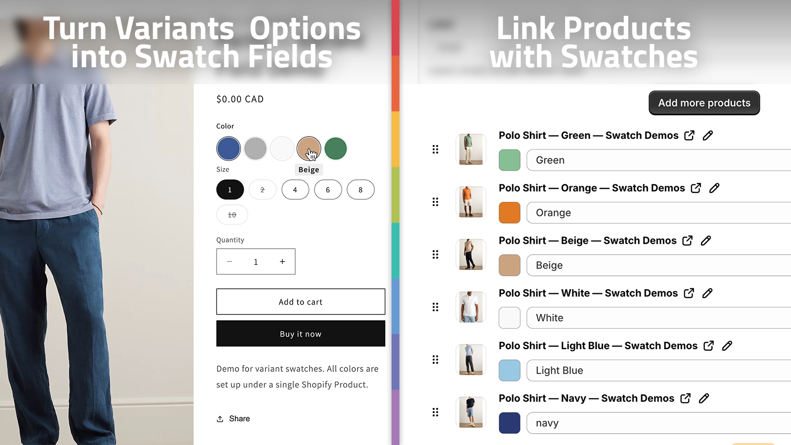
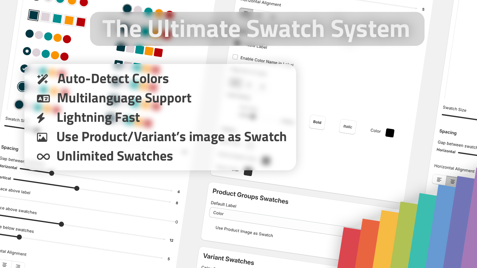
Supra Swatch Colors lets me transform built-in variants into swatches and customize how they look. The app can auto-detect colors in the store, or I can use product images to set them up quickly. That matters when I am trying to move through a catalog instead of hand-building every swatch one by one.
The other reason I lean this way is presentation. The app offers more than 20 styles, so I can tune the tooltip, label, size, and shape to match the brand instead of shipping the default Shopify look.
If you want the shorter version of that setup path, I covered the variant-focused version in How I Replaced Dropdown Variants With Shopify Swatches That Load Instantly.
When Linked Products Are Better
Linked products are the right move when the choice changes more than the color chip.
If the item needs a separate title, a separate page, different SEO text, different imagery, or different inventory behavior, I do not force it into one variant set just to keep the catalog tidy. I let each product stand on its own and use swatches to connect the family.
That is where linked-product swatches are useful. The shopper still gets a visual color or image picker, but each swatch can route to a different product page. Supra Swatch Colors supports that pattern directly, which keeps the storefront consistent while letting the catalog stay honest.
For a broader build note on that tradeoff, I recommend How to Build a Shopify Swatch System for Variants and Linked Products.
The practical advantage is consistency. The customer keeps using the same swatch pattern across the whole family, and the store does not have to invent a different interaction for every collection.
Collection Pages Decide the Click Path
Most stores still behave like the product page is the whole story. It is not.
Collection pages are usually where the shopper decides what is worth opening. If the swatches are visible there, the shopper can narrow the catalog before they ever enter a product page. That usually means less pogo-sticking, less backtracking, and a cleaner browse path.
Supra Swatch Colors includes collection-page swatches built in, so I do not need to touch theme code to get that behavior. That is the part I care about in production, because it keeps the implementation stable across themes and keeps the merchandising logic in one place.

I wrote about the collection-page version separately in How I Set Up Color Swatches for Shopify Collection Pages Without Code, because that is usually the first place I test whether the swatch system actually feels native.
The Setup Checklist I Use
When I am rolling this out on a store, I keep it simple:
- Decide whether the product is a variant or a linked product.
- Use swatches for the choice that the customer should recognize instantly.
- Match the swatch style to the brand instead of using a generic default.
- Check both product pages and collection pages before calling it done.
- Verify the storefront still feels consistent in multilingual shops.
That last point is important. A swatch system is not useful if it only works cleanly in one language or one theme. The reason I prefer Supra Swatch Colors is that it handles multilingual shops, all themes, product pages, and collection pages without me having to keep separate fixes around.
If you are comparing swatch apps right now, I would also read How I Choose a Shopify Swatch App That Feels Native. The decision usually comes down to whether the app can keep the storefront fast, flexible, and visually coherent as the catalog grows.
What I Would Do First
If I were setting this up from scratch today, I would start with one high-traffic collection and one product family that has both color variants and sibling products.
Then I would:
- Turn the true variants into swatches.
- Connect the sibling products with linked swatches.
- Put the swatches on the collection page first.
- Check whether the product list feels faster to browse.
- Only then expand the pattern to the rest of the catalog.
That sequence gives you a clean test before you commit to a full store rollout.
If you want to try the app itself, the install page is Supra Swatch Colors on Shopify, and the product site is supra-swatch-colors.sktch.io. The fastest next step is to install it on one collection, compare the click path before and after, and see whether your swatches make the catalog easier to read.