
October 10, 2026
I Used Product Images as Shopify Swatches Before Designing Color Chips
A practical Shopify workflow for using product imagery as swatches, keeping linked products clear, and QAing the result across product and collection pages.

I had a collection where every color option technically worked, but the swatches still made me pause. A beige dot could mean oat knit, sand canvas, or a warm ceramic glaze. A customer had to click into a product to understand the material and finish. That is a small hesitation, but it becomes expensive when a shopper is comparing colorways quickly.
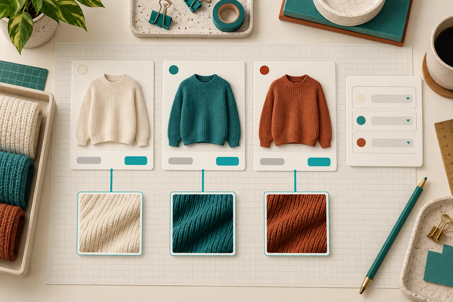
So before I designed another set of perfectly flat color chips, I tried a simpler rule: use the product imagery I already trust. For products where texture, pattern, or finish changes the decision, an image swatch gives the catalog more context than a hex value ever will.
Start With a Swatch Job Description
The first decision is not visual; it is structural. Ask what the swatch is meant to select.
- Use a variant swatch when one Shopify product holds all of the selectable colors or finishes.
- Use a linked-product swatch when each colorway has its own product page, photography, inventory story, or merchandising copy.
- Use an image swatch when the material or print is the signal the shopper needs, not merely the hue.
This keeps the UI honest. If a ribbed knit, a mottled glaze, and a plain cotton tee would all be represented by the same tan circle, the circle is hiding useful information. I still keep a consistent naming layer underneath it—my earlier Shopify swatch naming system is what stops Oat, Cream, and Natural from becoming three competing records later.
Build One Small Mapping Table Before Touching the Theme
I make a compact catalog map first. It can live in a spreadsheet, Notion, or a task description:
Swatch label: Oat Rib
Selection type: linked product
Image source: cropped knit-detail image
Destination: oat-rib-sweater
Collection behavior: display on all knitwear cards
Fallback: neutral color circle
The table is intentionally boring. Its job is to catch a product with no destination, an image that looks too much like another option, or a label that will not translate cleanly. It also tells me where a flat color circle is the better fallback. Image swatches are helpful only when they are recognizable at a small size.
Supra Swatch Colors fits this setup because it can turn variant options into swatches or link separate product pages, while letting me use color or product imagery and carry the treatment onto product and collection pages. The no-code piece matters less than the ability to keep the catalog model and the storefront model aligned.
Use Product Images, But Crop for Decisions
A full product photo rarely makes a good swatch. I choose a crop that answers the shopper’s comparison question: the knit texture, the leather grain, the print repeat, or the finish. Then I compare those crops at the actual swatch size—not at 1600 pixels in the asset manager.
My checklist is simple:
- Can I tell this crop apart from its nearest neighbor in one second?
- Does it still look like the product rather than a random texture sample?
- Does the label explain what the image cannot?
- Is the fallback color sensible if the image fails to load or is too busy?
That last point is why I do not treat image swatches as an art project. The image should reduce ambiguity, not create another tiny interface puzzle. For a second opinion on the linked-product side of the decision, this walkthrough of linking Shopify products with swatches is useful background.

Put the Same Choice on Collection Pages
A good product-page swatch system can still fail in the collection grid. Collection browsing is where customers scan fastest, so I want the selected visual language to survive that context: same image crop, same order, same label, and the same destination behavior.
I had already written about planning collection-page swatches before touching the theme; this is where that planning pays off. With a clean mapping table, I can apply the same product groupings rather than hand-tuning every card. If you are introducing swatches to the grid for the first time, the collection-page setup guide is a helpful companion.
The trade-off: do not show every possible swatch just because you can. A crowded grid can obscure the product. I start with the best few options, then test whether the visual cue improves scanning more than it adds noise.
QA the Tiny Details on Desktop and Mobile
My final pass is deliberately unglamorous. I open a product page and a collection page at desktop and phone widths, then test the nearest-looking two swatches. I check tap targets, selected-state visibility, labels and tooltips, image cropping, destination URLs, and whether the order stays consistent. Before a launch I also run the label check described in my swatch-label audit.

The useful outcome is not “more decorative swatches.” It is a shopper seeing the information they need before they commit to a click. If your catalog has materials, patterns, or finishes that flat circles keep flattening away, install Supra Swatch Colors and test one small product group with image swatches this week. Keep the mapping table, compare product and collection behavior, and promote the pattern only after it survives the small-screen QA pass.