
October 4, 2026
I Built One Shopify Product Content System for Three Catalogs
A practical way to organize Shopify product details across catalog types with reusable tabs, accordions, metafields, and content rules.

I hit the same product-page problem three times in one week: a clothing catalog needed care details, a consumables catalog needed ingredients, and an accessories catalog needed compatibility notes. All three had the information; it was just trapped in descriptions that had become unscannable walls of copy.
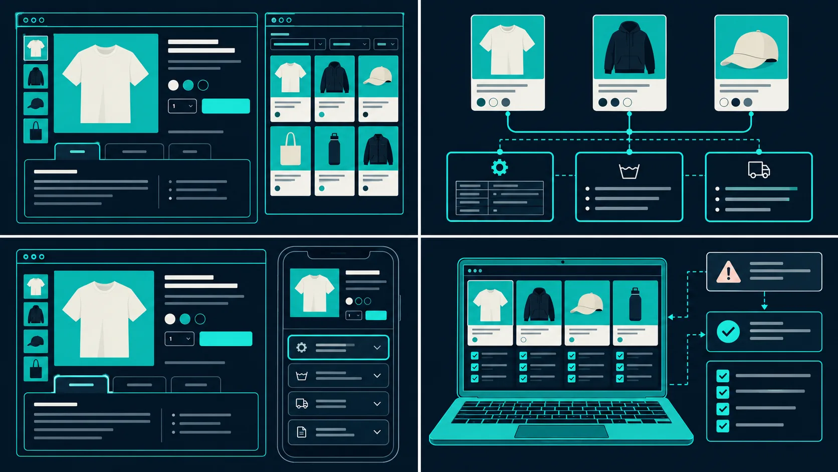
My first instinct was to make three bespoke templates. That would have worked until the fourth catalog change. Instead, I built one content system: consistent sources in Shopify, a small set of clear labels, and one presentation layer that could become tabs on a roomy desktop column or accordions on a narrow product page. Supra Tabs & Accordions is the free app I used for that presentation layer. It changes the organization of the page, not the underlying product data.

Start With Content Contracts, Not Tab Names
A tab named “Details” is easy to add and hard to maintain. I began by writing down what each catalog actually needed to answer. Clothing got Fit & Measurements, Fabric & Care, and Shipping. Consumables got Ingredients, How to Use, and Shipping. Accessories got Compatibility, In the Box, and Warranty.
That became the content contract. The labels are shopper-facing, but each one has a defined source: product description for the short story, a metafield for product-specific specifications, a store page for shared policy copy, and a metaobject where structured data needs to be reusable but not identical. This is the same discipline that keeps a fit-family system sane: when content has a home and a rule, it is much less likely to drift. I used the same kind of rollout thinking described in my fit-family size-chart build.
The useful constraint: do not create a tab just because a competitor has one. Create it because you can name the source, the owner, and the products that should receive it.
Keep Product Facts Separate From Reusable Copy
I split the content into two buckets. Product facts—dimensions, materials, compatibility, what is included—stay close to the product in descriptions or metafields. Reusable copy—shipping expectations, a standard warranty, care guidance that genuinely applies across a family—lives once in a store page or reusable object.
That distinction matters when a policy changes. I want to edit shipping copy once, not hunt through 180 descriptions. It also prevents the opposite error: giving every product the same generic specification block. In Supra Tabs & Accordions, a tab can pull from a product description, a product metafield, a store page, a metaobject field, an image/file, or copy written in the app. Empty tabs hide automatically, so a broader rule does not expose a blank “Compatibility” panel on a simple item that has none.
Target by Catalog Rule, Then Check the Edges
The app lets a tab set target a collection, tag, vendor, product type, or individual products. I use the broadest rule that is still explainable. A collection works when the range genuinely shares the same information architecture; a tag works when one product family crosses collections; a direct product assignment is my exception lane.
For example, I gave a “Technical Accessories” collection a Compatibility tab sourced from a metafield, then made a narrower exception set for bundled products. The preview, match count, and overlap warnings are the important bits here. If two rules can match the same product, decide which set should win before you publish. A system that is predictable on paper but ambiguous in the catalog will eventually surprise you.
This is also where I borrow a lesson from adding color swatches to collection pages: the presentation can be elegant, but the source data and targeting logic have to be boringly consistent.
Let the Product Column Choose Tabs or Accordions
I do not force a desktop layout onto mobile. Supra Tabs & Accordions responds to the actual width of the product-page column, which is more useful than guessing from screen width alone. In a wide two-column template, a short tab row makes related details easy to compare. In a tight column, accordions make each heading easier to tap and scan.
There are a few overflow choices for a long tab row: horizontal scrolling, a More control, wrapping rows, or stacked sections. I prefer fewer, specific labels before I reach for an overflow control. “Care” beats “Product Information and Maintenance”; “Sizing” beats “Measurements, Fit and Sizing Guide.” The app also includes keyboard support, appropriate roles, reduced-motion behavior, and direct links that can open a particular tab. Those are small implementation details, but they stop a tidy layout from becoming a hidden-content trap.
Run a Five-Product Test Before the Whole Catalog
My rollout was intentionally unglamorous. I tested one simple product, one product with every content source, one product with a missing optional field, one that matched an exception rule, and one on the narrowest product template. For each, I checked the preview, the live theme block, and whether the page still made sense with JavaScript-free-looking fallback content. The actual headings stay in the page for search engines and screen readers; the app is organizing access, not deleting the information.
Then I added the theme app block once to the product template. That is the leverage: the set and its rules do the catalog work, instead of asking someone to paste an accordion into every description. If you are building a product-content system without touching theme code, this is the natural next layer after a clean template strategy.

What I Would Check Again Next Month
I would open a handful of newly added products, inspect the match count, and look for empty or duplicated sections. I would also search support questions for signals that a label is too vague. A “Compatibility” question may mean the data is missing; a “What size am I?” question may mean the size chart is present but placed badly. The point is not to endlessly tune the chrome. It is to keep product facts findable as the catalog grows.
If your descriptions are becoming the junk drawer for specs, policies, and instructions, start with three content contracts and a five-product test. Then install Supra Tabs & Accordions from the Shopify App Store, build one tab set, target it with a rule you can explain, and add the app block to your template. It is free—no trial, tiers, or card required—and it gives you a practical way to make product pages calmer without rebuilding your theme.