
July 17, 2026
How I Keep Shopify Swatches Consistent Across Themes and Collections
A practical Shopify swatch workflow for linked products, variant colors, and collection pages without touching theme code.

If swatches look right on one product page but drift on collection cards, you do not have a color problem. You have a system problem.
That is the part I keep running into with Shopify catalogs: someone adds a new color, a theme tweak changes the presentation, and suddenly the store has three different versions of the same swatch logic. I started using Supra Swatch Colors because it gives me one place to decide how swatches should behave across product pages and collection pages, without turning the theme into a maintenance project.
The app also fits the practical cases I actually see in stores: linked products that should behave like swatches, true variant color swatches on a single product, collection-page swatches built in, multilingual catalogs, and enough styling control to match a brand instead of forcing every store into the same circle-chip look.
1. Pick the Swatch Model First
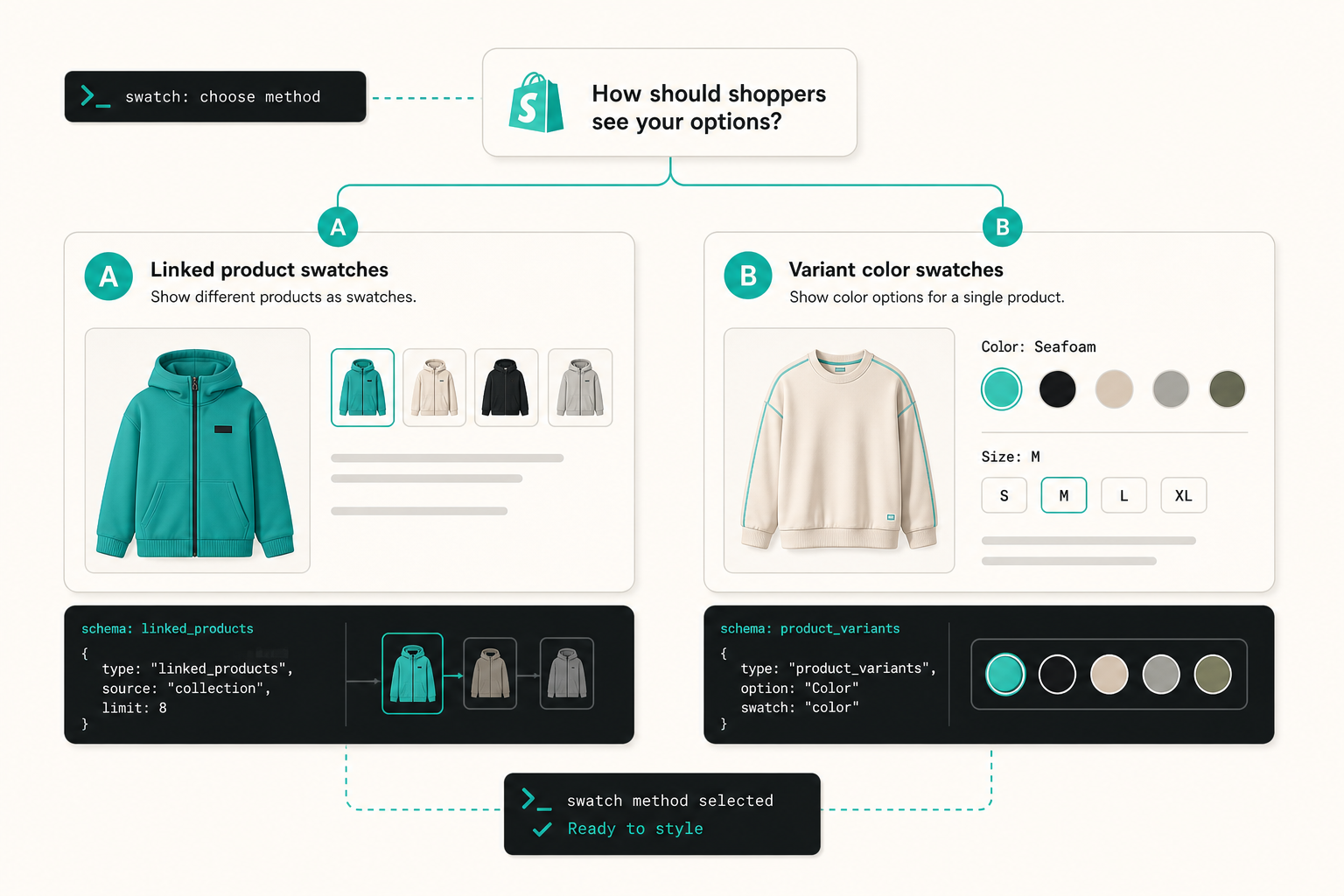
The first decision is simple, but people skip it: are you showing separate products, or are you showing variants of one product?
- Use linked-product swatches when each color, finish, or pattern should land on its own product page.
- Use variant color swatches when the difference lives inside one product and the shopper should stay on the same page.
- Use both only if your catalog genuinely needs both. Forcing one pattern onto everything is how swatch setups get messy.
This is also why I like starting with the decision diagram instead of jumping straight into styling. If the underlying model is wrong, no amount of tooltip polish will save the experience.
The app supports both paths, and that matters because the merchandising decision is not always the same across categories. A hoodie might work as a variant. A product family with separate photography and SEO pages usually works better as linked products.
If you want the no-drama rollout path, I wrote about the theme side of that in How to Roll Out Shopify Swatches Without Touching Theme Code. If you are comparing linked products against variant handling in more detail, the same product tension shows up in How I Build Shopify Swatches That Match the Theme.
2. Make the Style System Boring in a Good Way
Once the model is set, I treat styling as a standardization job. The goal is not to make every swatch look flashy. It is to make every swatch read consistently enough that shoppers trust the catalog.
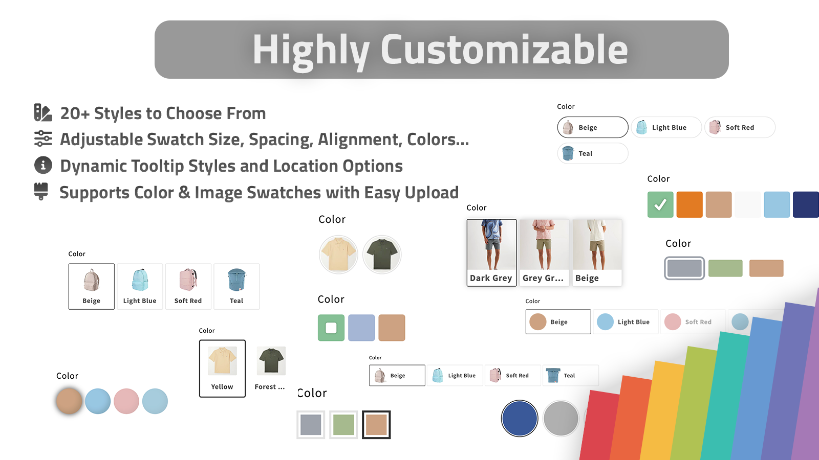
I usually narrow the decisions down to a few things:
- shape: circle, square, or whatever best matches the theme
- swatch size: large enough to notice, small enough to keep product cards compact
- tooltip and label treatment: useful when the swatch itself is not enough
- color source: auto-detect store colors when the catalog is tidy, or use product images when the catalog needs a faster setup
Supra Swatch Colors has more than 20 styles, which sounds like a design toy until you are trying to make a serious storefront feel coherent. That range is useful because it lets me match the store, not the app.
For stores with a stronger visual identity, I prefer to make swatches look like a native part of the merchandising system rather than an add-on. That is also where the broader visual stack matters. I connect this with the same logic I used in How I Build a Shopify Creative Stack From One Product Photo: the better the source assets, the less improvisation the merchandising layer needs later.
3. Bring Collection Pages Into the Same System
This is the part that usually gets forgotten. A swatch setup that looks fine on the PDP but disappears or feels inconsistent on collection cards is not really finished.
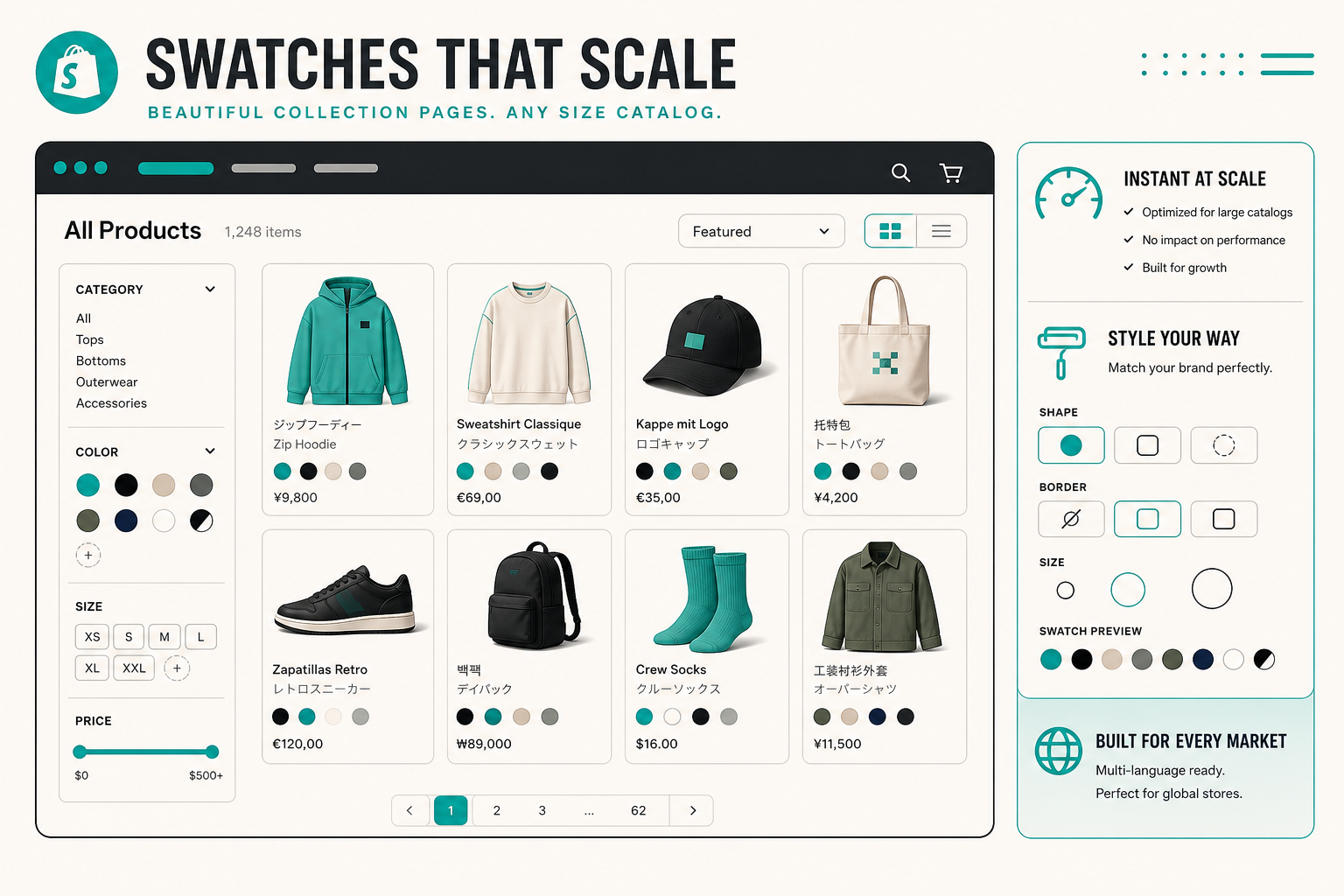
I like that Supra Swatch Colors supports collection pages directly, because it lets me keep the browsing experience aligned with the product page instead of inventing a second presentation layer for collection templates.

That matters even more in bigger catalogs, where a swatch system has to survive pagination, filters, and a lot of repetitive product cards. The app advertises support for large catalogs and product groups, which is exactly the sort of thing you notice only after the store has grown past the easy cases.
If your catalog is moving in that direction, How to Scale Shopify Swatches for Large, Multilingual Catalogs is the next useful read.
4. Test the Store Like a Merchant, Not a Designer
A lot of swatch setup work looks done in a preview but fails in the actual workflow. I usually check three things before I let it ship:
- The color names make sense to non-technical merchandisers.
- The same swatch style is still readable on product pages and collection pages.
- The store still behaves correctly in every language the shop supports.
That last point is easy to ignore and expensive to fix later. I would rather verify multilingual behavior before a merch team has to discover that one locale has broken labels or mismatched swatch text.
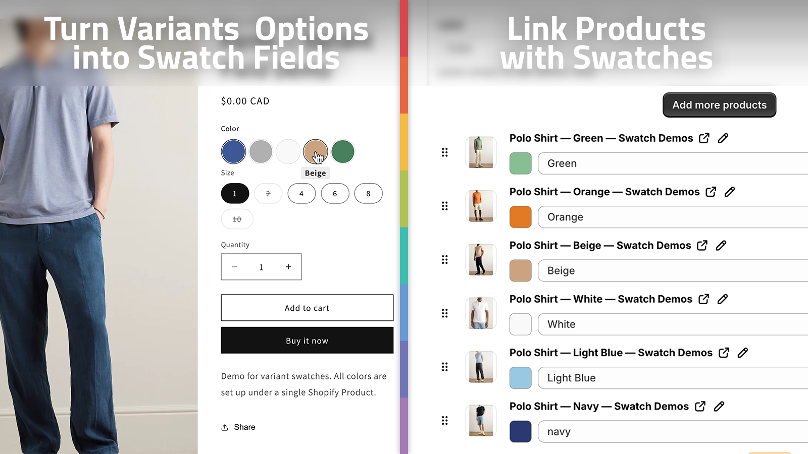
The fastest way to sanity-check the setup is to follow one of the product videos. The getting started tutorial is enough to see the basic flow, and the collection page walkthrough is the one I would send to anyone who needs the browse experience to stay aligned with the PDP.
My Rollout Checklist
When I want the setup to stay maintainable, I keep the rollout narrow:
- choose linked products or variants before styling anything
- normalize the color vocabulary the merch team will actually use
- pick one style system and apply it everywhere you can
- test product pages and collection pages together
- verify the multilingual edge cases before you call it done
That is enough to keep the system predictable without over-engineering it. The point is not to build a custom swatch framework; it is to make the Shopify catalog easier to browse and easier to maintain.
If you want a more tactical setup from the same product angle, How I Build Shopify Swatches That Match the Theme is the closest follow-up. If you are still at the very beginning, the original rollout notes in How to Roll Out Shopify Swatches Without Touching Theme Code show the least disruptive path.
The Short Version
Swatches work when the store treats them as part of the merchandising system, not as a decorative add-on. I want one decision about product vs variant behavior, one style system, and one consistent experience from the PDP through the collection grid.
If that is the problem you are trying to solve, install Supra Swatch Colors on the Shopify App Store and start with one collection, one theme, and one language. Once that works, the rest of the catalog is mostly repetition.