
October 7, 2026
I Chose My First Shopify 3D SKU With a Five-Minute Scorecard
A practical scorecard for choosing the first Shopify product to test with phone-captured interactive 3D media.
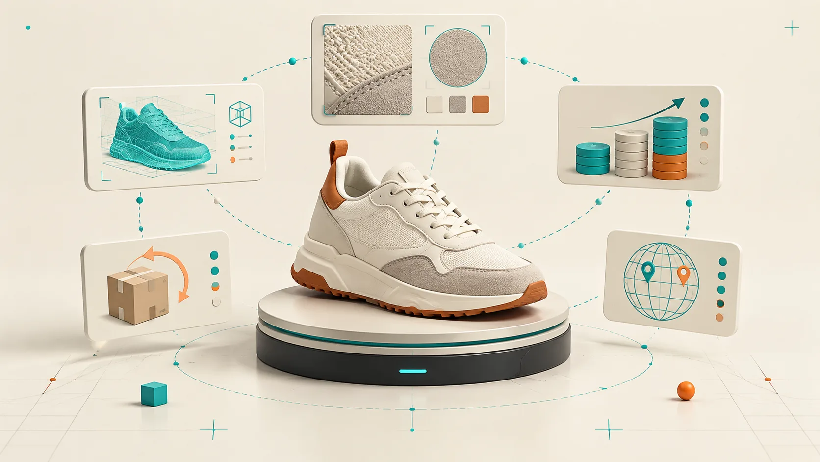
I wanted our first interactive 3D model to prove a small point: could a regular product page become easier to understand without turning the launch into a 3D program? The trap was obvious. If I chose the wrong SKU—a reflective bottle, a fuzzy garment, or a product with ten configurations—I could spend a week debugging the experiment instead of learning whether shoppers cared.
So I used a five-minute scorecard before opening a capture session. It gave us a boringly good first model, a clean baseline for product-page engagement, and a process I would reuse across the catalog.
Start With a Product-Page Question
I did not start with “what is our most expensive product?” I started with: which page still leaves a buyer asking what this object is like in real space?
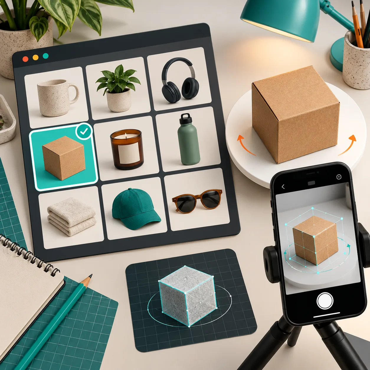
A good first candidate has one or two meaningful things that flat images struggle to explain: depth, a curved profile, scale, texture, or an underside shoppers cannot see. A structured shoe, a small appliance, a bag, a ceramic item, or a boxed set can work well. The customer should benefit from being able to drag, rotate, and inspect it—not merely enjoy an animation.
This is why 3D should sit alongside the ordinary product-photo brief, not replace it. I still want front, detail, scale, and lifestyle photos. The interactive model earns its place when it closes a specific expectation gap. If you are still deciding where 3D belongs, my earlier notes on which Shopify products to model first are a useful companion.
My Five-Minute Scorecard
For each candidate, I give one point for every “yes.” I am not pretending this is a conversion model; it is a way to choose a test SKU that has a chance of teaching us something.
- Does shape matter to the purchase? Could a shopper make a better call after seeing every angle?
- Can I capture it cleanly? Matte or lightly textured products in consistent light make a friendlier first test than clear, shiny, or furry ones.
- Is the object stable and complete? It should sit still, fit in a simple capture space, and not require a moving part to make sense.
- Does the page get meaningful traffic or questions? I want a real customer problem, not a beautiful demo nobody visits.
- Can I publish and QA it this week? The right first SKU has an owner, a ready product page, and a theme where we can confirm native 3D media or an app block.
Four or five points is a strong pilot. Three can be fine if the question is important. Two or fewer means I save it for later. This keeps the team from treating difficult capture conditions as a product verdict. Some materials genuinely need a more deliberate setup; they are not the place to learn the basics.
Pick One SKU, Not a Whole Category
The most useful constraint I set was “one SKU, one success condition.” Our goal was not to announce that the catalog had gone 3D. It was to learn whether an interactive model improved the way a shopper could inspect this product.
That changes the brief. I write down the specific uncertainty, such as “the side silhouette is hard to see in photos” or “buyers ask whether the heel is chunky.” Then I capture the simplest version of that product, before variants, bundles, or every colorway. The same thinking is behind the 3D capture brief I write before picking up my phone: a narrow question makes the output easier to judge.
Run a Small Phone-Capture Test
Supra 3D Capture is designed for this kind of test: you take a guided orbit of 10 or more phone photos, the app processes them into a web-ready GLB, and then you publish it to Shopify. I like that it removes the “we need a 3D artist first” excuse without asking the operator to become a photogrammetry specialist.
Before capture, I use a plain, evenly lit spot; remove loose packaging; and make sure the product stays in the same position. Then I move around the product rather than spinning it between shots. The goal is overlap from angle to angle, not cinematic variety.
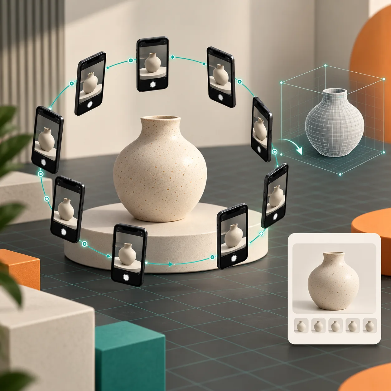
After processing, I inspect the model the same way a skeptical shopper would: rotate to the awkward side, zoom toward distinctive details, and compare it against the actual item. Check edges, openings, seams, and any area that could create an expectation gap. If the model does not faithfully communicate the product, I fix the capture before I debate placement.
For a more technical shipping checklist, the native 3D publishing workflow is worth keeping nearby.
Publish Where It Solves the Problem
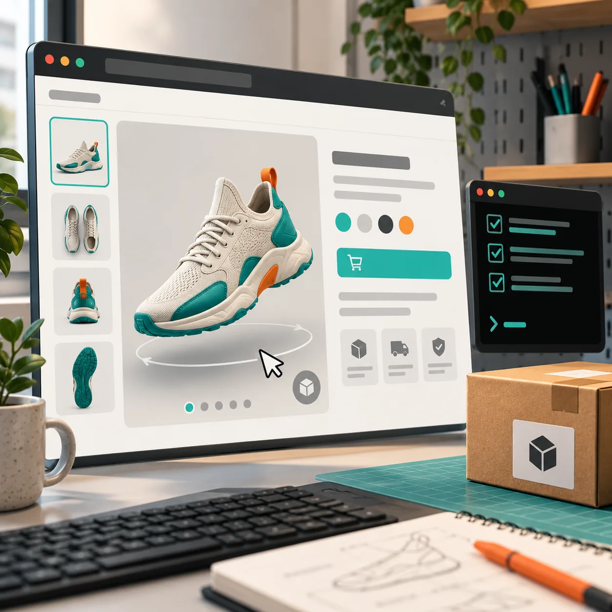
Supra 3D Capture can attach the GLB as Shopify product media for the native viewer, or place it with an Online Store 2.0 theme app block. I choose the placement based on the question from the scorecard. If the model is core evidence about the product, it belongs near the gallery. If it is a secondary exploration moment, an app block below the key buying information can be less distracting.
The publish step is also where I confirm the theme behavior on an actual phone—not just a desktop preview. Open the live product, rotate the model, test the normal gallery, and make sure the page still loads and reads naturally. Our previous capture-plan notes are useful here: a short QA loop beats a large rollout with no baseline.
Decide the Next SKU From Evidence
I watch for support questions, product-page engagement, and whether shoppers use the viewer—not a promised magic conversion number. The first model is successful if it makes the item more legible and gives us a repeatable capture-to-publish path. That is enough evidence to test a second SKU with a slightly harder shape or a higher-value question.
If you want to run this next week, open your catalog and score five physical products. Pick the highest-scoring one that can be photographed today, then start a Supra 3D Capture test. A single trustworthy model is a far better foundation than a grand 3D roadmap.